
Swamplot mentioned the cancellation of Randall Davis’s Titan condo project in passing yesterday, announcing at the same time that the project had scored the first-place spot in the hotly contested Most Grandiose Development category of the Swamplot Awards for Houston Real Estate. But really, if any 2008 event in Houston real estate deserves its own separate post on Swamplot, this is it.
Davis told the Chronicle‘s Nancy Sarnoff that slow sales convinced him to shut down the 25-story highrise project. There’ll be no rearranging of the deck chairs, no putting the project “on hold,” no “My Heart Will Go On.” It’s all over.
But the Titan will be sorely missed.
***
Why? Because no project dreamed or built better dramatized the frightened, defensive pomposity rampant in the Houston development scene. It’s the mid-late-’00s Houston real-estate zeitgeist: Make it grand, but make it grand in a way that we really hope other people will think is a lot like something else they also think is grand, so they’ll think we’re grand too! In its concept, its design, and its marketing, the Titan grasped desperately at themes — from anywhere but Houston — that might somehow bestow on the project a greater nobility than otherwise possible from its humble origins in a McDonald’s parking lot.
Really, the Titan just wanted to be loved.
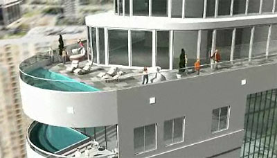
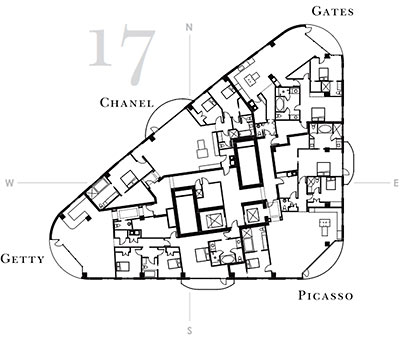
Buck Rogers deco profile? We’ll do it! Pools high on top-floor balconies? We’ll do it! Celebrity suite names for the social-climbing set? We’ll do it! Pointless spire? Hey, it points! It may not have had the absurdity factor of the toilet-obsessed Turnberry, or the overwhelming “live here, and you’ll be able to forget you’re in Houston” quality of so many other local luxury developments, but the Titan threw as many marketing wows as it could into its theme blender, whipping up a frothy glass of condo Kool-Aid. This time there just weren’t enough takers.
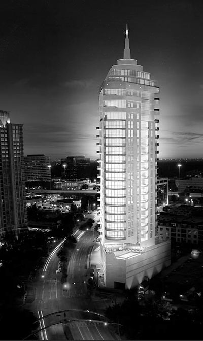
Will Houston ever see anything like the Titan again? Are you kidding? Just drive around. The local landscape is already dotted with shopping centers, apartment complexes, and lifestyle centers trying hard to compensate for low self-esteem in similarly cartoonish ways. The Titan wouldn’t have been so different, really. It’s just that when you hop onto a 5-story parking garage and stick your spire straight up into the sky, people tend to notice what you’re wearing.
It may be a long time before the local economy makes it safe for pretension and bluster on such a Titanic scale again. In the meantime, if you run into a lonely, down-on-its luck, wannabe-deco condo tower drowning out its sorrows in a crenellated Uptown Park bar, please try to be supportive and understanding. And tell ’em Swamplot loves the Titan and all those other buildings for what they really want to be, deep inside: nice, friendly, helpful pieces of the city.
- Proposed 25-story luxury condo tower bites dust [Houston Chronicle]
- The Swamplot Awards for Houston Real Estate, 2008: The Winners! [Swamplot]
- The Titan: Uptown Theme Blender [Swamplot]
- The Luxury Highrise and the Drive-Thru: They’re Lovin’ It! [Swamplot]
- Nine and a Half Bathrooms: The Turnberry Tower Penthouse Evacuation Plan [Swamplot]
- Caceres
- Not So Gaudi on Antoine: Barcelona Villa Boxes! [Swamplot]
Top image: Element Architects; all others: Randall Davis Company


Bravo, Gus. What a fine post for the last day of 2008.
I love this site and generally like and agree with most of the post. I’m also not generally a fan of Randall Davis’ projects as most have been cheesy and poorly designed. However, I actually thought the Titan was cool. It didn’t have the pseudo Gotham City embellishments that the Gotham, Renoir, and other past Davis projects overuse to distaste.
It was over the top, but finally not tacky. Your post is a hatchet-job. “..the Titan grasped desperately at themes — from anywhere but Houston ..” What Houston based themes would be appropriate? A bayou tower? A strip mall tower? A freeway tower? Give it a rest. Houston NEEDS buildings and developments that aspire to be something more than this place has to offer.
“…bestow on the project a greater nobility than otherwise possible from its humble origins in a McDonald’s parking lot.” Are you kidding? What new development doesn’t intend to be better than what came before? This is just overblown rhetoric aimed at an easy target. At least the Titan was not faux French, Tuscan, or Tudor. Houston is supposed to be Space City afterall, so why not a Buck Rogers tower? Swamplot deserves better than this post.
I pretty much agree with John. Throw away all the marketing for the building, and it’s a pretty sweet tower in my opinion. And I liked the pointless spire, but that’s just me. (And by the way, aren’t all spires pointless?)
John and JessieM, I still agree with Gus’s story and think the thing’s design out of context. Frankly, I am not sure the triangular piece of property supports a tower.
-humor warning-
Regarding spires, by design they must have a point. Otherwise they would be… uh, I don’t know what you call a pointless spire.
Maybe the big problem was trying to sell apartments with those weird trapezoidal living rooms.
Brad,
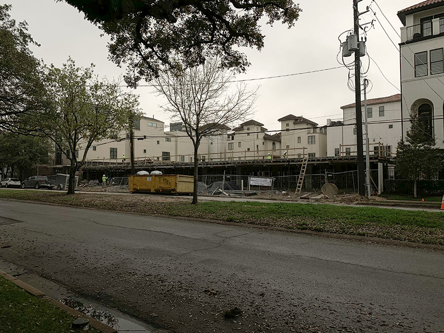
I guess I don’t understand what context you are referring to. Post Oak is filled with towers now and will be more so in the future. I think the new garden apartments next door to the site are out of context. If there is one thing the more urban parts of Houston, like Uptown, Midtown, and the Med Center, don’t need it’s more friggin’ garden apartment complexes. Regarding the appropriateness of a tower on a triangular site – I recommend you take a trip to San Francisco or NYC or Chicago where you will see amazing towers built on every type and shape of site imaginable. Houston’s developers need to travel more too. There is NOTHING so unique about Houston that it can’t have better buildings, real urban development, and designs that are better than mediocre. The facts that land is so plentiful and cheap, labor is cheap ( no unions), and regulation is practically non-existent should make Houston a hotbed for daring, progressive architecture and development. Instead, there is no real competition so everyone is just lazy, producing just whatever it takes to get by. It is sad and frustrating.
John, thanks for your comments.
I have been to all three cities, thanks and you are correct. But… all three of those cities are forced to use every square meter due to density. Houston developers(at this point) do not have density issues. Mostly they are driven by ego and greed it seems. I’m sure many of us drive past that location regularly. Saturday morning I drove past and imagined the claustrophobic feel (not to mention traffic load) that tower would dump on the curve.
As a designer, I agree that Houston is an empty palette for progressive, daring design. But as I was told in art school, a real artist knows what to leave out as much as what to put in. I think we are better off with a tower on that particular triangle at this time.
Happy new year to all.
i am glad to see swamplot taken to task. although i did not care for the idea of the titan at that spot due to the small size of the site, i did not see the design as awful as this reviewer indicated. in fact it reminds of some of the bizarre movie reviews i see.
that site won’t remain a mcdonald’s site forever. the highest and best use has changed. i do agree about the garden apartments next door. what a waste of a good site. i watched the construction and it was garden apartment alright.