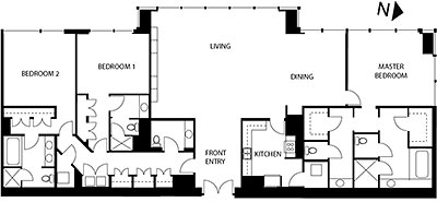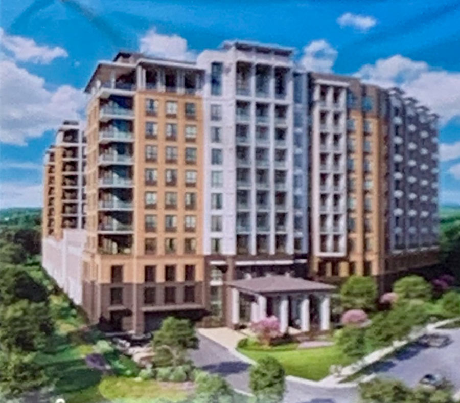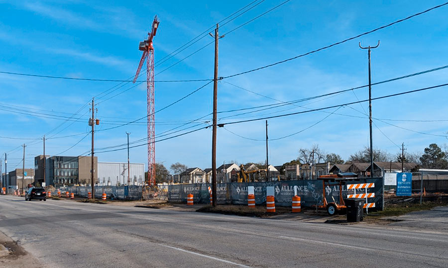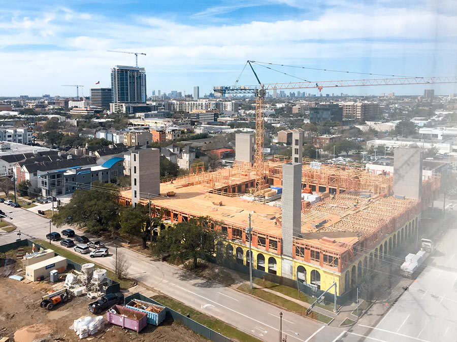
When Canadian home-design expert John Brown featured an oddly designed 2800-sq.-ft. 3-bedroom Houston highrise apartment on the “What’s Wrong with This House” video feature of his online Slow Home Design School last week, Swamplot readers naturally wanted to know where the place was. A new west-facing 17th-floor apartment . . . somewhere “Downtown.” Hmmm . . .
You came up with a lot of good guesses: One Park Place, the Turnberry Tower, the Cosmopolitan, the Legacy at Memorial, Mosaic, Orion, 2727 Kirby, Commerce Towers, the Shamrock Tower, the Four Seasons, Titan, the Regent Square tower, Park 8 Place, the Royalton, and Four Leaf Towers.
So what’s the answer?
***
John Brown writes that he doesn’t know:
We have a group of my architecture students who find floor plans and send them to us with only the barest amount of detail as to size and location. We redraw them all to a consistent format. It is not really important for our purposes to know where they are exactly – in fact as case studies in a design school setting it is really quite irrelevant except in so far as it gives an indication of climate.
The subject houses are drawn from across North America and we are not privy to all of the local situations and contexts in which these houses exist. We keep the projects anonymous to shift the emphasis away from the specifics and towards a more general discussion of design principles. We also don’t want any person or place to be unfairly affected.
Shucks. That doesn’t mean that some enterprising Swamplot reader won’t figure it out for sure one day, though!
If you missed the original videos, you can study them again here for clues:
What’s Brown, a Calgary architect, doing poking into Houston home and apartment floor plans, anyway? It’s just part of his own ridiculously well-integrated business plan. Brown’s Housebrand Design Store in Calgary’s Mission district sells modern furniture, accessories, design books and magazines to customers interested in simple and environmentally sensitive design. Then there’s Housebrand Real Estate (Brown is its broker). Once clients have found the right place to live and the furnishings for it, Housebrand’s in-house architecture firm can help with renovations or new construction. Did we mention the construction part? Brown is also a licensed contractor.
Brown runs all these businesses with two partners. In his spare time, he has a day job as architecture professor at the the University of Calgary.
To draw even more customers into the elaborate Housebrand web — and to combat what he considers the architectural equivalent of fast food (“a new cookie cutter suburban home [is] like a supersized hamburger and fries”) — Brown launched the Slow Home Design School, to “empower individuals to make better, more informed decisions about how and where they live.”
Appropriately, the school’s format is modeled after . . . yes, TV cooking shows. (“Save the liver! Living Room!”) After a few years running local classes, Brown launched Slow Home on the web earlier this year. (Brown was nice enough to cook up a video feature about Swamplot for last week’s Slow Home Report.)
- 07.20. What’s Wrong With This House? [Slow Home]
- 07.21. What’s Wrong With This House? Part 2 – 2800 sqft High Rise Apartment, Texas [Slow Home]
- 07.24. Slow Home Report [Slow Home]
- What’s Wrong with This Highrise Apartment? [Swamplot]
- Slow Highrise Recognition School: Is This Place Really in Houston? [Swamplot]
Floor plan and videos: Slow Home


Really??? Seriously???
That plan is pretty bad.
This has got to be 2727 Kirby. The whole west side of the building is a slanted glass wall. And, having known someone who has visited a condo in that building, the layout is similarly odd (bedroom entry from dining room, small kitchen, etc.)
He says it’s downtown. It has to be One Park Place.
It’s nothing in downtown.
It’s definitely not 2727 Kirby since the unit is too generic.
All the built projects and proposed projects had floorplans on their websites. None of them match.
My guess is that the student took what was considered a bad floorplan from somewhere in his professor’s eyes and just said it was in Houston since the professor has a penchant for making fun of Houston anyway.
My guess is that the student took what was considered a bad floorplan from somewhere in his professor’s eyes and just said it was in Houston since the professor has a penchant for making fun of Houston anyway.
________________________________________
Hilarious. You never know. The “revealing clue” is probably on the outside wall of the building per this plan. There is another apartment obviously to the left. And possibly another section which “juts out” as the section of the living room in this plan does. The windows themselves indicate the “left” side of this apartment is in the center of the building. Most architects tend to at least “balance” the window/walls for aesthetic effect no matter what the style of the building. The windows in the “left” side of this apartment appear to be wider than on the “right” side which is at one end of the building. Which may be the end of the buidling. If not, then it is a very large building.
The “length” of the building is east/west. So it cannot be 2727 Kirby. The length of 2727 Kirby is north/south although it is not “due” north/south. Angled from the street perhaps if it is in Houston. It could be a building still being planned but my guess is on a student with a sense of mischief as well as humor.
It has a distinctly “Manhattan” flavor to it. Something about the “closed-off” kitchen and the enormous bathroom in the master bedroom which appears to be smaller than one of the other bedrooms. And the lack of a balcony. Something that has always been a “negative” in Houston. People in Manhattan for some reason don’t care about balconies. Most people in other cities including Houston do care.
I meant to say East/West and North/South facing in terms of the view from the units. 2727 Kirby is North/South facing. This building is East/West facing.
Instead of “Slow Home Design School”, this whole post should be called “Slow News Day so Canadians get free ads”.
What a waste of time, and dull to boot.
This entire entry is a joke.
Methinks the premise of this being downtown is misleading. Possibly somewhere “inside the loop” might be considered downtown to those not from Houston.
Also, as such, I don’t think this can be a new build.. at least not in good conscience.
The enclosed kitchen reminds me of ’70s-’80s and very similar to a Warwick Tower’s unit I’ve been to. The odd placing of bathrooms also seem somewhat familiar. While Warwick is around 30 stories, and not 17, much of the “facts” have been wrong so far anyway. And this facing the South-West would be a similar positioning as well.
So, my guess is either a Warwick tower unit, or the whole thing is a farce and does not exist.
Warwick Towers doesn’t have that section that juts out from the side of the building. And the units primarily face north/south. The units in this building face east/west.
I think the bathrooms are wonderful. And I bet the shower in the master bath has a double door leading to both sides. I also suspect this was a custom design change for the owner and they took part of the original kitchen area and the original master bedroom for the additional bathroom and the master probably originally had an “entry hall” the way the other two do.
The more I look at it the more it looks like one of the more recent co-op buildings in Manhattan.
If downtown is not accurate, why not the west-facing unit on the 17th floor of the Royalton?
Very similar to what I have seen there.
The Royalton has rounded windows for it’s larger center units.
The windows are the clue.