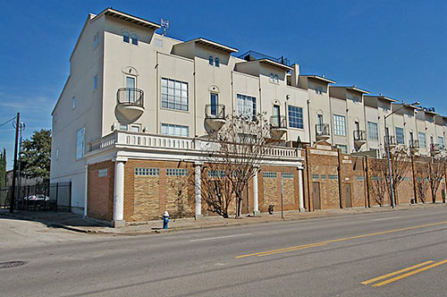
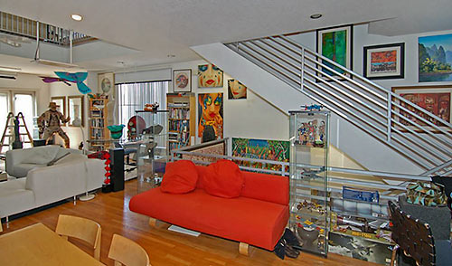
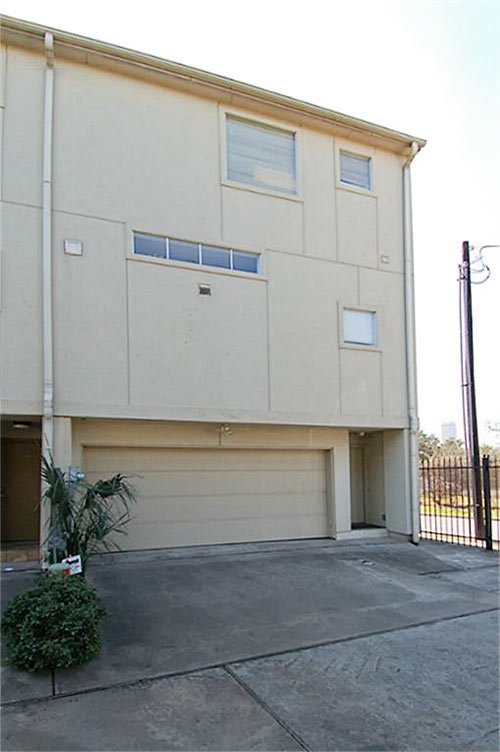
The 1998 transformation of a former auto shop on Washington Ave to the 9-unit Lopresti Lofts was a bit of a quirky redo. McGregor Real Estate Group gave the building a mash-up of infill materials, various porch-balcony-terrace views of downtown, and a piggyback stucco-faced addition topped by roof flaps saluting crisply above each unit (top). The amalgamation sits right across across the street from the gated entry of peaceful, park-like Glenwood Cemetery. A corner unit (in the building, not the graveyard) listed last week but quickly dropped its asking price by $20K to $370,000. Inside (above), lots of tubing ties together 4 levels of wide, somewhat open, sometimes high gallery space . . .
***

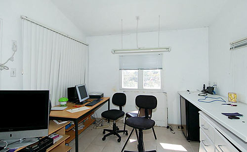
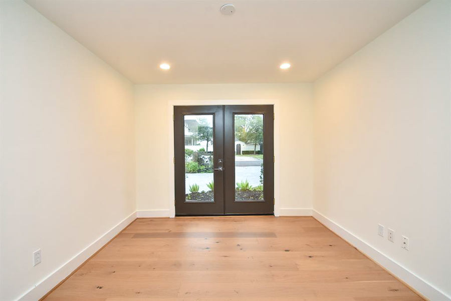
First, though, comes some street-level flex space (above) lit by glass-block-blocked clerestories at the front of the property. At 3,464 sq. ft., the corner condo is the largest in the block, HCAD indicates. Up one level, the kitchen also gets high-light windows, though they’re at the back of the unit:

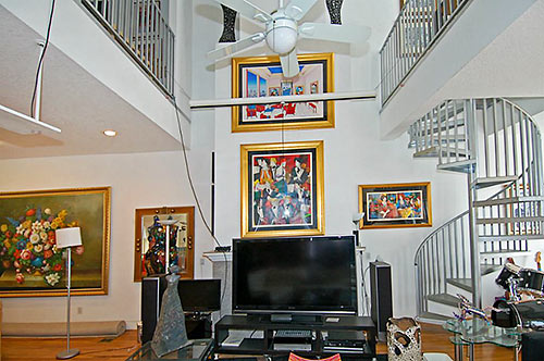
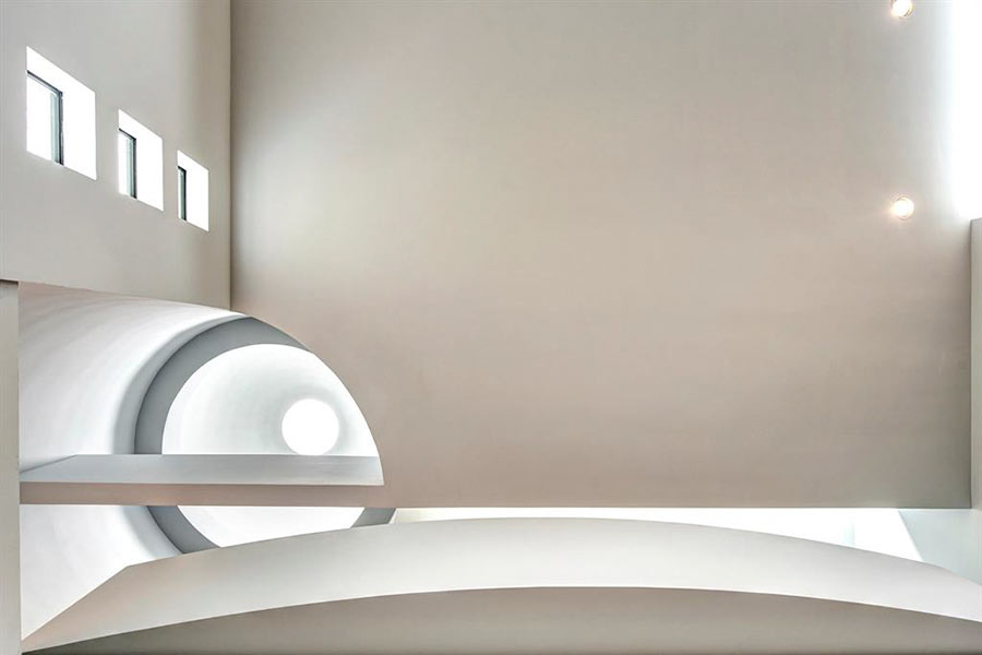
A spiraling staircase (above) links the second floor to the split-plan third level:
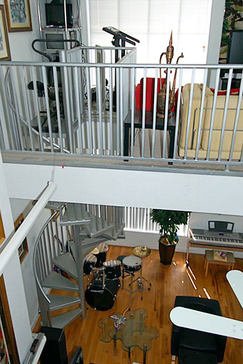
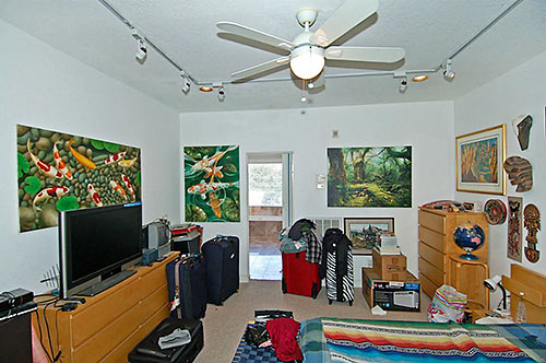
Tiny windows here place the room way, way up all those stairs:
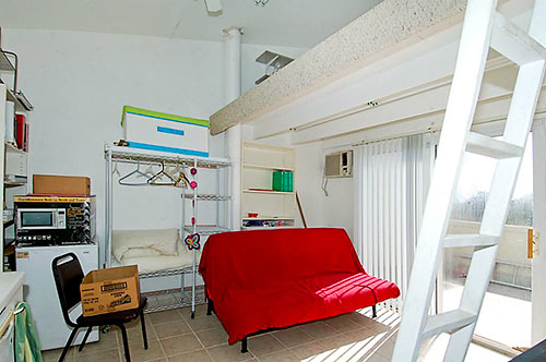
The home has 4 bedrooms, a study, and a library. (Or 6 bedrooms. It’s all in the count.)Â Bathrooms? There are 3 and a half. The porch count is 3, including this one, visible through a narrow door:
A gated driveway serving the garages beneath each unit runs between side streets Oliver and Custus:
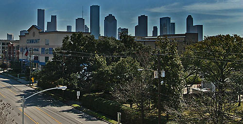
If closet space in the unit proves tight, Community Self Storage is in the next block. Meanwhile, Downtown’s west side architectural testament to the oil boom pokes through the treetops:
- 2602 Washington Ave. [HAR]


I always wondered what those units looked like inside. I am very sorry to know.
That’s just too much concrete. It should be against the law to use more concrete than it is necessary to use so natural surroundings is used more; very sorry landscape.
Somewhere behind all that mess and clutter could be a very decent interior. Guess they have never heard of staging a house for sale.
Hideous unit in a hideous building. It looks very Third World.
There’s a window unit a/c in that 3rd floor bedroom? Must get pretty hot up there in August.
I have been inside one of the other units – and it was actually very nice. I’d say this is a seriously good bargain for someone looking for that much space in a prime location.
I’d have to agree on the staging comments, though – at least take all the paintings down and shove some crap in the garage for photo day.
ShadyHeightster I spotted those a/c units too and it makes me wonder if increasing the main unit’s size would be enough to counter the rising heat issue you get with open spaces. I agree with TXdesign, some staging and a LOT of decluttering would do this place wonders. I’ve driven by them so many times and wondered how amazing the interiors must be. I still think there’s potential in this one. The views would be great, the walkability is stellar and I’d want it for the first floor flex to be workspace if nothing else. As long as the restrictions allowed running a business from home. Could be an amazing spot to meet clients in.
I usually love seeing other people’s art collections in HAR listing photos. Not this time.
I’m not one for piling on hate, but the criticism for this one is constructive. The lister can clean up and re-shoot pretty quickly and cheaply. Right now it doesn’t look like 3500 square feet of space. I’m sure folks would love to get a better look at this home.
Close to the cemetery, nice – – on Washington, not so nice. About as ugly of an exterior as is possible.
It looks like a bunch of students or a band live there–possibly both–which means it could be a lot worse.
Yeah, those same students and/or bandmates could be your neighbors.