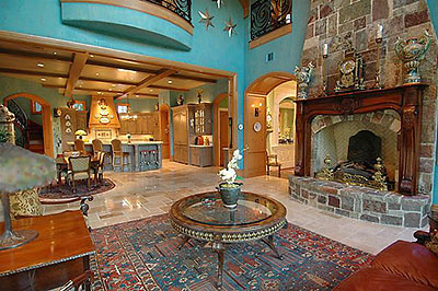
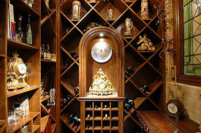
Just what is it that gives this Sweetwater chateau that authentic French je ne sais quoi? Could it be the multipurpose wine room? The big-enough-for-giant-pancakes breakfast area? The Vince Young seal of approval? No telling if any actual chateaus were harmed in the making of this grand home, but that’s all likely ancient history anyway — this place dates from the last century!
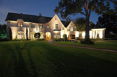
Listed earlier this week for just under $3.5 million, this little cul-de-sac palace backs up to the grounds of the Sweetwater Country Club and packs in 4 full bedrooms and 3 full and 3 half baths — all in just 7,744 sq. ft. Many delights await you in this photo tour:
***
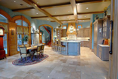
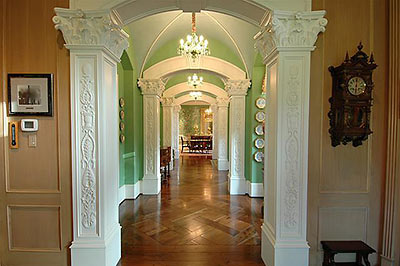
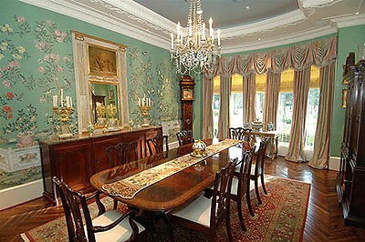
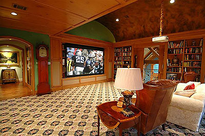
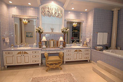
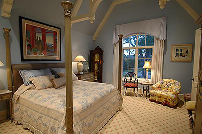
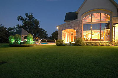
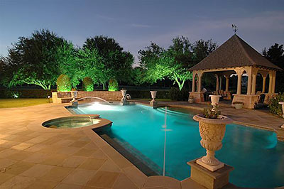


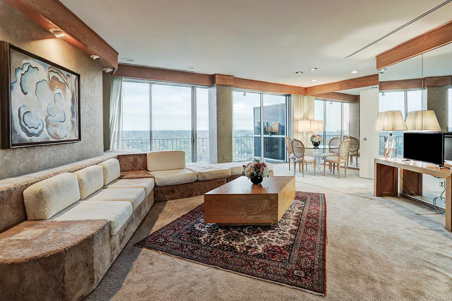
Mon Dieu! I am embarrassed to admit that I actually find myself kind of liking this place. Now I just need to buy a powdered wig and a French poodle…
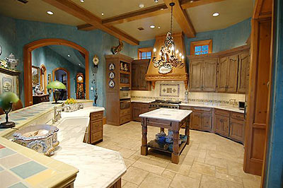
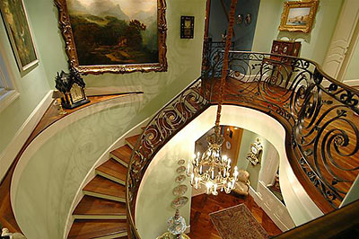
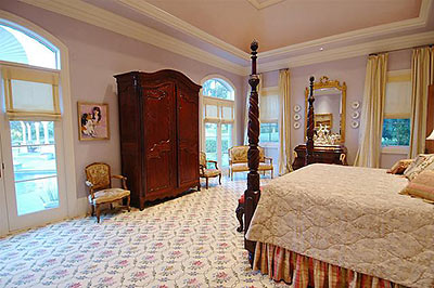
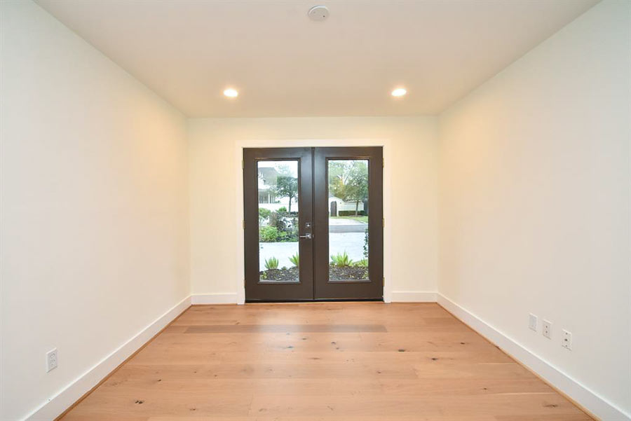
The formal areas and bedrooms are very tasteful, and I love that entry with the connecting hall, but the informal areas, well, not so much which is probably the result of attempting to incorporate a “country French” look and ending up with a “Tuscan” look instead. Tuscan. Tacky.
except for the infatuation for the turquoise walls and baby-blue tile, this place is pretty awesome. They knew what they were doin by putting football on TV for their TV room pic, that room is sweet.
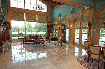
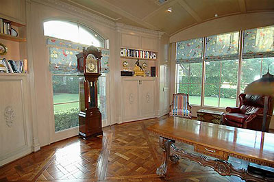
The clock collection is kinda creepy…
The house itself is a stylistic mess. Looks like the interior decorator and the house designer (perhaps a member of the ‘Texas Institute of Building Design?) mustn’t have talked much during the process.
At least 7 grandfather clocks…probably more. Anyone else think these owners are a little cuckoo? How is it possible to have so much money and so little taste. You’d think at some point they’d just pay a decorator to have taste for them. The poor breakfast table looks so lost sitting it’s island of a carpet in the middle of nowhere.
I know that house! It sits on the 16th green, 17th tee box on Pecan! Looks a lot nicer from the outside..
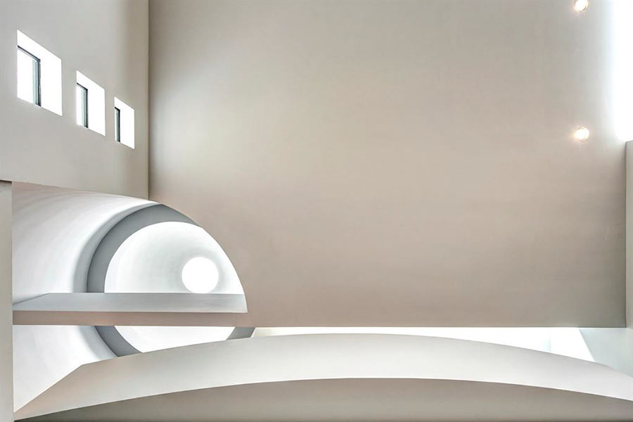
Ceilingriffic!
There’s just so much going on in that house! I’m gettin’ dizzy!
OK, the Locke Lane house had personal style. Not my style, but a style. This house is just full of design cliches and too many chatskis. Heck, even Jonathon Adler would protest that there’s too much blue/brown in that house…
Frenchiriffic! (Sorry, Scott, had to crib from you.) Gotta love how that burled barrel vault in the man cave sets off the ginormous sports TV screen. Zoom, baby, fourth and goal.
Just keeping the floors swept in this place would be a full-time job.
Seems kind of plain. I like houses that have more fancy decorations and much more gold stuff.
Agree with Doofus. Locke Lane I really liked – the walls, ceilings and floors are simple and clean which allows visual texture to be created with furnishings. Here there is so much freaking texture going on ALL OVER THE PLACE OMG that the eyes can’t rest. In the kitchen alone there are at least 3-4 different major textural elements of stone/tile and 2-3 different woods. Columns! Patterned wall to wall carpet! Parquet floors etc etc.! Ouch.