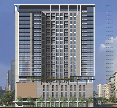
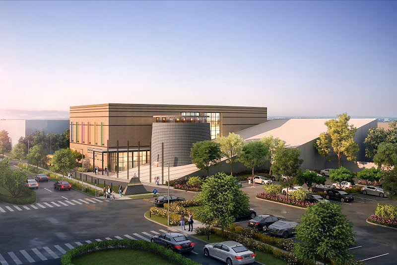
Here are a pair of early drawings and the site plan for that apartment tower Hines has said it’s considering putting up across the street from the Asia Society Texas Center in the Museum District. Previous reports and rumors pegged the building at 20 or 22 stories, but these elevations appear to show a 25-story structure, with 19 floors of apartments perched atop a 6-level parking garage. This drawing shows the north façade. The block Hines has in mind is bound by Caroline, Oakdale, Southmore, and San Jacinto, where the light rail runs. But it appears that the building won’t take up that whole block: The site plan shows that the tower has been drawn around that home on the corner of Southmore and Caroline, whose owners have been rumored to have refused to sell.
***
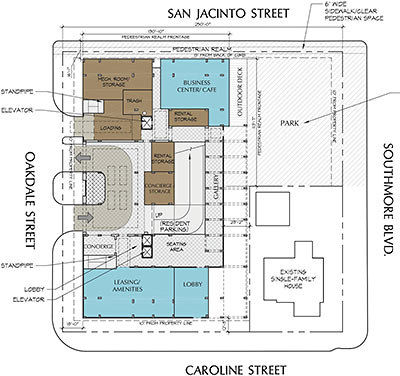
That site plan shows a park replacing the 1919 house recently used as an eyelash institute and presently standing vacant at the corner of Southmore and San Jacinto.
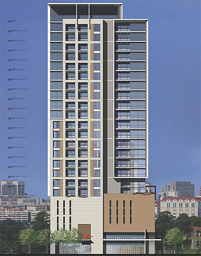
Below: The east façade:
- Previously on Swamplot: Around the Museum District Block Hines Likes for a 22-Story Apartment Highrise, Hines Buying Up Museum District Property To Build Highrise Apartments, Yoshio Taniguchi’s New Asia Society Texas Center: The Full Photo Preview Tour
Images: via Swamplot inbox


Why must so many of the new apartment designs be it highrise or midrise look like this cheap looking bore. I appreciate the new tower on West Alabama at least has style, it’s not exactly my taste, but at least its got flair. Honestly, I expect more from Hines in relation to design aesthetics, this is just so bland and nut bland elegant but bland cheap and quickly dated and to thin they want to tear down great old houses for this? it reminds me of an updates version of The Castilian, a grand bore of a dorm at The University of Texas. Seriously Hines, thus is Houston!, we expect your A game, step it up!
Can anyone make out the height of the high-rise?
Why must every new tower be some architectural achievement? Infill development is repetitive and boring…just look at any modern Asian, South American, or European city…even the U.S and Canada have cities with rows of boring density.
i’m a fan — i think it looks pretty good.
It’s not bad but compared to previous designs by Hines it did fall short as far as aesthetics.
It could be worse though! Don’t forget Embassy Suites near Discovery Green in DT.
I agree htownproud, it does look good: clean, contemporary and elegant…perfectly melds with the local aesthetic around it of today. Hines even gave a polite ‘the show must go on’ f#@* you to the turd that wouldn’t sell.
And the design/style bitches are going to bitch no matter what, so ignore them. Be thankful for the quality infill and greater density and let’s get on to building the next one. Thanks Mr. Hines, other cities across the country would kill for it.
Looks good.
“From kjb434:
Why must every new tower be some architectural achievement? Infill development is repetitive and boring…”
.
If this new tower was infill, or if any new tower in Houston was infill, you’d have a point, but since Houston doesn’t have the tower density of any of the major cities in places that you mention, your point is mute.
.
This tower, like most in Houston, will stand out significantly from everything around it, and especially in the skyline. For the record, I don’t hate this Hines building proposal, though I do hate it’s proposed location. This city continues to suck when it comes to smart development, but that is to be expected when there is not only no zoning, but literally no planning.
.
Projects located like this ensure that Houston will continue to be considered one of the ugliest cities in the country, one of the most inhospitable to visitors, and one of the hardest to get around. Voters here have long been brainwashed by developers into believing that these attributes somehow make us special, and that the resulting relatively low value of properties here somehow don’t correlate with the low desirability to live here – if you don’t have to. The fact that luxury homes in Houston’s best neighborhood can be had for less than $500/sq ft, while similar homes in the other Top 5 American cities can top $5000/sq ft says it all. It would be funny if not so pathetic.
But, this isn’t infill. The lot is presently occupied. The house that is refusing to sell is beautiful. The cool old apartments being torn down are unique with metal casement windows. It sits across from the Asia House. If this thing were going up on an empty lot in downtown or midtown, yippee… but it isn’t. It’s going to stand out and alone across from one of Houston’s newest architectural gems. Visitors to Asia House will possibly have views of a massive parking podium in the future. Again, only in Houston…
How cool would it have been if Hines had hired a noted architect like Richard Meier or any other architect of note and got a great building, why settle for mediocrity? Even Fingers designs better buildings than this. It’s cool some of you like it (I never agree with you, so moving on) and others sonterra care what it looks like as lib has it’s “infill”, I just don’t get this attitude. Why not strive everytime for an interesting design. I interned at Hines when I was at UT, I can’t image them developing rote by the numbers bores like this then.
Uhmm…kjb434,this should be an architectural achievement because it’s in a neighborhood bejeweled with architectural achievements. Some even call it the “Museum District”. Hines is bringin’ the hood down, too bad.
Funny that it’s stated that the corner owners “refused” to sell. Maybe they “declined” to sell their beautiful historic home?
First floor retail seems to be absent. No spaces for cafés or restaurants are shown in this plan. If this is indeed the case, then what a wasted opportunity to improve the street level. Hines can surely correct this oversight before the beginning of this project.
Perhaps we’re still a bit spoiled from the era when Hine’s founder was still in charge. That said, it’s still a heckuva lot more attractive than recent stuff like “the Whiteco Tower” near Galleria.
Looks good. I’m glad thsoe homeowners refused. That’s a cool house and tearing it down seemed unnecessary. That said, it seems there is a lot of space in the area surrounded by San Jacinto, Main, Binz and 59 that seems ideal for these kind of developments.
@Urbannizer, no idea, but if you give 10′ per residential floor (maybe 20′ for the main floor) and 15′ for garage floors, you’re looking at around 290 ft.
I do wish that it had some ground floor retail. The park looks interesting. Hopefully, it’s not only accessible by the tenants and is more than just grass. The entrance doesn’t look very grand; it seems a bit tight, but I guess that’s because they can’t use the entire block.
I agree with the previous posters – I think a high rise from Hines would be greatly received in this area, but the block they chose is all wrong. They want to put that bland design across from a true gem of architecture (Asia Society), and adjacent to a gorgeous 100-year-old home. While bland, the design becomes a complete eye sore in the proposed location. There are extremely empty and ugly blocks that are walking distance to this location…I wish Hines would reconsider the location for this project. Comes on Hines, please reconsider.
A bit of an odd duck of a building architecturally. More quirky than ugly. Sure, why not?
I suspect the lack of retail will be blamed on the owners who chose not to sell. This neighborhood is ripe for development–it seems that with a bit more though & gasp! Planning, they could do this much, much better.
putting it along the rail is an awful idea. across the street from eight story apartment buildings and several short blocks away from other high rises — who do they think they are?!? and between the medical center and downtown to boot. Awful idea. And that is to say nothing about how this building will ruin the allure of the surface parking lot across the street and the random houses/empty lots otherwise surrounding it. i’m shaking my head at you mr. hines.
What’s with that skyline? Shows a bunch of buildings that don’t exist. The area is low rise. Looks like Caroline, one of the best pedestrian streets in the City, will be dead to the world. What a lousy design.
This project will destroy an amazing apartment complex with lots of appeal, as well as a vintage residence. It’s a real shame these legendary properties are doomed. Houston does it again…
It is rather underwhelming from a design standpoint. Rather looks like what the architect came up with when presented with a tight budget and lot measurements. I doubt these are economy apartments, so we’re probably talking average unit rental rates in excess of $2500/month. There are lots more interesting high rise rentals being built in Atlanta, Seattle, Chicago, and San Diego right now.
.
Jon, #8, makes an interesting point about why real estate prices in Houston are so much cheaper than other major US cities. It usually is explained away by saying we have so much land and no physical barriers like bays or mountains. I’d also posit that low prices are in part due to uncertainty about what could be built next to you. Who wants to pay $500 sq/ft for a house that someone could build a day care center or used tire store next to? Who would pay $800 a square foot for a nice historical mansion when you could have a 25 story tower go up in your back yard? Maybe prices here are kept in check by buyer uncertainty over what will be near them. Our lack of zoning and planning mean more risk for your money when investing in real estate.
A nice clean, modern look. Appears to have some volume/modulation to the facade, given the shadows as shown. What, no brick and stucco with quoins? Where’s the cast stone doo-dads? I like it.
Houston rocks. The only real problem we have is that all this prosperity and freedom tends to attract chronic internet whiners who are long on bitchiness and short on capability, expertise, aptitude and resolution for whatever bug they have up their ass.
I agree with ShadyHeightster – who wants to buy a house in the innermost area of Houston when you never know what horrible thing is gonna sprout 25 stories in the sky butted up next to your charming house and garden you spent so much time on? Renting is the only quick easy escape. Of course then your landlord sells the vintage apt bldg, gives tenants notice and the new owners tear it down. I feel sorry for my old neighbors, they’re about to have a colossal monstrosity next to them, after they put up with the banging and the big trucks and the port-a-potty that sits in the yard for 6 months.
I know the family that refused to sell. They spent thousands to restore that home; it was once featured in a Houston Chronicle magazine spread (yes, they used to have those). The home is beautiful inside and out.
Sorry, I think this ugly building will wreck what could be a showplace boulevard. Yes, sometimes I’m naive and wishful. A 3-4 story development would be much more in keeping with the neighborhood.
I actually like the renderings of this building but have to agree with other posters on the location. There are so many empty or underutilized blocks that it is a shame to take out one of the ones that is utilized. that said, if Hines has bought the land, there probably isn’t any going back….
The Developers act as if there is no other available land. There are lots after lots after lots of land for this high rise that would not destroy a neighborhood.
At some point you do have to ask yourself why they choose to build where they build.
I know it’s all about location, but that’s really only an argument in a city where there is no place else to go.
Honest Truth,
How can you call someone a turd and deride them for trying to preserve such a wonderful architectural jewel in an area that really didn’t look like anything would ever happen in.
I don’t think anyone is against growth when it isn’t right up against your home. These people worked very hard to create a beautiful home on a wonderful landscaped property. They invested a lot of time and energy in creating something that you don’t see often in Houston anymore. There are numerous empty lots in that area that would have been just as acceptable for a high rise condominium tower. Its just sad to listen to jerks like you belittle people who try to do things right and get screwed like they have. Its about the quality of life and they had worked a long time to get it right.
The design of this building is actually quite a nice compositon of protruding masses and planar elements.
Here’s a brief explaination of architectural drawings for those of you who seem to not understand: these are elevations–2D analytical drawings that express the vertical representation of a building. They are not 3D and do not have perspective, therefore you may not understand that there is a rather large amount of relief and variation in the massing of the building(although the shadows should help).
And, you should also keep in mind at such an early point in the design, final color/material selections have probably not yet been made. So any quick judgements should really be withheld at this point.
I’m with you Bob, that home is a priceless gem and it’s heart breaking to see the knuckleheads at hines select such a bone-headed site. There’s plenty of available lots on Main & Almeda. The owners of that home are friends of mine – they have been such awesome neighbors. I hate this is happening to them. Hines, pick a better site and give us a nicer building. Y’all are being bullies.
I hope the single family homeowners turn it into a no-tell motel.
Hines, Buckhead, Trammel Crowe et al pick these sites because they are cheaper than lots being held by investors (vacant or otherwise). Offer a few home/business owners a few bucks over market price and you will get land at a fraction of what an investor with a long term position on a piece of land will take. Developers are like cheetahs. They look for the slower gazelle that has strayed from the herd. That is why these projects end up in such odd nooks and crannies in Houston instead of building up along major corridors and getting some synergy with the density created by other developments.
I hate for anyone to compare developers to any creature as majestic as a cheetah. I prefer maggot.
Houston does have planning, its called deed restricted neighborhoods. They have HOAs. This is the museum district, the tower didn’t replace a single family residence. Neither did Hines, Ashby, or any of Davis’s deals.
Comment 35- meet comment 14 from comment of the day:
From Sic Transit Gloria:
If you’re relying on deed restrictions to protect your homestead from development-happy neighbors, you either have never had to sue to enforce those restrictions or you’re wealthy. There isn’t a competent real estate attorney in town who will take a case to enforce a deed restriction — especially with pending construction next door — without a cash retainer of $25,000, at least. And you’re looking at, conservatively, up to $100,000 in legal fees (not including court costs) once you start seeking injunctive relief to stop that contractor with the bulldozer and a work crew. Residents of some inner-loop neighborhoods may have that much cash lying around in cookie jars, but most of us don’t, having purchased well before the current land boom and having other financial obligations, like paying property taxes and helping our elderly parents.
October 10, 2013 at 4:57 pm
Mel you are correct after reading about 3 ridiculous comments, I stopped. You don’t need a high priced lawyer when you have a HOA. Do you know how much power they have through assessments and fines, they are not even bound by constitutional constraints that public government must abide by. Riddle me this Mr Mel, what high rise, mid rise, low rise has been built in a deed restricted neighborhood in Houston? My HOA wont even let me put a Texan flag in my yard, much less build a 14 story high density residence.
Just Build it!!!!!!
Harry – are you serious? You have to be joking! The better question is where in Houston do you live, surely not the inner loop??? All deed restrictions are not the same. Lols.
Actually, quite a few neighborhoods have not only deed restrictions but HOAs…Afton Oaks, Southampton, a large chunk of Boulevard Oaks, River Oaks, Broadacres, Shadyside, Royden Oaks – the list could go on if you want to include the incorporated island cities. My guess is some have had bad experiences in Montrose or the Heights and assume all of the Inner Loop works that way.
“So any quick judgements should really be withheld at this point.”
LOL… then there wouldn’t any comments on this site!
I feel bad for the owners of that amazing house, but this will be another great step for the area. Next, more restaurants!