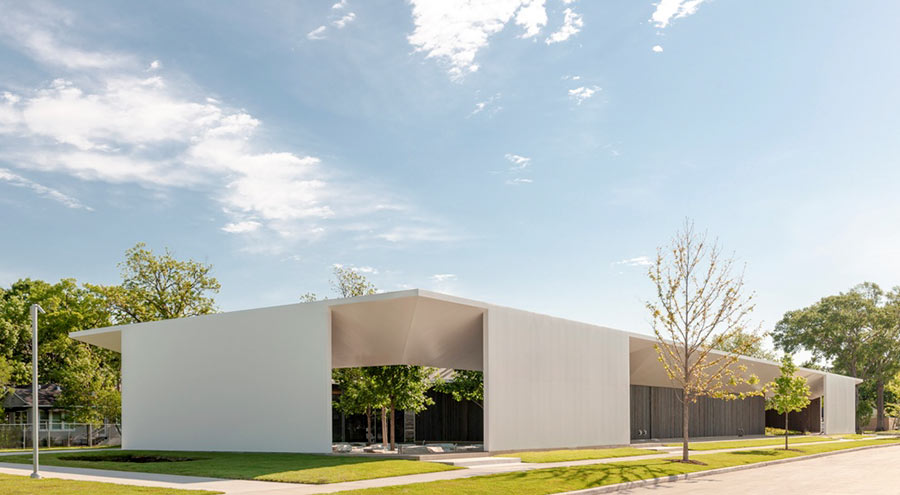
THE MENIL DRAWING INSTITUTE: 6 MORE MONTHS  What’s been going on at the Menil Drawing Institute’s new building since its opening — originally scheduled for last October — was postponed over the summer? A lot of sensing and measuring: “It’s extremely important to monitor the climate control and the humidity gauges for a number of months to make sure there are no deviations,†the museum’s director Rebecca Rabinow tells the New York Times’ Andrew R. Chow., outlining what kind of ambiance is required for the paper works the structure will soon house. (Last year’s cold winter didn’t speed things up either — reports the Chronicle’s Molly Glentzer, killing off many of the new plants that had just been installed in the surrounding park according to the plan from landscape architect Michael Van Valkenburgh Associates.) Now that both the indoor and outdoor environments have been stabilized, the official opening date for the 30,000-sq.-ft. building designed by L.A. architect Johnston Marklee has been set: November 3. It will cap off a 3-year building process that began in place of the since-completely-demolished Richmont Square apartments’ backsisde off Branard St. The new structure’s first residents: 41 works on paper by Jasper Johns. [New York Times; previously on Swamplot] Photo of Menil Drawing Institute: Paul Hester/The Menil Collection


I might add it was nice to see that The Menil finally decided to mow their new park full of grass and weeds last week, although I still wonder where the wall of trees planted along the east side adjacent to AT&T went. Perhaps they decided an nearly empty field is a feature of Minimalism?
Those trees were dispersed throughout the property. They were just planted there temporarily until they were ready to plant them where they were intended.
I still miss the Byzantine Chapel. I hate the art Dominique De Menil collected, I think her taste was rubbish: literally. Have you seen the Cy Twombly Gallery? A two year old throwing paint at a wall is more inspiring, but the frescos were amazing. I loved that place. Also hate her house in River Oaks, it looks like a engineering firm from the 50’s. Johnson’s worst design.
Thank you, Bob
Jonathon, that’s pretty funny. I think her house is ugly as well. I’ve heard it was the first house and still one of a very few that put the front door towards San Felipe.
Jonathan, since you “liked” the Cy Twombly Gallery so much, try the Dan Flavin Installation at Richmond Hall. I typically describe the installation as a poorly designed display of neon light fixtures that might have come out of a closed Home Depot. It’s still good for one (and one only) 5 minute visit when you need a good chuckle.
Aw, I think y’all are being too harsh. Then again, I remember many years ago taking my mom to the Rothko Chapel and by the end of our ‘tour’ she was openly sniggering and drawing one or two nasty stares from the, uh, whatever you call the people who just sit in there for a while.