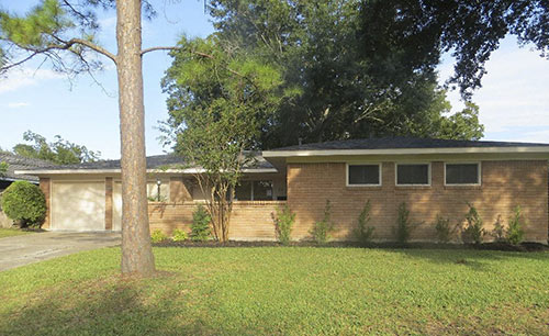
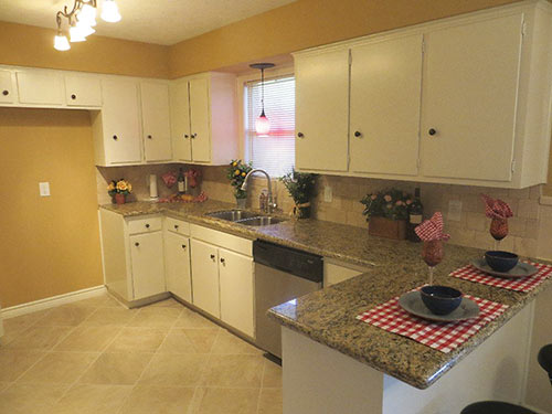
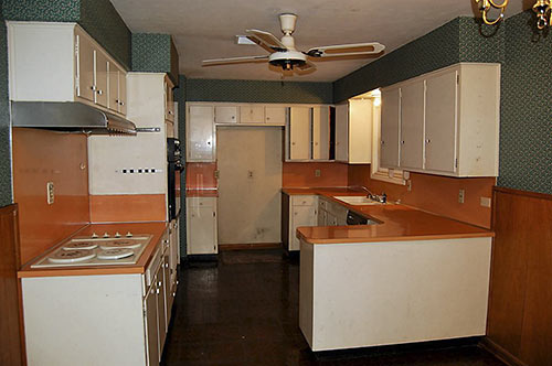
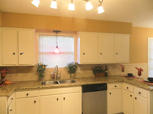
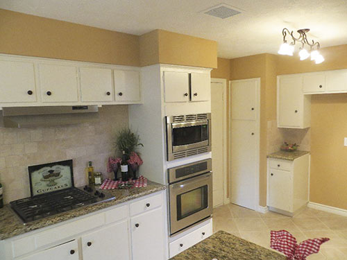
Since its purchase in August for $86,100, a 1956 Glenbrook Valley property located on one of the mid-century neighborhood’s interior streets has been zhushed for a flip. It’s now back on the market and asking $144,900. Changes are most apparent in the kitchen (above middle, with the original below it) and bathrooms. Tweaks before its listing last week included a new roof, new flooring, repairs to underground plumbing, leveling of the foundation — and home staging with careful attention to corners . . .
***
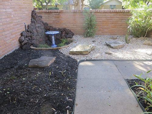
A rockin’ courtyard entry forms a patio hidden from the street (above) but on display from the living room’s west-facing and full-height picture window:
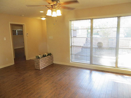
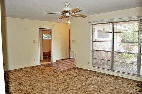
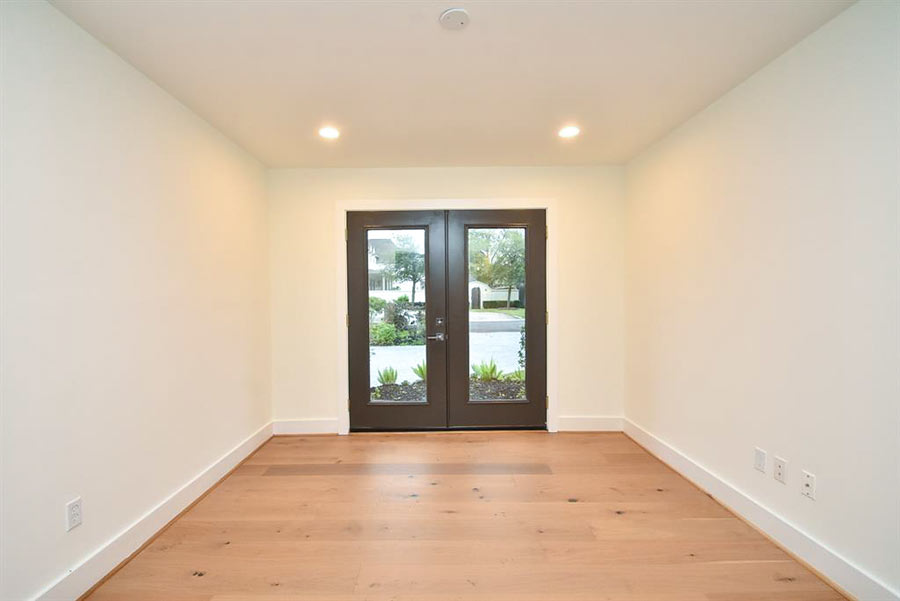
Before the update, textured carpet covered most of the non-sleeping side of the 1,881-sq.-ft. floor plan, as shown in the picture from that listing below. The front room’s knee-high planter has picked up some landscaping by the entry, where an interior door leads to a hallway serving 3 bedrooms.
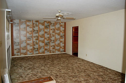
The other end of the combo living-dining space changed its accent from wallpaper . . .
to decorative wall-huggers. Fresh paint smooths out the shared space and an arch opens up passage into the adjacent family room:

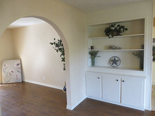
New ceiling fans are also part of the updates.
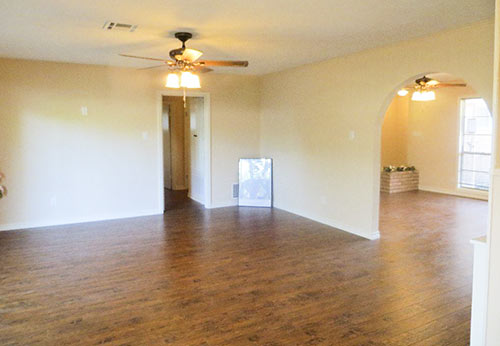
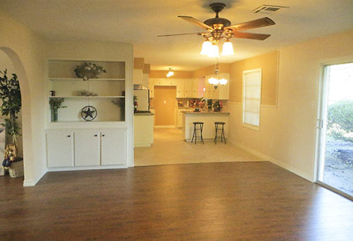
The new arch also extends the reach of natural light coming through the east-facing sliders at the back of the home:
Here’s the same view from den through open-ended kitchen before the redo:
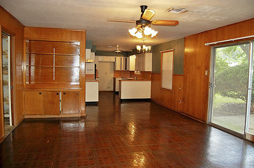
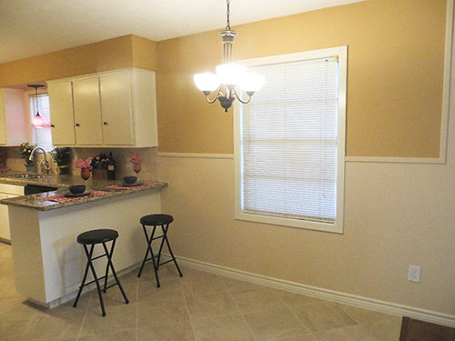
Original paneling in both rooms has been painted to match the cabinetry in a kitchen tweaked considerably:
Propped up corner props also pop up in the bedrooms. The master suite . . .
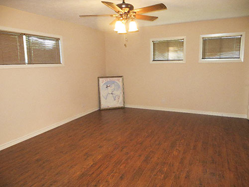
has a smaller room nearby . . .
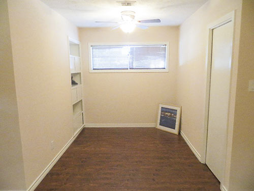
a pair of closets . . .
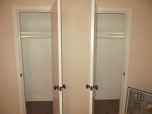
and an original shower now sporting a seamless glass door. The vanity was previously green laminate.
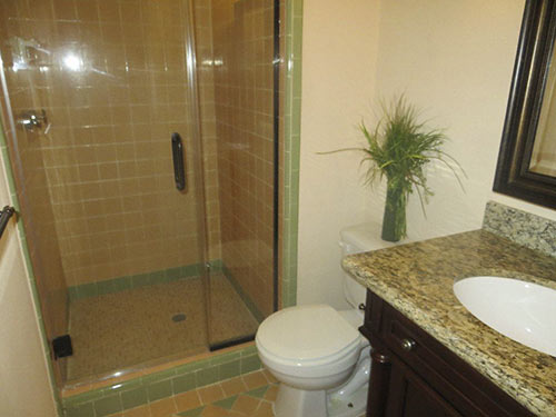
Here’s the other bathroom after its updates from . . .
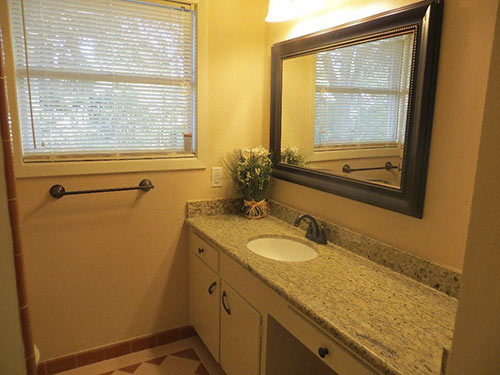
its original state:

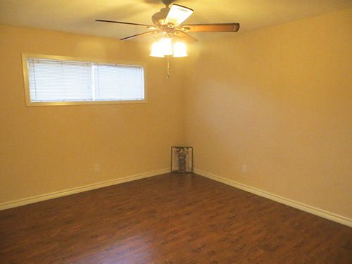
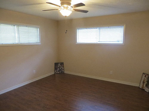
Meanwhile, the 2 secondary bedrooms come with high windows — and low art:

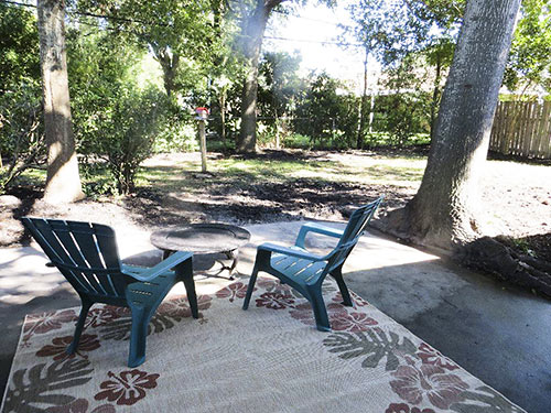
The family room’s sliding doors open to a patio overlooking the 8,775-sq.-ft. lot’s back yard:
Here’s one of the neighboring homes:
Prior to its summertime sale, the home appears to have been in the same family since at least the early 1980s.


Probably one of the worst, half-assed renovations I’ve ever seen. This home is a deformed, bastardized hybrid of a MCM + McMansion. Terrible mismatched finishes.
Just from a finishes perspective:
1. You kept the old kitchen cabinets? Why would you put granite on top of 60-year-old cabinets, some of which look like they don’t close? (picture before “Propped up corner props “)
2. It looks like the windows didn’t change. New windows that open properly and insulate well make an enormous quality-of-life and energy-efficiency difference.
3. If they didn’t replace the windows, I wouldn’t be too sure about the quality of their foundation work.
Not bad at all for the price. I’m sure the next owner will finish revamping the bathrooms.
Some nice touches, but the planter in the LR is both goofy and hazardous. And I take issue with painting over the wood paneling. It is not POS knotty pine, but, but something finer (can’t tell what species). It’s part of the whole MCM thing, and if the goal was to lighten the room, another approach would have been desirable.
Agree with other posts about the awful job done on this renovation. Granite on top of those cabinets? No window replacement? The archways, while perhaps nice in another setting., are not in keeping with the style of the house. Were they put in to remove evidence of cracked doorways? (Though I like the oddball planter.)
Why do investors have to go ruin everything? Does no one care about restoration & preserving these homes?
The wave of flipping that has besieged the city’s mid-century neighborhoods is a major downside of Houston’s economic boom. A nice 1700 sq ft mod at 2005 Shadowdale (which I’m still kicking myself over) was picked up for $100k at the end of 2013, and sold six months later for twice the amount, outfitted with new “upscale finishes” from Home Depot and slathered in puke-yellow paint. The 1960 Parade of Homes mod at 10630 Olympia in Walnut Bend was similarly ruined; I almost laughed at the seller, who wanted $450k for their “updates”. Breaks my heart, but it’s their property and they can do as they please with it.
Wow. This house reminds me of my last house. Actually, that paneling isn’t as good as the knotty pine paneling. It’s true plywood, not particleboard, but it’s not board paneling like the knotty pine is. Finishing in baths is atrocious. If you aren’t going to change out the tile on the tub surrounds and floor, at least use a very light, near white granite on counters. My guess is the green tile bath is the master bath, and the skinny closets back up to skinny ones for the bedroom on the other side of the wall. If that odd small room is even halfway close to the master, convert it into a master closet and get rid of the two tiny ones by making a bigger, walk-in one for the bedroom on the other side, or open up the master more. Definitely get rid of the old windows. Those old sliders are a pain. If they were redoing the floors anyway, why not take out the planter first? If it were taller, I’d say top it with a nice wood, to make an entry “table”, but it’s too short. One thing I found on my house that age – the roof decking was tongue and groove 1×6 boards. Really helped in energy efficiency.
Let’s step back a minute on this one. In agreement that this flip isn’t one of the best. Those granite counters are horrible. The orange counters were the only thing with any verve in an otherwise undistinguished tract home. But being that this house , atypical of the Glenbrook Valley Historic District, would fall under all kinds of rules to replace the windows and other exterior elements, the owner probably didn’t want that added hassle of appearing before a board etc……seriously this house and 90% of the others in GV are just boring little tracts of no historical value. Keep in mind this section is close to Hobby surrounded by crappy apartments . The flip doesn’t exactly warrant major expense nor is any up n coming Millenial going to consider this home or section of the neighborhood as a viable choice. That said, they probably did enough but clearly need some pointers.
I’ve seen much worse. I too like the little planter and I’m glad they kept it. I understand the reasoning for the arch but it should have been squared off. The only thing that really bothers me (and it bothers me a lot) is painting the original paneling. Someone should have known better. Especially since it looks like the paneling was in good shape.
Home Depot contractor grade crap everywhere.
Did anyone see the pictures of the realtors? That’s could be possible Swampie nominee (close to Michael Sweat). I think one of them is in full drag, not that there is anything wrong with that.
So few flippers do any important and expensive structural work like foundation fixes. The interior stuff is the cheap and easy stuff. So I give this two thumbs up.