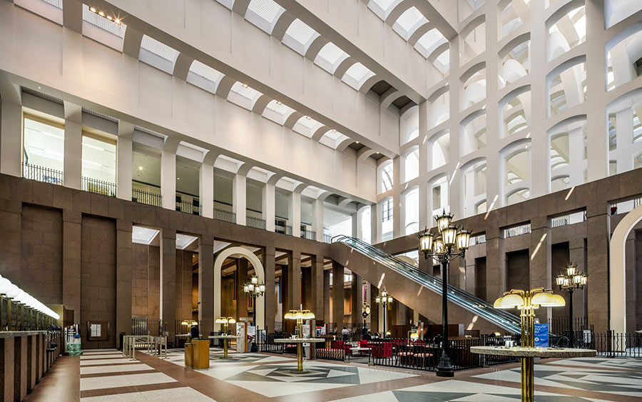
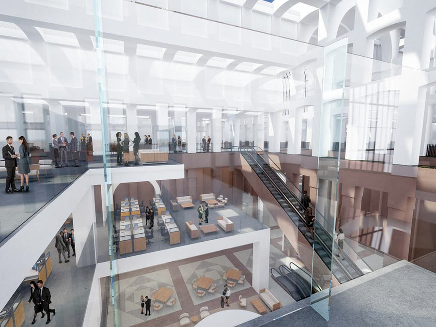
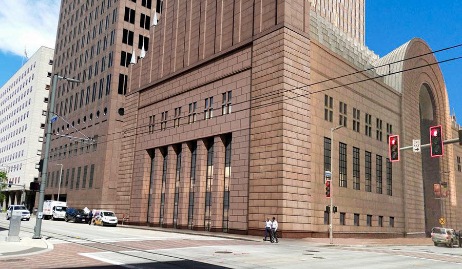
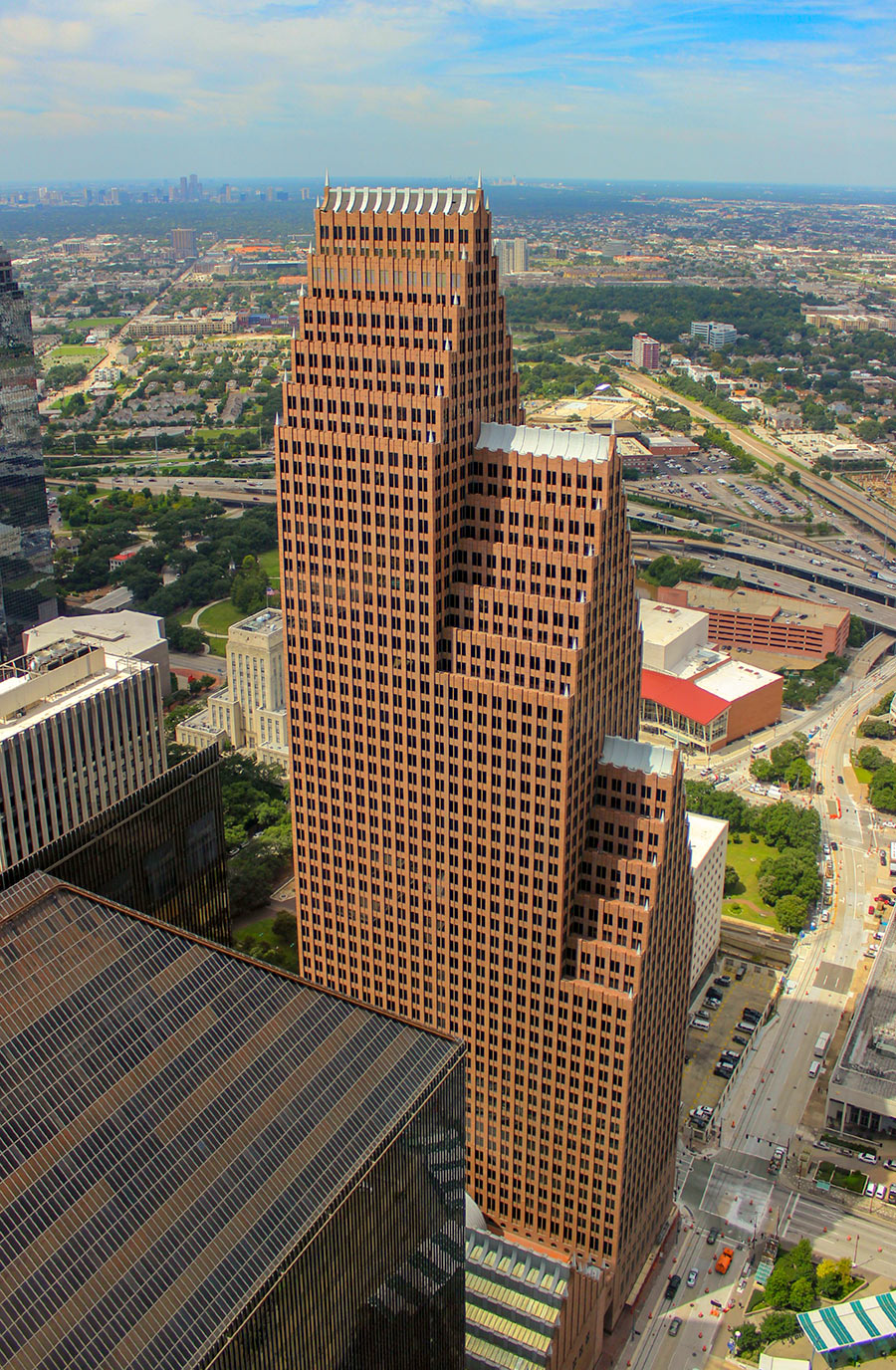
Quick, what’s the most vaulted bank in all of Houston? Easy: the lofty Bank of America branch on the ground floor of the Bank of America Center at 700 Louisiana St. Downtown (pictured at top) — so grand, so postmodern, so . . . unleasable. Philip Johnson designed the 12-story high banking hall to resemble “a sixteenth-century Dutch guild hall, albeit one scaled to be seen from the freeway at sixty miles per hour,” writes Joel Warren Barna in a history of the project included in The See-Through Years. But now big changes are planned for that empty space:
“We’re just going to kind of slip in these two floor slabs,” Jeff Sydness of Sydness Architects tells the Chronicle’s Katherine Feser. Sydness was hired by M-M Properties to reconfigure the lower levels of the 56-floor tower, which was built in 1983. So: Lower ceilings ahoy! New mezzanines are now being planned to colonize the banking hall’s towering overhead emptiness. The new structures, edged with glass walls, will fill much of that air-conditioned but unused airspace with workstation- and cubicle-ready office platforms:
***
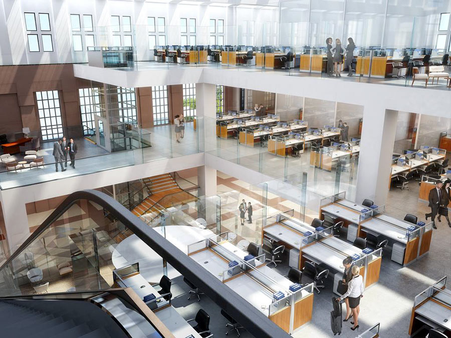
The rendering above shows the view from the top of the existing escalator, looking south toward the mezzanines (to the right) and the building’s frontage along Louisiana (to the left). A new glass elevator on the left and encircling stairway drop straight down into the lobby from the added floors above.
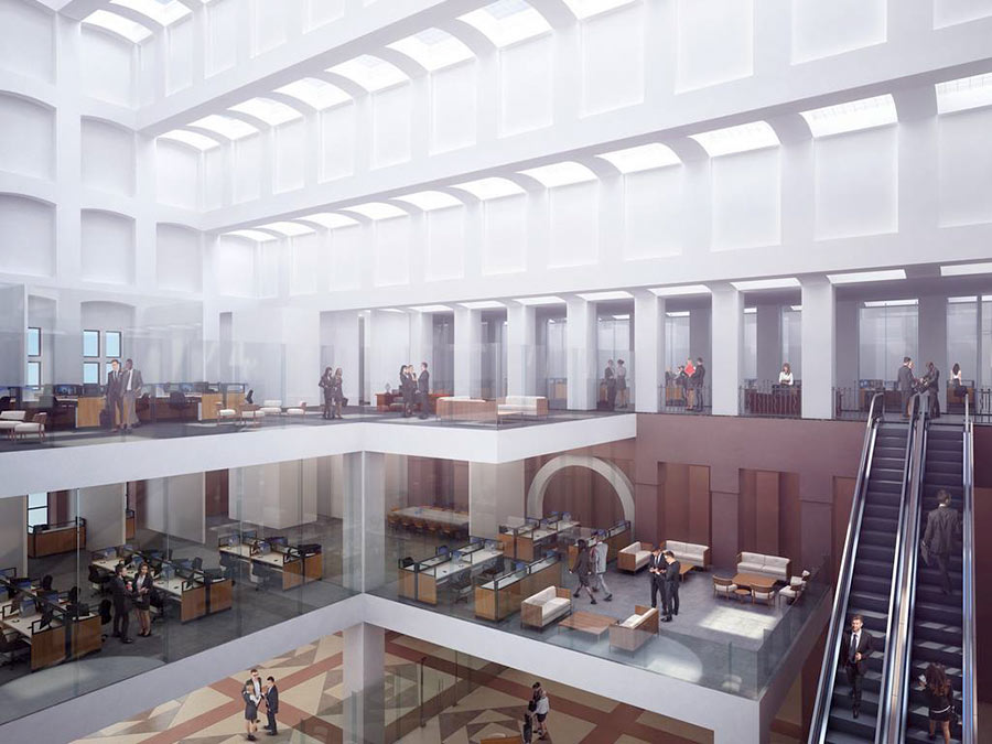
Here’s the view from the new 2nd mezzanine level just above and to the south of the building’s Louisiana St. entrance:
Since their construction, the banking hall and tower have been through 3 name changes: first dubbed RepublicBank Center, they then became NCNB Center, then NationsBank Center, following the successive corporate makeovers of their anchor tenant. Bank of America now plans to move out in 2019.
The renovations are expected to start after Bank of America departs. Before they begin, an earlier phase of construction will metabolize the 2-story Western Union building on the corner of Louisiana and Capitol streets that the Bank of America Center surrounded and swallowed when it was first constructed. In total, the project is set to add 25,000 sq. ft. of space to the building.
New 2-story windows are also planned to open up the bank hall’s southwest facade. Here they are viewed from the corner of Rusk and Louisiana:
- Photos: With anchor tenant exiting, Bank of America Center to undergo massive renovation [HBJ]
- Bank of America Center to bring hidden building to light [Houston Chronicle]
- Previously on Swamplot:Â For Its Next Trick, Bank of America Center Will Completely Digest the Secret Building It Swallowed 35 Years Ago
Renderings: Sydness Architects; Photos: Bank of America Center (banking hall), Russell Hancock via Swamplot Flickr Pool (Bank of America Center)



Anyone heard about renaming the building one BOA moves out?
A space so very big, it might even turn it into an Art Museum-Like MFAH or The Menil.
Why would you redo a Philip Johnson interior that was made for that building. Ugh!!!!! This sucks
Jonathan is right, shoving makeshift mezzanines into a grand banking hall is not the treatment a great architect deserves, I don’t care how much hip glass they have. Similar things were done in the state capitol and many county courthouses in the 50’s-60’s when false ceilings were put in and grand two-story spaces converted to utilitarian one-story spaces. Now mostly undone, thankfully. Fifty years from now these mezzanines will be ripped out and they’ll be restoring Johnson’s hall.
@Jonathan: The reason to modify this open space is to make money. Buildings that aren’t economically viable do not survive. It isn’t enough to have a great architect. A building must also serve a purpose.
I’ll go ahead and disagree with Jonathan and Mike.
Philip Johnson was a racist, an active Nazi apologist, and, by most accounts, an awful human being. Oh, and his buildings are almost universally terrible.
Architecture should serve the people who live and work in buildings, not the egos of the architects who design them. If the current owners of this building believe that adding a mezzanine of usable space serves their purposes, more power to them. Same goes for the proposed changes to the AT&T building in New York, which would be a massive improvement on the current street-level facade of that building.
I happen to work in the Bank of America (currently), and love the design, however, I can agree with Angostura that if a building can’t sustain itself with tenants, it will have to undergo changes. Angostura, your other arguments about Philip Johnson as a person are irrelevant. And, I only hope if you believe what you said that you’re not one of those that think every old house in Houston should be protected as historic.
Angostura – I guess we should have just left all those false ceilings in the state capitol then and not restored it, since the people who built it in the 1880’s were racist. Johnson apologized plenty for getting caught up in the early Nazi movement, but of course the sin of intolerance is the one sin that can never be absolved.
.
Memebag – pretty sure this building makes plenty of money. There’s a difference between making money and compromising the architecture to squeeze every last buck out of it.
My $0.02,
Buildings should work for the people that interact with them, not the other way around. Most of PJ’s buildings are designed to look interesting from far away, or while speeding down a highway, but they do a very poor job of engaging the environment right next to them. (The street level facade of this particular building is horrendous.) This is not a problem unique to PJ, but most of his buildings have this problem. It’s a problem shared by most modern, large-scale buildings. Most great streetscapes are made up of many small parcels, not a few huge ones. Compare this block to, say, the 300 block of Main, and tell me which is more fun to walk along.
.
W/r/t to preservation of single-family housing, my opinion is the same. It should serve the owner, not the other way around. Some make sense to preserve; others make sense to replace. The reason we have such a high opinion of older housing stock is survivorship bias: only the good examples have stuck around. Most of the crappy stuff was demolished long ago. We should in general resist the assumption that anything we build anywhere is the last thing that will be built on that site. Incremental development on small parcels lets cities increase density as needed over time.
@Mike: I have no idea how much money that building makes, or how much would be “plenty”. My guess is the owners aren’t making this change because they are bored. More likely they see it as the best way to utilize the space. Perhaps this will help the building live long enough for some future architect to restore it to its classic 1980s aesthetic. Or maybe all of the tenants will leave because that open space was all that was keeping them there. I don’t really care one way or the other.
Angostura, that last post was a doozy. This is complexity and contradiction that Robert Venturi never dreamed of.
First, there’s that business about Philip Johnson’s buildings, which “do a very poor job of engaging the environment right next to them….It’s a problem shared by most modern, large-scale buildings.”
Well, yes. I agree. But why blame PJ in particular for producing buildings that look like they were built after the first half of the 20th century? That was, after all, when they were built, and the clients who commissioned modern, large-scale buildings demanded a clean, uncluttered appearance at street level. To me, it’s impersonal and sterile, and, like you, I prefer the charming disarray of the northern blocks of Main Street.. As you say, it’s a more pleasant place to walk, and I hope that these buildings are preserved.
So why do you say that when it comes to “preservation of single-family housing, my opinion is the same. It should serve the owner, not the other way around.”? Didn’t you just make the case that buildings should contribute to their surroundings? And wouldn’t you rather walk in one of Houston’s preservation districts than, say, those blocks in Montrose that have been razed and rebuilt with cheek-to-jowl townhomes? This type of development leads to neighborhoods that are just as sterile and impersonal as those featureless downtown streetscapes.
Now, getting back to PJ: at least his banking hall can be changed to incorporate windows that make the building more relatable at street level while respecting the original design. Compare and contrast with the horror which is the redesign of Two Shell Plaza’s street level. Maybe Mr. Johnson should be credited with some foresight.
Big Tex,
Thanks for the thoughtful reply.
My point w/r/t preservation of single family housing is that we should resist the notion that the first thing built on a given site should be the last thing built on a given site. When the original single family homes were built in Montrose or the Heights, 1500 s.f. of house on 6000 s.f. of land was an appropriate density. It’s not anymore. Some blocks of townhouses look better than others, but for a lot of the “preserved” neighborhoods, there’s no point walking in them because there’s nothing close enough to walk to. Usually preservation comes with minimum lot sizes, minimum building lines and FAR caps, which make sure we never get to a walkable density.
Cities can and should develop incrementally, at the densities that are appropriate for the era. This is VERY difficult when you build a block at a time, but it happens naturally when you build on parcels with, say, 25-ft frontage. And it’s not a question of WHETHER homes get built, but WHERE. Remember that every home that’s NOT built inside the loop ends up getting built in Spring or Katy or Cypress, probably with a lot more roads and sewers and parking lots than the equivalent in denser neighborhoods.
@Angostura, regarding “Remember that every home that’s NOT built inside the loop ends up getting built in Spring or Katy or Cypress, probably with a lot more roads and sewers and parking lots than the equivalent in denser neighborhoods.”
.
That’s not how people end up living in the far-flung exurbs like Fulshear and Cypress. People I know who live out there move there for “the schools”, because of a perception of higher crime in the city, and because they get more square footage per dollar.
.
The townhouses, condos, apartments that are being built inside the Loop are increasing density, but don’t address any of the three main reasons that people move to the suburbs in the first place. When a developer pays $600K for a bungalow and replaces it with two $900K townhouses, that doesn’t help anyone except the developer.
.
The people who are willing to pay more to live in a dense urban neighborhood, maybe in a shared building with no yard, possibly near old-time renters in 1940s quadplexes who don’t look like them and aren’t in their economic and/or social class, are a different set of people from the ones who want a sprawling 5000sf house on a half acre in the burbs in a master-planned community with a HOA, with neighbors from the same upper middle class social stratum.