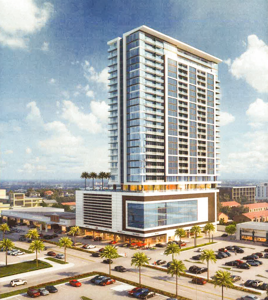
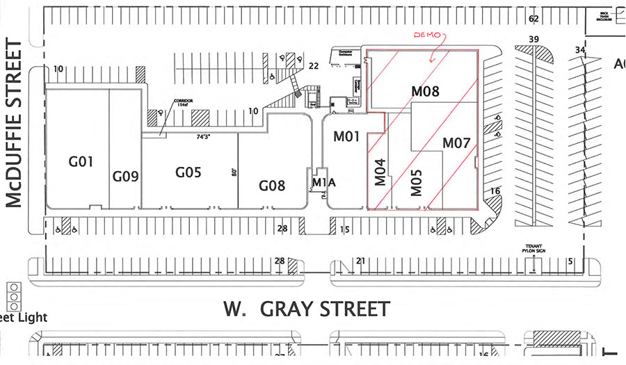
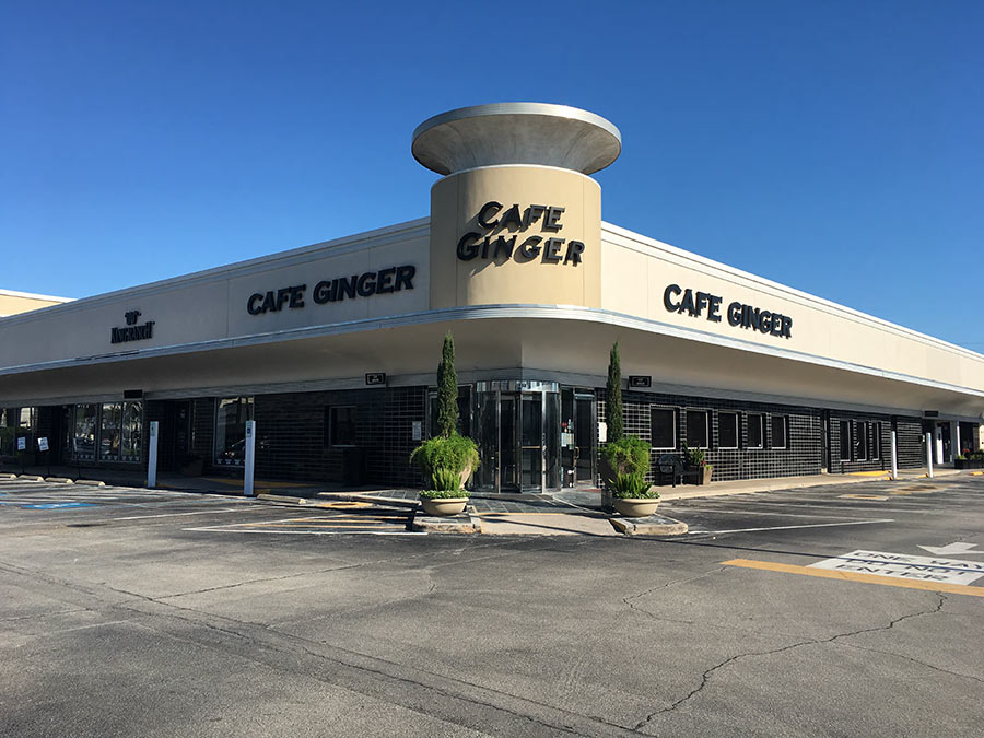
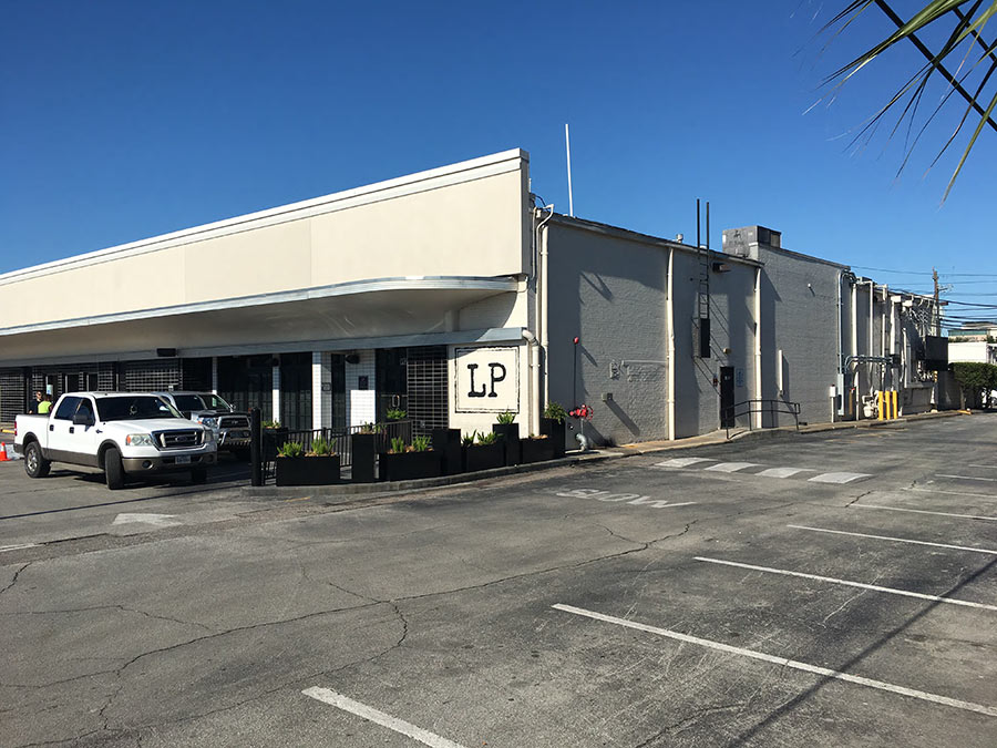
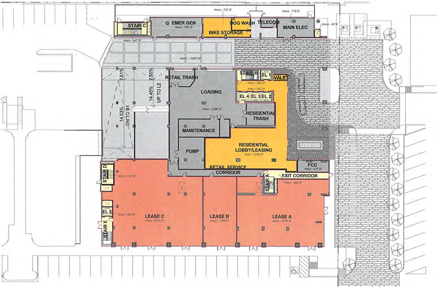
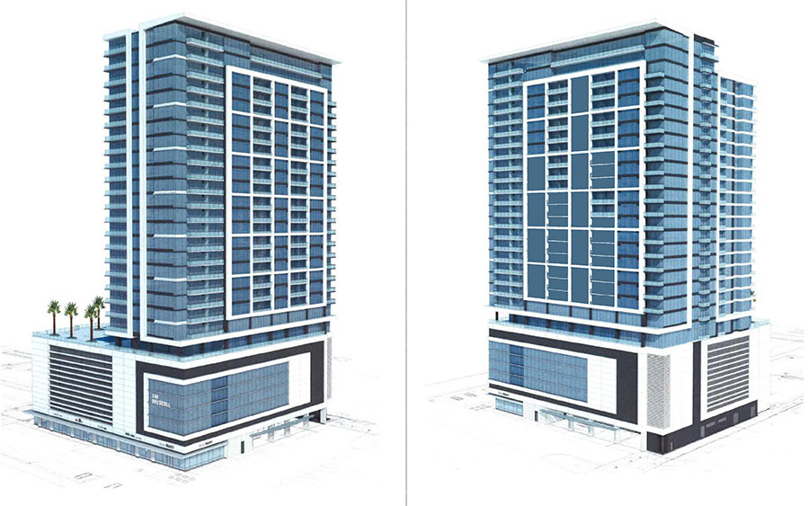
In advance of a public hearing scheduled for this Thursday, Weingarten Realty has submitted these drawings of the 29-story apartment tower it’s calling the Driscoll, and which it’s proposing to build across the from the northern end of Driscoll St. The site at 1958 W. Gray also happens to be occupied currently by the eastern end of the 69-year-old northern portion of the River Oaks Shopping Center, which has city historic landmark status despite the numerous inconsistent alterations Weingarten has made to the Art Deco complex over the years. As suggested by the included diagram above, the tower will knock out most of one wing of the complex, leaving Brasserie 19 in place, but deleting 18,000 sq. ft. of space currently housing Café Ginger, Local Pour, and some office space above — as well as 2-and-a-half bays of parking to the east.
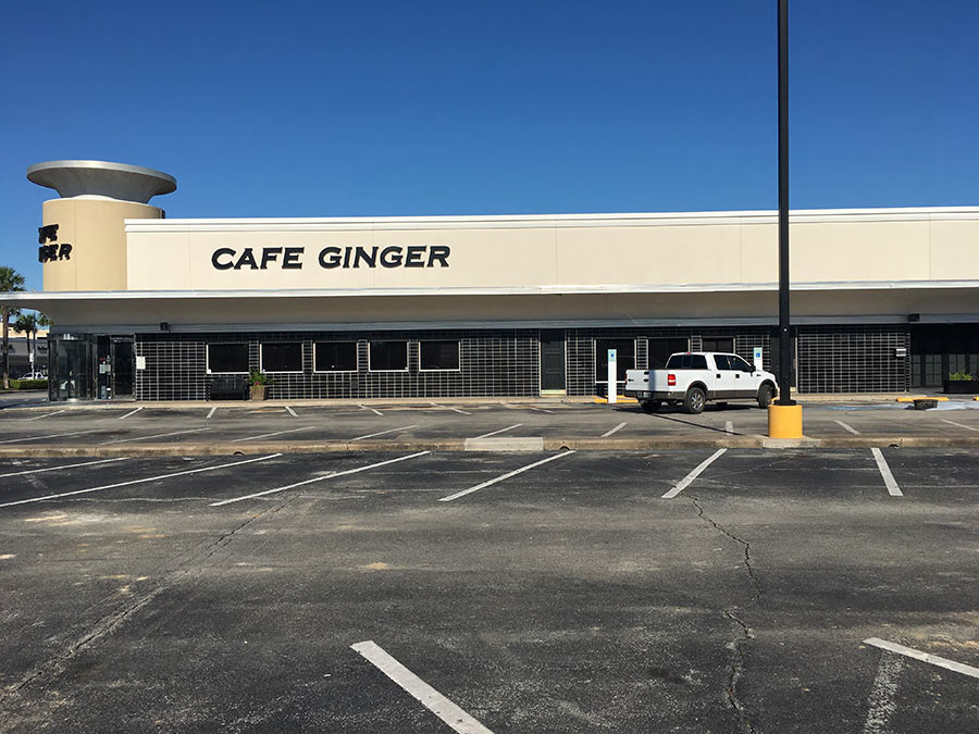
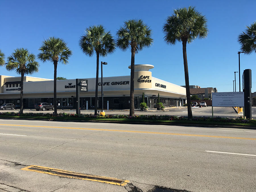
As part of its package for the required hearing before the Houston Archaeological and Historical Commission, Weingarten presented this photographic evidence in support of its claim that its existing property, which it altered significantly during renovations conducted in 2011, is in a “deteriorated state“:
***
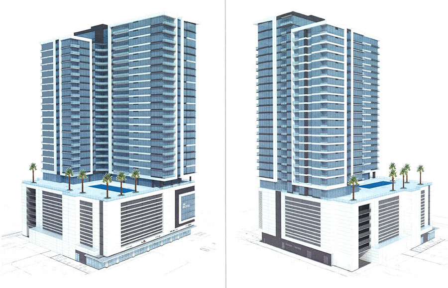
The new tower, designed by Ziegler Cooper Architects, has 11,000 sq. ft. of retail space on its ground level — set back from W. Gray St., like the rest of the center, by a row of parking. More parking would be added on 2 subterranean levels as well as 6 stucco-faced garage levels stacked above it. An “amenity deck” and 21 floors of apartments are shown sitting on top of that deck:
Thursday’s hearing is scheduled for 3 pm in the City Hall Annex at 900 Bagby. Because the shopping center qualifies only as a city landmark but not as a “protected” city landmark, it won’t mean much if the HAHC denies a “certificate of appropriateness” for making the changes. Weingarten could simply wait 90 days and then proceed with any alterations to the existing building it wants.
- Certificate of Appropriateness Application (PDF) [Houston Planning & Development]
- Weingarten Realty moves forward on River Oaks Shopping Center demolition and alterations [Preservation Houston]
- Previously on Swamplot: Where Weingarten Plans To Stab That 30-Story Residential Highrise into the River Oaks Shopping Center; Café Ginger To Move Into Mama Fu’s Place Some Time Before the Highrising Starts; Weingarten Hoping To Improve Classic Taste of Art Deco River Oaks Shopping Center with New Cheese Topping; How To Demolish Houston Landmarks
- River Oaks Shopping Center coverage [Swamplot]
Images: Weingarten Realty (photos); Ziegler Cooper Architects (drawings)



I gotta say, if I was interested in apartment living there would be a lot to like about this location. Walk to Kroger, movie theatre, about a dozen decent restaurants, a book store, three Starbucks’, a secret bar… But that rendering sure does make it look like it will tower over everything else in the area.
It’s death by a thousand cuts. How hard would it be to incorporate the existing deco design elements into the new facade? Or make even the smallest gesture to the existing design. Instead, they’ve dropped a completely generic apartment tower into the space. Where other shopping centers strive to create a statement with fake gables and turrets, Weingarten has (or had) a unique design and seem willing to rip it away piece by piece. It makes no sense.
@ Darryl Morrison: They’re leaving the setbacks and parking layout about the same as the existing structures and will re-build the three front retail spaces, while leaving an attached space (indicated as M01 in one of the drawings) unchanged. That’s a pretty substantial “gesture to the existing design”, and its one that they didn’t have to do.
Looks great! I disagree that art deco is worthy of protection that extends beyond the normal economic life of a building. It’s a neat style but nothing that qualifies as historic in my opinion.
That’s pretty fugly
I understand the preservationists attitude towards the strip mall, especially for a city like Houston. things do need to change though, if Houston wants to become a true world-class city. Nothing can stay the say, especially when considering its location.
I like the building…. however they should have considered destroying the Kroger building and pushing the high-rise up to the street with a ground level Kroger, retail, and a parking garage. In fact with that much space they could build two high rises. I am assuming the Kroger is not original to ROSC?
There’s no reason why a huge project like this should subtract ground floor retail space instead of adding to it. Plus, Cafe Ginger is the only Asian restaurant in the shopping center, and Local Pour is one of only two bars. If they do this, the city should require them to a) style the ground floor appropriately to match the rest of the center, b) include as much retail space as was originally there, and c) cut deals with the owners to bring back the restaurant and bar once the high rise is complete.
Houston has so little beautiful Art Deco architecture and it’s a travesty what Weingarten has done to the River Oaks Shopping Center. It’s absurd to say Art Deco isn’t historic and that this building is a gesture to the style of this building. It’s a bland lazy design. Typical Weingarten.
Sadly, this is exactly the kind of dreck invading Chicago at a record pace. Every new residential building has a huge parking podium and a poorly detailed curtain wall with large bands of materials and vent louvres. Developers think they’re doing a great design service by hiding the even uglier parking decks. Besides community input and approval, what’s really sad is the one thing missing from these developments: real trees and landscaping. Palm trees are not coverage.
To Robert – I agree about the parking podium issue considering Chicago. It adds a horrible blank wall that is sterile. It is even worse when they add faux windows to emulate building floors. However, with Houston’s porous soil and close proximity to a flood plan/bayou, there really isn’t any other option, right? Underground parking just isn’t feasible.
There is no clear area for a “behind the scenes” parking garage (which are a waste of space IMO). As long as there is retail at the base and a parking podium that is cleverly designed to support the height of apartments above, what is this issue? I say create a setback so it isn’t as viewable from walking level and consider wall greenery break up the blank wall. Perhaps consider creating roof terraces that restaurants can utilize on the 2nd/3rd floor?
To Jonathan – agreed on the art deco style. Miami has preserved tons of art deco buildings for the sake of history. Also, I love the feeling that ROSC evokes based on its art deco feel and complete absence of Mediterranean or bland Texas-stucco commercial look (sans the B&N side). However, I think adding to this shopping center is a great move because it adds to the vitality of the area. Would you prefer they keep the strip as is and move all development to the strip mall that houses Marshall’s? This could potentially take existing retailers away and create gaps in ROSC’s existence.
Sometimes you just have to evolve with the times. It is like an 1890s 10-story skyscraper keeping its facade to house a 50 story glass highrise.
It’s not a bad building. And the general area makes a ton of sense for new apartments; lots of older strip malls and some big box stores are just waiting to be redeveloped. Bricks and mortar retail is suffering a long death; but people want new, high density urban living, within walkable distance to restaurants and entertainment –
And this is the place to do it.
.
All of that said, I question why the one historic shopping center in the area has to be targeted for new apartments. Why not go a little further East, buy out River Oaks Plaza (which has no architectural or historic value) and do something bigger there: a whole midrise/highrise mixed use development with an internal street and a parking garage – sort of a mini City Center?
I like how they have already planned on knocking down the men’s warehouse block.
Because ZAW, ‘everyone” knows City Center won’t work.
The reason they are building this here instead of down the street is that they already own the land and this is a better use of such valuable land. Eventually I’m sure they’ll add several more of these, replacing most of the old art deco buildings. They have a responsibility to their shareholders first. Yes, it’s sad, but it’s reality.
@ZAW..Why not go a little further East, buy out River Oaks Plaza (which has no architectural or historic value) and do something bigger there: a whole midrise/highrise mixed use development with an internal street and a parking garage – sort of a mini City Center?
.
Allen House empty land with a similar, decade-old vision says hello.
There are a lot of developer apologists* on this website.
The building design is generic pablum and the location is just wrong. Piecemeal destruction of a harmonious and fine shopping center. SAD !!!
*Look it up.
“Why can’t they just move it over a little bit?”
.
If they’re to the point where they’ve got detailed renderings out and they’ve got political consultants working on entitlements, then they may well have put a half million dollars into this project so far already. That’s a sunk cost, yes, but it is one that they would have to incur again if they just picked up and moved it over.
.
Also, in this case, Weingarten has owned this land for so long that they might as well have a zero-cost-basis for its acquisition. If they’re in it for the revenue stream and they can contribute the land to a new project without being taxed on its sale, that might tilt the economics of this site so that they’re more favorable than other sites that Weingarten does not already own.
RE River Oaks Plaza, with the overall lack of investment and boring retail mix you can’t help but feel that it’s owners are just in it as a land play at this point. You know whatever they’re asking it’s going to be well above market rate and top dollar.
.
I would think it’d take an outside group with some really big plans and a ton of money to buy them out rather than a long-standing owner of large tracts down the street whom could easily re-invest in their own tracts.
Everyone is up in arms over this. However, I love the organic evolution of the plaza. Beats the sterile feel of City Centre and River Oaks District. True character comes from evolution. This area has more complex character than then new “mixed-use” developments. As long as the River Oak Theater is intact, this area will always have a special, unique atmosphere that the newer developments will never have.
Anyone who says walkability to the grocery store is a perk has never been had no car and needed to grocery shop.
@qqq Anybody who doesn’t think walkability is a perk has never tried to park their car at the Montrose HEB on the weekend.
Yeah, that a pretty lame design. Shame about the piecemeal destruction of a mostly decent strip mall.
At least they put the pool on the sunnier side of the building.