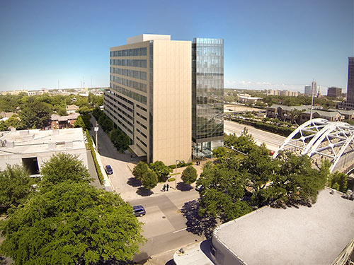
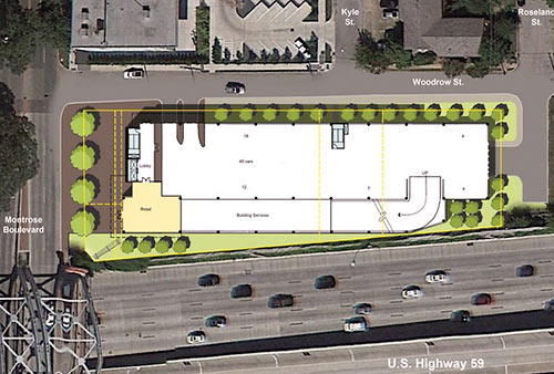
Here are a few views of the 11-story spec office building planned for the north side of the Montrose Blvd. bridge over the Southwest Fwy., across the street from Kam’s Fine Chinese Cuisine. And yes, it appears developers Griffin Partners really do intend to call the inside-the-Loop project Bridgeview Crossing. The design by Kirksey Architecture includes a single 1,500-sq.-ft. retail space facing Montrose, but the rest of the building at 4503 Montrose Blvd. is all business: 5 floors of office space sitting on top of a 6-level parking garage.
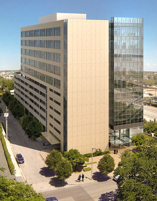
The design’s surface treatments, however, play down that simple offices-over-cars division, presenting instead a glassy-and-griddy front to Hwy. 59 on the south:
***
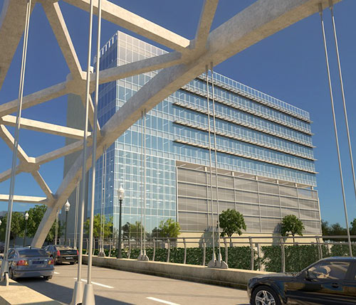
. . . and a more solid face to the north — though on this side the up-down split is a little more obvious.
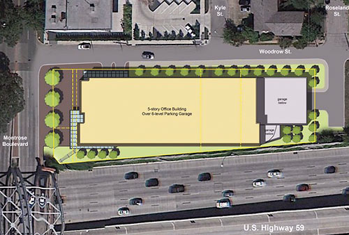
The development extends from Montrose Blvd. to Roseland St. A brick building dating from 1920 is currently on the western portion of the site.
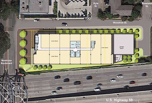
A previous design for an office building on this spot, by Muñoz + Albin for the Midway Companies 4 years ago, included 4,000 sq. ft. of space for galleries on the second floor, matching the gallery building at 4411 Montrose Blvd. immediately to the north.
- Exclusive: New spec office building slated for Montrose [Houston Business Journal]
- Bridgeview Crossing [LoopNet]
- Bridgeview Crossing (Formerly M Fifty Nine) [HAIF]
- Previously on Swamplot: A New Gallery-Ready Office Tower at Montrose and 59
Rendering: Kirksey Architecture/Griffin Partners


I love the design and the great use of space. It does look more like a suburban office building but hey we obviously can’t stop it so let’s embrace it best way possible!
Welcome to Houston, where we present the prettier side of the building to the freeway and give the shaft to a main artery of one of the more walkable parts of town. That is, pedestrians are presented a blank wall that conceals an elevator shaft.
I think having an all-glass facade facing the western sun would be energy inefficient. On the east side, the sun would be less intense and even pleasant for the tenants.
Remember when people said there was not enough density along and around Richmond to support light rail?
Yeah… about that…
I would love if they would instead build this thing OVER the freeway instead of right next to it–some cities have capped freeways and built on top of the caps to knit back together neighborhoods which are split by an interstate. Of course I’m sure that kind of development would be more expensive and would require the DoT funding a cap to build on, which is unlikely.
The article says there is retail fronting Montrose so why don’t we see it in the rendering?
Any renderings on the lighting project of those bridges over the freeway that the Montrose District is working on?
@ JM: The retail in the rendering is obscured by trees. It is indicated in the floorplan and has a front entrance to the street and a side entrance directly to the building’s lobby.
I am also a bit critical of that monolithic wall along Montrose. Hopefully the building’s management will see it as an opportunity, sort of like a blank canvas. But…my money would be on signage for naming rights.
This looks very spec. It reminds me of all those rote glass box’s they threw up at a fever pitch in the 80’s. I hope the city doesn’t get covered with these things again like in the 80’s. This building is the definition of mediocre. Full of ambulance chasing lawyers and nefarious brokers. Some things in Houston never change.
Good question, JM, and good point Derek. At the very least they should show some mural or pop art thing on that blank wall. Liven it up, and make it in keeping with the character of Montrose (gay, offbeat, artsy). This building looks like it could just as easily front on Post Oak Boulevard.
I think a giant gay rainbow slapped on a boring wall would be a perfect symbol for Montrose today.
This building is the definition of mediocre. Full of ambulance chasing lawyers and nefarious brokers. Some things in Houston never change.
____________________
I didn’t realize that there were particular professions that sought out mediocre spec buildings. Learn something new every day!
Wow. I didn’t see the retail down there either. Something tells me that’ll go away in the final design. If retail is hidden like that, what’s the point? It’ll be hard to find tenants because it’ll be hard for patrons to find it…. Unless it’s just a cafe intended for people who work in the building….
They should get in talks with a popular food truck (or three) and provide a permanent space for food trucks in front of that blank wall you guys are talking about. It’s a good high traffic spot for a food truck anyway, but especially for the lunch rush from people working in the office building.
Something else to block the views from the apartments on the lower floors of 5000 Montrose.
@Shannon- Just curious but, what noble, altruistic and respectable business are you in?
Montrose was gay, offbeat and artsy. Sadly, it’s just yuppy, mainstream and bland nowadays. The building should fit right in.
OMFG – first-floor retail….cover your boners, Swamplotters!
Seriously–what kind of lone retailer will occupy that space? A copy shop? A mini mart for the building? A Credit Union? What is the point–no one ambling down the street is going to find anything of interest in a spot like that.
Besides, with the parking in a garage and the entrance through the lobby and next to the bridge, it is hardly an inviting space. Talk about a boner crusher…….And what is this obsession with pale blue glass? It has become as ubiquitous as sprayed on stucco.
Prehaps I’ve just been in too many of these buildings and seen row after row of lawyers and financial agency’s that seem to disappear the next time you’re in the building, like a noxious vapor. @I.P. Freely –very funny
a mural on that mofo would replace the one lost on teh houston club building
Another bland, boring,vapid, lame building designed by architects for a suburban mindset. Nothing outstanding to scare those boring safe loan committees at the banks. Gotta please the gray suit squares !!! How totally gross and a waste of a good opportunity to design/build something out standing. But no- they gotta toe the line in Houston. YAWN !!!!
I don’t understand how people say this is one of the most walkable areas in the city, while at the same time claiming that a restaurant would certainly fail at this location. I agree it’s a dull building, but there is a dull building right across the street with a chinese place that does well, and plenty of places next to and across from Zimm’s. And the other side of the freeway has several restaurants and bars, and the Chelsea is going up over there as well. Do I think Forever 21 will work there, no. But I would not be so dismissive of something like a restaurant working here. Most of the restaurants in the city are in boring strip malls or buildings next to busy roads.
Read carefully: it’s 1500-s.f. of retail. That means a deli for the office worker to get lunch, not a destination.
Come on, people. This is a pretty building that will improve the freewayscape. And yeah, it’ll probably be filled with lawyers, mortage brokers and insurance agencies. Tramp stamps, tit tats, cock rings and dime bags ain’t sold round there no more.
Even if the area isn’t a poor gay slum any more (not that gay neighborhoods ever were slums – they were always much safer than most slums) why does the building have to be bland and boring? Honestly, this part of Montrose is practically in the Museum District – which means rich, but artsy and avant garde. (And when you think about it, what is “avant garde” but “offbeat, when it’s been noticed by art critics?”).
The developer should be commissioning the artist to cover that tall blank wall with something fantastic right now. If the developer doesn’t have a clue regarding how to do that, I am sure a call to Houston Arts Alliance can put them on the right track. Swamploters should pick up the battle flag for “no more blank, uninteresting walls”. They can carry it into battle right there beside the “ground floor retail” banner!
ZAW, Montrose has never had a reputation as an especially safe neighborhood. The last time that I ran comprehensive crime stats was maybe eight years ago, but Montrose was pretty far up there for violent crime and especially rape. It scored poorly for thefts and robbery, too, and there were a number of adjustments one could make to the data where Montrose stuck out on the map like a sore thumb. If Montrose was any safer than other slums, it may have had to do with reporting bias…but I’ll just say this, that I always felt safer as a UH student parking off of Scott Street or as an Eastwood resident than I did when I lived off of Montrose and Bissonnett.
The perceived blandness of modern office buildings has nothing to do with the lack of vision or enthusiasm of developers, it has to do with where the money comes from today. Decades ago there were eccentric millionaires and corporations with money to burn on monuments of their own egos, but these days money only comes from carefully calculated, vetted, reexamined, audited, and risk assessed finance packages. Throw in a healthy dose of anti-wealth and anti-corporate profit sentiment in the US and you have the real estate equivalent of a Toyota Camry… simple, functional, non-offensive, and very forgettable.
ZAW didn’t say it was safe, he said it was safer than say Compton or Detroit. I don’t recall too many drive by murdees or gang rapes in Montrose. I can assure you I feel safer in Montrose than around Texas Southern.
to speak in the contrary, there’s probably lots of blue-minded folks such as myself that would much rather than see a blank wall rather than whatever offensively bland and generic mural could be agreed upon with all parties and commissioned at this site. there’s a reason you don’t see many museums or buildings covering up their walls. there’s a way to do it right but many ways in which you shouldn’t even bother. when did a blank wall become so offensive?
looks like a great use of space for the area though and I’d agree that the montrose needs more boutique office space in much higher density such as this as opposed to all the little independent buildings that have popped up.
I’d like to see some commenters actually come up with an interesting design. All I hear is a bunch of complaining from the masses. The building looks fine to me. Not memorable, but not horrible either. I don’t find this part of Montrose to be that walkable. I drive by this stretch every day and there are rarely pedestrians out around here or Chelsea Market just over the freeway. Whenever the new residential tower comes up on the other side of the 59, perhaps you’ll get a few more people looking for food in this neighborhood. Most people tend to drive to Nelore, Kam’s, etc.
@ joel: I don’t disagree that there’s demand for office space right here or that a large building is warranted. I wouldn’t ordinarily disagree with you about it being okay to just leave a blank wall being blank. It’s just that this building is in such a good location and yet is so uninspired that it seems to demand some sort of nod to its environs and the blank wall is the only place that such a thing could be tastefully installed.
The developer should be benchmarking to The Campanile, which sort of defines this little office submarket and that has historically done very good business and weathered Houston’s ups and downs gracefully. But it caters to a certain kind of office tenant that is willing to pay a premium for a tastefully developed and managed office space. The developer needs to understand that although a building like this might be perfectly acceptable to an engineering firm or an energy company, that’s precisely the sort of tenant that is least likely to appreciate the reason that this site is a premium site; and in fact a user like that might even discount the site due to it not being right off of a freeway ramp. They need to go after boutique architecture firms, law offices, non-profit foundations, wealth management firms, other real estate developers, that sort of tenant. This building such as it is won’t appeal to any of those users.
Regarding the blank wall…why not split the baby? The developer can leave the wall blank (cheapest), while offering it as a canvas to various art groups for (light/image) projection installations (fits with character of area). Sounds like a win/win to me.
The developer will of course do none of your suggestions. It is what it is and I suppose it’s better that what resides there currently.
And another old Montrose mansion, currently sitting on that site, will bite the dust! Sad!