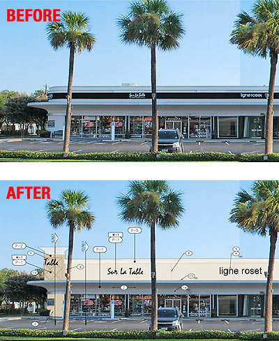
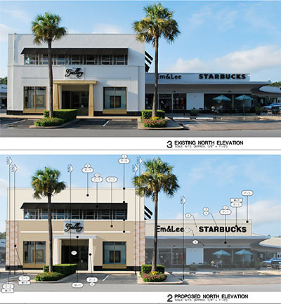
C’mon, we all know what the problem’s been with the old Art Deco River Oaks Shopping Center on West Gray, just east of Shepherd: The place was too black-and-white, the signs were too damn small, and it didn’t have enough turrets. Hey, nothing a little forehead lift and a generous slathering of EIFS can’t fix! Got some can’t-sell brick up there? Time for a little arch-ee-textural adjustment! It’ll look just like stucco — with all those control joints you love, plus they’ll be painting the new glop a nice Pearland-y mustard color. All that and a new wash of beige paint over the rest of the place should make folks driving in from newer suburbs feel more at home when they visit — and may have the added bonus of attracting a few of those nail salons and check-cashing outlets the place has been so sorely missing.
***
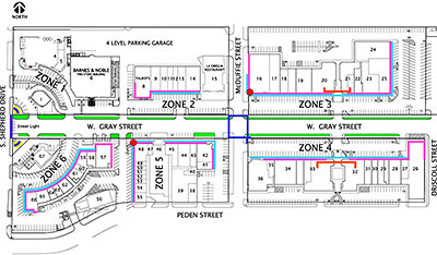

A few more before-and-after images:
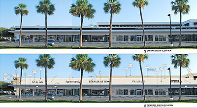
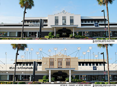
If you just loved the new Barnes and Noble and the sorta-curved enclosed-patio building where Américas went in that Weingarten built after tearing down the 70-year-old northwest section of the center in 2007, you’ll absolutely like these changes, because they dress up grandma to look just like her grandson, Rocco — in the strip-center clothing everyone’s wearing these days. Hey — haven’t I seen those sandstone tiles somewhere before?
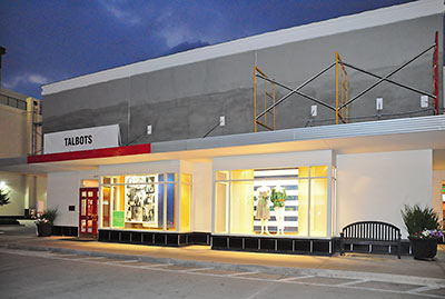
Plus, just for the OMG value, it looks like these overhangs may be getting a delicate smear of don’t-park-here-red lipstick:
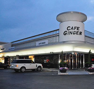
Luscious! The design and preservation snobs that Weingarten’s had so much fun making cringe over the last few years with various small and bizarre changes to the center (like knocking out those pesky black clay tiles from the various portions of the streetfront, and adding that gee-whiz turret overhang on top of what’s now Cafe Ginger) will soon be much relieved: Because the new stuccover promises to make those earlier changes look much more delicate and sensitive. Now, let turrets loom over every corner!
It’s all going up now.
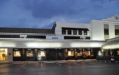
On the shopping center’s website, Weingarten touts the “Certificate of Appropriateness” its makeover received “from the Houston Planning Department, following a review by the Houston Archeological and Historical Commission (HAHC).” Technically, that’s correct. The HAHC actually rejected Weingarten’s application in October, noting that the proposed alterations destroyed the center’s low-slung look, tacked on art moderne-ish elements to the Art Deco-style buildings, and were generally out of scale with the original. But the city’s revised preservation ordinance still requires that a certificate to proceed with changes to or demolitions of designated historic buildings be handed over anyway — if the applicant simply waits 90 days. And Weingarten’s waited almost twice that long already!
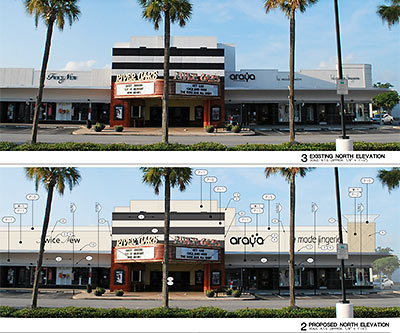
Sadly, the construction will only barely alter the River Oaks Theater — doing so might have caused some people to get upset. But getting rid of the Art Deco look on everything else around it should make it much less of a big deal to knock down the south side of the center and rebuild it with . . . say, a more appropriate Tuscan-style parking garage.
- About the Center [River Oaks Shopping Center]
- River Oaks Shopping Center coverage [Swamplot]
Images: Weingarten Realty; Photos: Candace Garcia



they truly are out of touch with their customers…
I just threw up all over my desk.
I think this is an appropriate occasion for rageguy.jpg.
mmm…love EFIS and beige!
Art Deco was SO 1920’s!!!
It was fine in its original form:
http://www.houstondeco.org/1930s/art/rosc/rosc1a.jpg
The good folks at Weingarten’s are so clueless.
And they make me cry. Alot.
Im hoping for a 4th Starbucks too.
“I just threw up all over my desk.”
Aaagh, me too!
Faux Tuscan-izing the RO Shopping Center–what a crying shame.
And anything called the Houston “Archeological and Historical Commission” qualifies as an oxymoron.
Love the photo, Texmex01.
“Stuccover:” what a great new term!
Does anyone on this site even own property?
No building is safe from the Beige EIFS Scourge as it continues its inexorable campaign to destroy all that is unique and beautiful about our beloved city.
Benjy is right…why don’t we just cover the whole city with synthetic stucco and turn it into one big generic Faux Tuscan surburban strip mall…
This reminds me of the “Cat Woman” who is addicted to plastic surgery. “I just can’t stop for some reason. Yes, I know I look strange, but I keep doing it despite knowing better.” Weingarten, go eff yourself.
Woah, am I in Houston? With all this beige stucco I could have sworn I was in southern Italy, sipping a Frappuchino. You probably haven’t had one, it is a local thing. You can get them at this small cafe called Starbucks, you’ve probably never heard of it. It is distinctly Italian.
What? Exhaust from a River Oaks SUV? Why no, that is merely the breeze coming in from the Mediterranean.
Why would I need to appreciate Houston for what it is, when clearly I can pretend that I am somewhere else? Local pride? Houston, its worth it? I thought that place only had oil companies and cowboys. Who would ever want to enjoy its history and architecture?
EIFS is an automatic risk rejection or non-renewal for more than one insurance company. Good luck with shopping that particular policy! There are unregulated companies that will do so for higher premiums. And if that becomes the case the non-savings, dear consumers, will be passed on to you.
This makes me so sad. Stuccover :(
I didn’t go to b-school or anything, but this seems like a giant waste of money. Also, it is DISGUSTING. IT IS DISGUSTING.
Really, 18 comments in 1 hour, is this really that interesting of a story? :)
Oy Vey!
The Weingarten family is still punishing Houston for sending Lea Fastow to jail.
Why stop at the faux-ification of the building facias? Take all the palm trees down and replace them with faux plastic ones. Let’s make it as cheap and tacky looking as possible! Cheap and tacky is an acceptable design scheme, right?
In my opinion, Weingarten is one of the worst things to happen in Houston real estate since they gave up grocery stores and started systematically destroying the fiber of anything and everything historic in Houston they gain ownership. Classic is a term they know nothing about…it’s a wonder they aren’t painting it a shade of a greenback. They are indeed the owners of the property but have little to no social responsibility to the greater community sense of place. They will be remembered for what they continue to destroy not for what they build. A shame.
they’ve lost their damn minds.
j,
How is Weingarten out of touch with their customers? Although the Art Deco style on the building is nice, I doubt people shop there because of it.
Also, the Art Deco stylings on these buildings were the Faux Tuscan at the time.
this is my first time to comment, although i am a daily reader of swamplot. but this also made me almost throw up on my desk. sure, art deco was the stucco of the 1920s, but there was just something cool about the RO shopping Center, compared to all the other bland centers outside the loop that use the beige stucco as a building requirement. I always thought the black and white contrast of the buildings was very classic and although the center is old, it didn’t look dated to me. Are they going to also remodel Kroger to look like all the other Krogers in the burbs?
“Also, the Art Deco stylings on these buildings were the Faux Tuscan at the time.”
Um, are you actually trying to equate Faux Tuscan with Art Deco? I very much doubt that “Faux Tuscan” will be around in 72 years, much less considered one of the great major architectural styles of this century. Do you think that Faux Tuscan will last as long as the Art Deco movement did? Nooo, this ridiculous “style” will look like total crap in a year or two (it already does now)
im with JMK… i do not believe any posters on this site own property or possibly live close to inside the loop. Yeah. Weingarten are such FAILURES this’ll ruin them for SURE! not. How awful they are for trying to keep their properties current and fresh. shame shame. keep it dated looking and let it slowly run down, that would be much better! WHY, by the way, is this article’s author so BITTTTTER about this? and you know what, they left the precious RO theater alone because of all the squawking….can you not be positive about that? This is SO sad. Moaners and Groaners…i know…you hate it so much don’t go there. don’t shop there. you show em! I’m sure they will all fold and come running to the likes of you for advice of how it should really be done.
If you don’t like it, buy the shopping center and decorate it any way you want. In the mean time all the whining from faux-architects is funny.
So, making it look like any of the innumerable beige, stucco/EIFS-clad shopping centers already in existence throughout the area equals “trying to keep their properties current and fresh?”
JRo,
When Art Deco was in style is was just like today’s Faux Tuscan. It was bland and on everything. And your prediction that the Faux Tuscan won’t last could have also been made for the Art Deco. Most Art Deco structures is gone and was destroyed long before anybody thought is was historic or classic.
Think, in 70 years you’ll have emotional people crying over Faux Tuscan homes and shopping centers being torn down.
kjb434,
I couldn’t disagree with you more about Art Deco being bland and ubiquitous, but to each his own. Sadly, unless the average life expectancy increases very dramatically, I won’t be around in 70 years to see folks crying over Faux Tuscan being torn down, but then again, Faux Tuscan won’t be around either…
I’m going to start patronizing the re-art decoized strip center on San Felipe to show these ass hats that design matters!!!
If Weigarten’s is so concerned about what is currently considered “fresh” to the exclusion of all else, they had best have Barnes & Noble throw out the Dickens, Tolstoy, Fitzgerald, etc. and fill all the floors with nothing but teen vampire novels.
Hellsing….right. Cuz Weingarten owns the bookstore??? and their inventory? that was such a clever comment. you should head over to San Felipe with Bama Luke…you guys will crush em!
If there was no appreciation for what was everyday in the past but rare and unique nowadays, wouldn’t Turner Classic Movies be the Lindsay Lohan Channel instead? As my late father was an architect major in college, he had a plethora of books from the 40’s & 50’s I’ve enjoyed reading. I don’t recall offhand any ridiculing Art Deco or Art Moderne the way faux Tuscan is now in its heyday. It’s rather like the polyester leisure suit of construction; sold and snickered over at the same time.
LudiKris, should I send you a definition of “sarcasm” or just type slower next time? And capital letters are our friends.
I personally appreciate ALL types of architecture, but i also believe strongly in the right to do with the things you bought and paid for as you please. If individuals feel strongly about preserving particular things be them buildings or anything…then they should figure out a way to buy and preserve them. It is not theirs to say what another does with their personal property. In this case, I am sure Weingarten would sell you the property if you throw enough money at them. Further, Weingarten surely is not throwing money at updating the facades for no good reason other that to annoy people, my guess is it has something to do with long range reducing the cost and time involved in maintenance, repairs, etc. I could be wrong.
An aesthetic felony. Who could be so tasteless as to think this is a good idea?
No, I was serious.
I also stopped patronizing The Men’s Club after its Stuccover last year. Sometimes you’ve got to make a stand people!
I like the art deco look of this center, its the main thing that sets it apart from other shopping centers. This seems like revamping a structure for no good reason other than “hey i was revamped”. Seems like a waste of money. Making the store names bigger does seem like a legitimate upgrade.
just can’t think of anything sarcastic to say about this. Ick.
Those Weingarten people just have NO taste. It is a garish and pedestrian design. I almost expect to see shoppers walking out with their items in those trash bags they give you at the grocers. This remodel screams RELAXED FIT and I for one will no longer frequent it when completed!
Once again, a large group of people are getting their “feelings” hurt over something they don’t control. The people that would not shop here anymore because of the change would just be a handful and the upgrades will likely get more stores to move in that draw in people.
Knowing some of the managers at the Gap at that location, they said their conversion rates have gone up since the completion of the B&N and the additional parking. Keep in mind this Gap store is one of the lowest performers in Houston. It’s sales have been on the downtrend for the last couple of years.
The new covering on the center will allow larger signs which is very important to many of the larger tenants part of national or regional chains.
Restoring buildings is great, but reality often has to rear it’s head.
You are correct, LudiKris – the property owner has rights to said property. However, to expect no sentimental resistance to altering a community landmark so unique is a bit unrealistic. There are no more like this in the city. Before the tear-downs and alterations, it was one of two unadulterated Deco centers of its scope in the country. There are no more; there will be no more like it. Was Frank Buckles, the last living US WWI vet, personally known to everyone who mourned his passing? Doubtful. But I looked long and hard at my grandfather’s framed commendation signed by Woodrow Wilson when I got home that evening. It’s exquisite; a B/W etching of Columbia knighting the kneeling soldier. Reframed yes, but never retouched. Age and wear are not necessarily unaesthetic.
If you own your own dog, why not just surgically implant some cat ears on it? Or put a shark fin on the back? Why not put a huge pickup bed on the rear of your Lincoln Continental, if you own it, do what you want.Take your 1956 Classic T-bird and put in some AMC Gremlin side panels. Just do whatever you want with what you own. Just put a swimming pool in your front yard. Like Mink Coats? Like Fox Fur hats? Wear them together in the summer time. You own it, why not? Like Charlie Perfume? Like White Diamonds perfume? Why not mix them up and wear them at the same time, you own them after all.
You can’t explain taste to people that don’t have any.
This news will make admiring Westminster Abbey tomorrow morning all the more enjoyable.
First all, Art Deco was not the predominate building style of its day. It was contemporary
and a change from the brick, Alamoesque type of
buildings that can be found on Washington and in parts of Midtown. It was quite vanguard–Tuscan revisited is not vanguard–it is a regurgitation of any existing style. Why do you think there are so few examples of the style–even before half of it was bulldozed?
Notwithstanding kjb34’s non empirical anecdotes,The Gap store at RO sucks and always has. Now, the men’s department is next to nothing. The store lost its edge a number of years ago. As for the rest of his comments, I don’t even have the energy to refute–only to say
stick with your wastewater contracts and rah rahs for Wal-Mart.
Of course, I too am disgusted with this absurd renovation because this rare Texas example of Deco architecture gets “dumbed down” to that of yet another hackneyed suburban strip center.
Haven’t we already proved that developers in this city have no vision let alone taste? This is just the crowning blow.
BTW, I wasn’t joking about the insurance aspect. I would advise someone at WRI to have their agent check and check again with the carrier if they plan on using EFIS. You matter to your local AGENT. If the company that produces the paper sees what they consider an increase in hazard on a risk, it doesn’t matter who you think you are or how much money you have – they have plenty of other agents writing lower-risk buildings that earn them just as much premium. Carriers/companies tell agents what they can and cannot do, not the reverse.
Interesting that no matter how many people howl with disgust at what some developers do in this city; the EXACT same very few individuals always come to their defense – no matter what. Seems a bit suspect.
.
Sadly, seems not a week goes by lately without another developer or big property owner (that would be you MD Anderson) doing the best they can to marginalize and literally destroy anything and everything that is remotely architecturally unique to Houston. I still think the “leaders” at Weingarten are dumbasses. How can you NOT be able to figure out a way to capitalize on your ownership of some of the most beloved buildings(RO Center, Alabama Theater,etc) in Houston, instead of destroying them? Because you’re a dumbass.
.
I suppose they are making the protectors of property rights ecstatic, afterall the only legitimate reason to tell someone what to do with their property is when you tell them to vacate it for the next freeway expanasion; making the suburbanites thrilled that all of Houston will soon look familiar; and the lazy and obese that they can see signs better from their SUVs.
Funny, I’ve never, in 25 years, heard a single person say, “Damn, the store signs at River Oaks Center are too small, and I hate shopping there because the buildings aren’t beige with styrofoam crown molding”
Weingarten continues to suck. (Is this more disastrous work from Heights Venture)
JT, kjb34 always spouts a mouthful defending this type of idiocy. It’s usually nonsense.
I really do think the Art Deco look encourages more business. People come into the city to do things they can’t do in the suburbs. Granted, much of it is pretention (“I bought the new Harry Potter at the River Oaks Barnes and Noble”{and we can picture the shopping center in our heads}). But regardless of the motivation, I think the Art Deco look makes the shopping center worth driving to for some shoppers. I would think refacing the center to look like every other center in Houston is a bad decision. Art Deco = River Oaks Shopping Center.
KJB… is right, we do have our feelings hurt by this remodel, but more importantly we have our EYES hurt by this remodel.
It’s called progress. Deal with it.
i’ll be impartial on this as it’s abviously a disgrace, but it’s also practical and beneficial to the businesses that pay the rent to keep the place going. this could very well have been initiated by the businesses that reside there just as much as being another one of weingarten brilliant ideas.
if you don’t like it, best to start patronizing all your favorite shops that reside there and let them know how any modifications will negatively impact the sentimental value of the shopping district along with the money that flows freely from your wallet.
Making something worse than it already is does not qualify as progress.
I do own property inside the loop, and I hate this change. If I wanted to live in Cinco Ranch, I could pack up my car and drive out to the suburban wastelands.
Also, what is the point of this remodel? I can’t imagine that “fixing” something that isn’t broken by making it uglier will increase business. I don’t get it.
Maybe the property owner, Weingarten that is, collectively does not care for Art Deco anymore? maybe its a design preference? oh yeah, not allowed. And if someone bragged to me that they bought a particular book at the RO B&N as if it were more impressive, i would probably be rolling on the floor for hours laughing. I’ve never heard anyone do that. hahha…funny thinking about it though!
@ Jon — Although I have never complained about the small store signs, I can say they have contributed to me not shopping much in the RO center, despite having grown up and living in the area and being an avid consumer for the last 35 years. Although I don’t much care for the facelift, I will appreciate the larger store signs. I might actually remember there is a Gap in RO next time I want to shop at Gap instead of going to the Village – if I can easily see the sign every time I drive down W. Gray. I also like the Sur La Table store, but again, forget it exists since I can’t easily see the sign. Just saying — not all that the rational for the facelift is unfounded.
If you believe that “good” style and architecture and that it has a useful place in society, stand by your beliefs and don’t shop at these stores. I personally think this style is horrible, and use to think us inner loopers had it better than the burbs. I for one will not be patronizing these stores if this is what it’s going to look like.
Looks like crap. What were they thinking?
Who cares what the store looks like? To me it’s only important if they have stuff I want and if parking is easy.
The fact is, there are ways to do more pronounced signage and other upgrades without compromising the architectural integrity of a building. It’s done all the time in other cities, but rarely in Houston. Weingarten doesn’t have to cover the River Oaks Shopping Center with crap; it’s doing so because it doesn’t want to go to the trouble of thinking of a better way.
As for the argument that “I own this, so I should be able to do what I want with it,” well, sure. To some extent, that’s true. But when it comes to owning a landmark building — and despite what some folks may say, the River Oaks center is — a responsible owner will also be a good steward. Yeah, it’s a little bit of a touchy-feely idea, but it’s also part of what makes a city truly world class.
Well, out with the old in with the new I guess.. :/ Its the Houston way I suppose.
Dear kjb434. Please do yourself a favor and stop speaking. Your complete and total ignorance coupled with an apparent inability to attach emotion to anything beyond, say money, is embarrassing. Faux Italian will not be around in 72 years to get sentimental about because it’s contructed without true craftmanship nor quality material, as was the case with Art Deco despite personal aestetic tastes. Plus, Faux Italian is just plain fugly. Even if we didn’t live in a disposable world where things are torn down the second they are dated, and even if it had any original design merits, Faux Italian wouldn’t withstand the elements long enough.
“From jmk:
Does anyone on this site even own property?”
Why, in fact close to this neighborhood, and it still stinks.
And when I say own, that means no mortgage, free and clear.
“From LudiKris:
im with JMK… i do not believe any posters on this site own property or possibly live close to inside the loop.”
You are ludicrous.
“From heather feather:
Dear kjb434. Please do yourself a favor and stop speaking. Your complete and total ignorance coupled with an apparent inability to attach emotion to anything beyond, say money, is embarrassing. Faux Italian will not be around in 72 years”
At the rate I see major EFIS tear out and reconstruction, in this neighborhood, I doubt any of it will last 20 years.
As usual with some here, attack the messenger versus defending your position.
Weingarten does it again, this is not progress, they have managed to destroy the charm the buildings had. Who advises them to do something this stupid? The buildings were elegant and classic art deco. This shopping center had an iconic look, which adds value to the property. Only Wein-gaudy could decide to do something so tasteless. I have known a few retailers who moved out of The River Oaks Shopping Center due to Weingartens lack of interest in upgrading the wiring, trash compactors and plumbing, but they will slap some stucco on the side of the buildings any day.
All hail the Lowest Common Denominator! I think it’s right for heroic corporations like WGI to march steadily forward with the homogenization of American culture. Progress! There is simply no room for distinction or originality in the NEW AMERICAN PARADIGM. When money talks, all you whining asthetes need to sit down and listen! The success of The Gap is of critical immportance to all thinking Houstonians! C’mon kjb434, let’s go get you a new closet full of straight leg jeans! You’ll LOOK as cool as you SOUND! I must stop now, as my pride is overflowing to the point that I can see through the tears in my eyes… (I tried not to type to fast for you LudiKris)
can barely see though the tears in my eyes… (doh!)
Since I first saw the plans for this years ago in my office, I knew that these folks were so effin ludicrous in their thinking. They were in a serious cost cutting mode, but were moving forward with this full stylistic change of a distinctive property that they owned. It must made no sense to me! This is an organization that has lost its leadership in retirement. The new blood had better start looking for new jobs because this type of thinking is not “forward” and will prove to be its downfall….
Wanna hear a joke?
Knock, knock.
Who’s there?
The Houston Archeological and Historical Commission.
Bua ha ha ha ha hahahahahahhaha!!! AAAAAAAAAAAHAHAHAHAHAHAHAHA!!
Thanks, Weingarten. Thanks for taking a dump all over everything in Houston. Really appreciate your work.
Lea should still be rotting in prison alongside her husband with about another 50 years to do… shows what family connections in Houston can get you.
And kjb, you’re talking out your ass again about the art deco. Seemed so peaceful for awhile.
I love it when folks say, “if you don’t like it, then why don’t you buy it?”
Uh, because it isn’t for sale and hasn’t been in decades. Idiots.
Also, Weingarten is a PUBLICLY traded company under the ticker, WRI. It isn’t wise to piss of the share holders. WRI has dropped just like most of the market over the last few years, but it hasn’t picked up like most other stocks. It’s lagging. I am not sure making a unique property more generic is a wise move. Chasing off local stores and replacing them with national chains is about the most absurd business strategy I have heard.
Signed, inner loop property owner and former WRI shareholder.
@ Houstonian, You know of retailers who moved out of West Grey due to management?
If true, has Weingarten been seeking different tenants, and messing with those they hope will vacate?
Could it be that Starbucks, fast food, tanning salons and, umm, bounce-houses can pay higher rent than dress boutiques and professional-kitchen-wares retailers?
This is the end of the world as we know it but it may only be the harbinger of looming homogenization – not just of West Grey, but of EVERYWHERE in this economic climate.
(I think Darwin could comment on this.)
Phew! the palm trees will receive a lighting upgrade. Watch out Vegas!
(I wonder if trees have feelings…)
I have a tinfoil hat theory. They revamp the place and make it look like every other strip mall in this city.
.
Who gets upset when a generic strip mall is demo’ed? No one.
.
Who gets upset when and architecturally significant and visually unique strip mall gets demo’ed? Lots of folks.
.
Demo by remodel?
:*
@McDave
Sort of like the Lakewood Church purchase of the Compaq Center. Lease that bad boy up for like 100 years and then nobody gets mad when you buy it for a 1/10 of its actual value.
I see what you did there… by turning it into a suburban strip-mall, nobody will throw a stink when you tear it down. See, Weingarten is just getting rid of a fauxtalian stip center that everyone hates… Everyone Wins!
If there was a complaint that it didn’t match the style of the new stores on the north side of the shopping center, why weren’t those stores constructed to reflect the style of what was already there? Kroger’s reflects that.
“From commonsense:
Who cares what the store looks like? To me it’s only important if they have stuff I want and if parking is easy.”
Well, I’d say that some 70-odd people who commented here care. Ain’t freedom of speech grand? Weingarten has the right to uglify its properties, and we have the right to complain.
Everyone is entitled to their opinion, thankfully nobody cares about any of the options expressed here and they will have zero effect on anything whatsoever. It’s like two ants looking at an elephant saying to each other… “First we will knock him over, then we’ll stomp him to death!”
Then why do you post comments? (Aside from the pleasure associated with being a troll?)
Because I need something to do while sending a fax to Obama!
commonsense…hahahaha! you made my morning!
you are right…the loud voices of the “70 odd” (?) people commenting here will make no difference at all. and my guess is at least half of them will end up shopping in RO even after the redo! and thank you everyone for typing extra slow for me so i could make sure to have plenty of time to consider the ignorance! haha! guess what…? Weingarten and all the other BIG bad developers? Makin’ money. Not going away. Also? You may not realize how many land and property trades occur without the property ever going “on the market”. Amazing what making an offer to a property owner can do! $$
@Hellsing Comment 45:
I have the exact same etching that belonged to my maternal grandfather. “Columbia gives to her son the accolade of the new chivalry of humanity.” It is pretty much the coolest thing ever. Here’s some background on it, with a picture:
http://pbma.grobbel.org/ph.htm
As someone who used to visit Houston frequently and now lives here and within blocks of it, I’ve always found the ROSC someplace elegant and unique. Unlike so much around Houston, it is truly a collection of buildings that gives a sense of place. As I turn onto West Gray from Shephard and get that long view of black and white deco buildings and palmettos, it somehow makes me feel happier and at home. When I have visitors from out of town I never make a point to conspicuously “show them” the ROSC but I always drive past just to show it off. It is unique. It is cool. It is a goner. And that seriously sucks. I just can’t understand how anyone could find this bastardization better.
you’ve said it best, Texpat.
Methinks Weingarten doesn’t understand the term “improve”.
Gee, I am surprised at how few responses this swamplot post produced.
Ahh, I am so relieved that Weingarten appreciates good taste and runs away from it with great speed.
Where did these drawings come from? I hope that whoever is leaking them to Swamplot considers the effect it may have on their business.
I’m sure they were thinking: hey, our tenants keep complaining about our atypically restrictive sign parameters and we had better listen to them if we want them (and us) to succeed.
The tenants were probably thinking: shoppers can not see our signs and brands, that we invested in so much, unless they are very close to our store and thus looking 90 degrees from the road, and we are missing out on passive-shopper traffic.
You might quibble about (or just not like) the design direction, but it makes a lot of sense to me. The black and white bands are an expensive use of valuable sign real estate.
@ JRO and @ CG
Staff as well as the Houston Archaeological and Historical Commission DENIED this project but because it is a Landmark they received a 90-day waiver.
Where were all you guys at the meeting????
…apparently the pictures/drawings were “leaked” off of the riveroaksshoppingcenter.com website…guess Swamplot can’t accuse Weingarten of hiding it….
hisper hit the nail on the head. If you truly loved, treasured, etc. this bit of architecture, then you should have participated in saving it versus complaining after the fact.
Even though the 90 day waiver is still in effect, the people that could have actually been affected by the opinion to keep the original style still would have actually heard you versus just screaming into cyberspace (which is much like real space) where no one can hear you.
Ludikris,
I’m really surprised they made that public. Doh!
I do think the Art Deco look with it’s classic and classy style does draw a certain clientele, the ones with lots of money.
More importantly, Weingarten blew it when they added the garage and made the original plans to increase the size. The women who shop there (I’m one) like to park in front of a store, run in, have the sale person set up a changing room for them and then walk a few feet back to their car with their purchases. It’s so different from the mall experience. I’m glad they’ve put that on hold.
The more they make it look and feel like a mall, the more the traditional clientele will shop elsewhere.
Johnny, you’d have to be from the suburbs to brag about getting a book and the River Oaks B&N. No one I know will shop there.
kjb34,
God you must think you are all that and less. The whole point of a blog is to be able to express an opinion. Why in the hell do you read the comments as well as the article–so you can refute them, agree with them, etc…..I for one did not know what they were doing until I saw the construction under way. So I guess that means I dare not have an opinion about it? Much less record it? By your logic, you better keep your piehole shut about anything an opposing political party does do cause you had your chance to be heard on Election Day and your side lost.
JT,
I didn’t say no one couldn’t have an opinion about this or any topic. Whatis so silly is the crazed ranting and hate filled remarks towards a group modifying their own building.
It’s one thing to disagree or just not like what they are doing. It’s a whole other issue to put the vitriol that often gets posted on here or pretty much any blog. Just like a bunch of teenagers. If you want to find an adult, it’ll be pretty hard amongst many of these comments.
Personally, I don’t like what Weingarten is doing. But insulting them and attacking them doesn’t change anything. Does it make these posters feel better?
I took a day off from Swampy and i see 106 comments fabulous.
From Vonroach:
The Weingarten family is still punishing Houston for sending Lea Fastow to jail.
>;-0 LMAO
Art Deco was a true American Design; to equate that with Pho Tuscan is an uneducated shame. A a dis to Italians everywhere, speaking of, Hey Tony Mandola? who designwed that thing on Waugh? icky icky poo poo
No surprise really. The kiddies in Montrose, Midtown, and the various mixed-use/high rises in town will feel more comfortable with this than those art deco relics. And considering that they now outnumber the RO families several times over, I don’t see why this shouldn’t happen. Whatever appeals to the majority, right?
Agree with Comment 106. So many people want to be an internet superhero. They claim they’ll change their shopping habits, lead a protest, and Poof – Weingarten will go out of business. These posters are invincable, passionate, and highly motivated
…except of course if that means keeping up with the goings-on of the HAHC and going to protest this beforehand. THAT would be too much work.
And stop being a martyr with that 1st amendment righs bs. Kjb, I, and one other poster aren’t trying to and would even NOT BE ABLE to squelch the free speech of 40 other people, especially since this is Gus’s blog. Just suggesting a more grown-up way to get what you want.
How many people protested during the 90-day period? If you’re out there, I’d like to hear your story, and I’m sure Swamplot would too.
You don’t have to be an “architect” or commercial property owner to appreciate the style of and lament the dwindling amount of Art Deco buildings in our area (and well-kept even moreso).
But hey, that’s what pictures are for.
marmer, that is it imdeed. Thank you for the info. It’s always made me think of that stanza from “The Band Played ‘Waltzing Matilda'”:
And the band plays Waltzing Matilda
And the old men still answer the call
But year after year, their numbers get fewer
Someday, no one will march there at all….
We’re getting to that point with WWII veterans, which my late father was. That’s part of why the River Oaks Center in its unadulterated form was so endearing. How many people went there during uncertain times to forget their troubles and raise their spirits with a movie and see the latest newsreel in the fairly-new theater? How many young men sat holding hands with their sweethearts in the balcony before beig shipped off to glory or destruction? How many ticket stubs kept as treasured souveniers of hope? How many precious ration coupons used in the stores? How many places are still around where any of the above actually happened?
So, enough of silly sentimentality. I’ll have to get my fill of truth & beauty in England this summer.
Just today I had the pleasure the see how ugly and suburban the new look is! WTF
Who has lost their mind? Did we really need a beige storefront/shopping area?
How will it look during the holiday’s
Perhaps we should move to Pearland or Katy
Because it really doesn’t matter where you go in Houston it all looks cheap and pretend facades.
I love the deco look of the RO shopping center, I find it beautiful, fun and reflects that little pocket of Houston, perfectly.
It will be missed. Like TexPast, I visited so many times before moving to Houston and ROSC was one of the few recognizable areas of town for me.
The art deco never seemed dated to me. It seemed crisp and clean and differentiated this shopping strip from any others in town.
Such a shame.