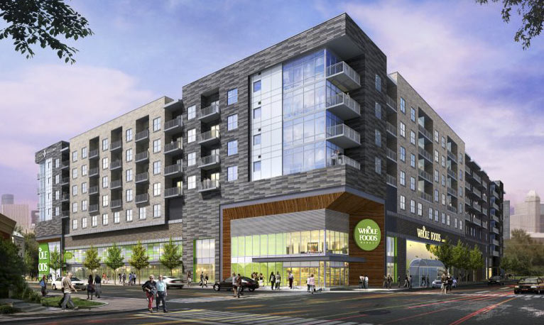
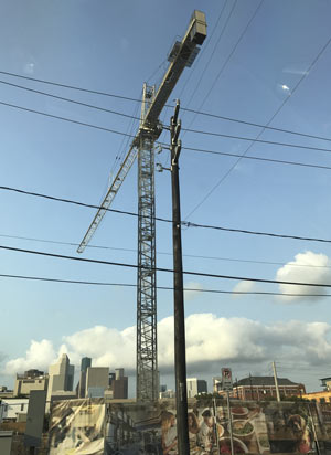
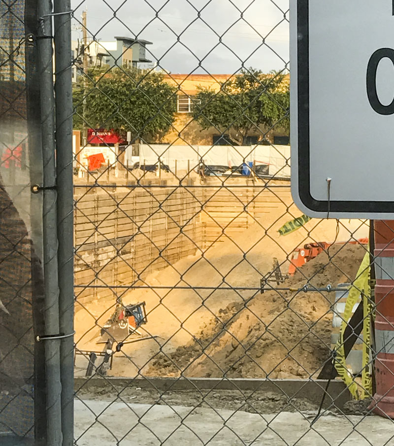
 In other grocery-apartment-midrise news, the 2-story hole for the below-ground parking component of the planned Pearl-branded apartment midrise with built-in Whole Foods looks to have touched bottom, and a tower crane on the site has reached its full height. Some of the construction site’s fence decorations have been swapped out with newer renderings, too — the latest drawings show a zoomier design and a new color scheme (this one falling more in the slatey-grey-brown range, compared to the doughy yellows picked out for the older drawings):
***
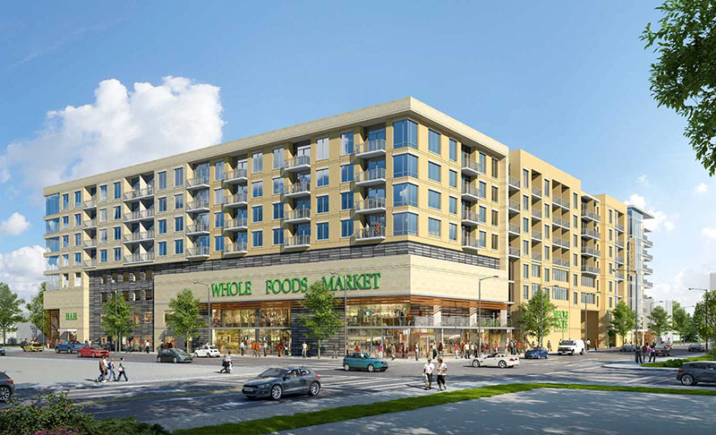
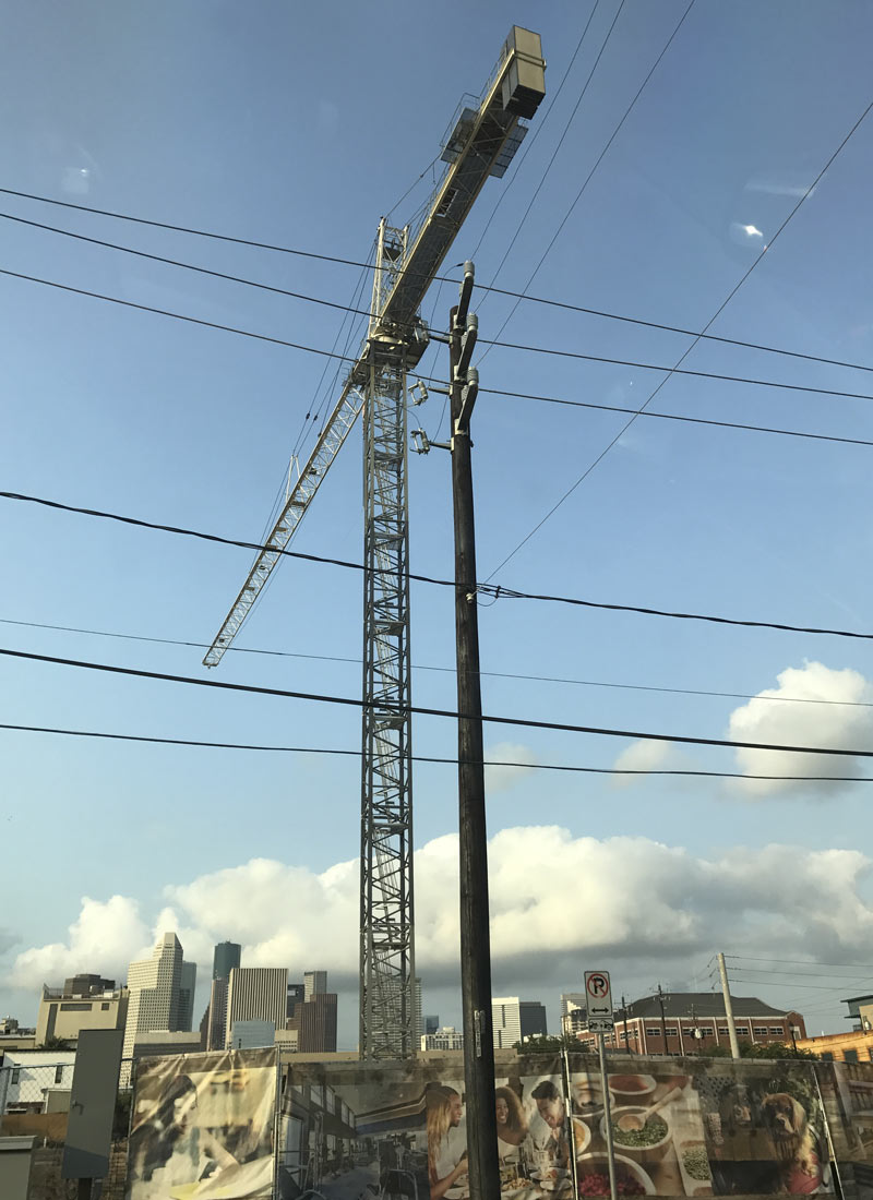
The new view looking up Brazos St. toward Downtown:
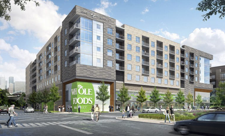
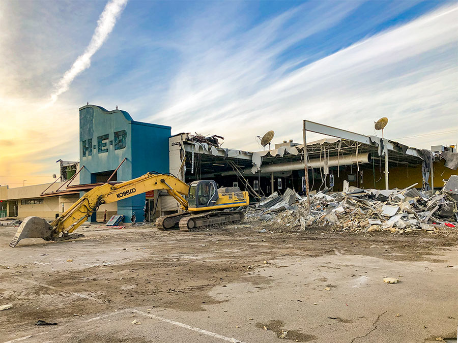
Any remaining traces of the Social Security office formerly on the site appear to have been thoroughly excised:
- Previously on Swamplot: Midtown Gorilla Mural Habitat Destroyed To Make Room for Pearl-Laden Whole Foods; Daily Demolition Report: At the Fairgrounds; Your Guide to Being Seen in Front of Houston’s Artsiest Walls; New Midtown Whole Foods Market Will Stand Apartments on Its Head, Shut Down a Street, Become Center of Universe; ; New Whole Foods Market Midtown Store Will Go on Site of Shuttered Social Security Office; An Apartment Developer’s New Midtown Pearls Are Missing
Images: Ziegler Cooper (renderings), Swamplot inbox (photos)


Boring architecture driven by BORING aka “safe” institutional lenders ( read pension plan / insurance companies / commercial banks) . Gerald Hines brought progressive,modern design to some of his buildings in the 1970’s. Go to Singapore-the architecture is “wild” by some people’s standards,but they’re boring people. And the snowflakes tenants won’t have to go outside to go to the downscale WFM -contrary to what WFM’s demographic consultant studies say. They’ll have their own elevator. And NO equity-just a hastily slapped together, all looks & image with NO character/charm and boring as hell ,OVERPRICED beehive living building. NO thank you !!!
“boring architecture”?
People have been clamoring for “ground floor retail” for so long they don’t know how to be happy about it when they get it.
I think it looks nice. However I did think I was looking at the Buffalo Heights HEB for a moment, so the style may be a bit played out.
Heard Whole Foods pulled out of this development. Oil price really taking a toll on new developments in Houston. Continues to get worse.
@Patrick Bateman if WFM pulled out it’s because they’re not doing very well and their millennial-themed 365 stores are tanking. Unless you’re trying to build apartments or office buildings current oil prices are pretty much baked in.
yeah the new Sprouts going up east of downtown will surely draw away some of the Whole Foods customers…
I began noticing at some point last decade that there were a lot of people conflating mixed-use buildings (along with some other functional accoutrements of a “forward-thinking” or “progressive” city) with aesthetic charm. They’d wax poetic on the virtues and beauty of uninteresting boxy multifamily projects that the City of Dallas had coerced into having a strip of ugly (usually vacant) ground-floor retail and lamented Houston’s ugliness. Some would lament new highrises as well, wishing instead for a ubiquitous landscape of boxy midrises. At that time, a Whole Foods in a mixed-use project in a multifamily midrise in Midtown was a panacea of dreams and aspirations, an accomplishment worthy of great celebration. Sobering perspectives on such a project as this, that it’d be a long time and coming and not really a very big deal when it got here, were…very few and quite unwelcome.
.
Fast forward to 2017. Now we have “lifestyle centers” (an insincere nod toward TND) scattered all throughout the nation’s affluent suburbs, and a few inconsequential nodes of TOD in some places that by themselves were destined to disappoint, firstly because the legacy infrastructure of the entire city cannot be undone, and secondly because living there and shopping there is a privilege of affluence and one that is exercised primarily in order to signal social identity and status. Thus we also have islands of urban simulation — like CityCentre, BLVD Place, the River Oaks District, the Kirby Collection, and so on — that simulate an urban form without quite fitting in very well to the urban fabric; they needn’t be transit-oriented because their customers do not use transit; and by and large, the people that live there do not work there and vice versa. The “traditional” aesthetics of a walkable urban neighborhood are ensconced by parking garages and well-secured from the hoi polloi, if not by private security guards then by sticker prices. How f***ing charming.
.
I find HappyGoLucky’s comment interesting. How can a boring people give rise to a not-boring city? Well, certain symbolic facets of their city have been developed with a kind of global statement in mind, “Look at us now!” “We can do it too!” “This is our time!” The same sentiment echos across mainland Asia (often with disregard to more practical considerations). But this mentality is anything but “cool”. Coolness hasn’t got much to do with colorful vibrancy, with braggadocio, with feats of engineering reaching unnecessarily high into to the sky, the “world’s most [something]”, the “world’s biggest [something]”, and so on. Coolness has to do with a calm self-assuredness, an understanding and acceptance of one’s worth and values, and with not giving a damn what others think about that or the implications thereof. Houston is waaaay cooler than Singapore.
Anyone who grew up in Houston knows that the place is all about trying to look good in comparison to other places – we have the biggest this, that, everything’s bigger here in Texas, et cetera. The fact that the U.S. is in steep and permanent decline (maybe just in the relative sense, since so many other places are in the ascendant) is what necessarily ended up obviating comparisons to other cities. A cheap price of oil, some layoffs, and suddenly the place feels like it’s winding down. Taking an unfiltered look it’s pretty clear Houston was really only competing with Dallas all along. Along those lines, who would dare suggest it’s still all about optics(?) – there’s an ‘Innovation District’ on the way! And it’s true, innovation-on-demand is just part and parcel of a newfangled diversified economy – see, it says so right here on the box. Ok innovators, do your thing…!