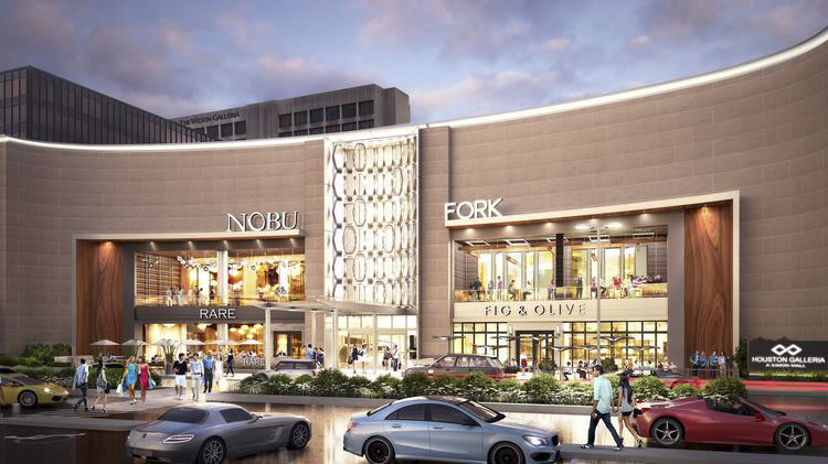
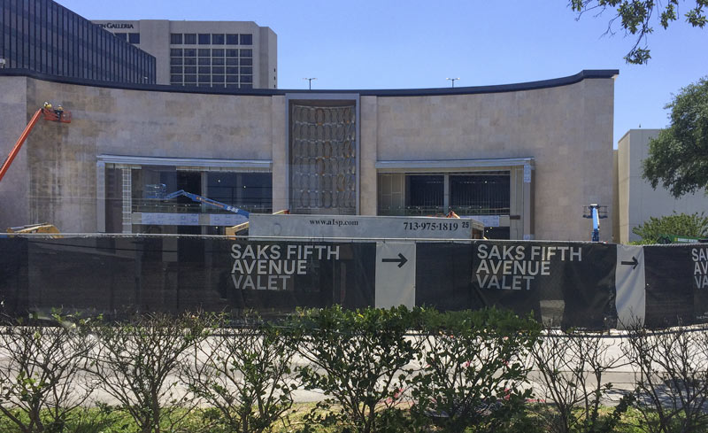
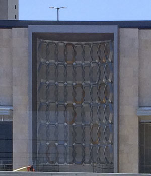
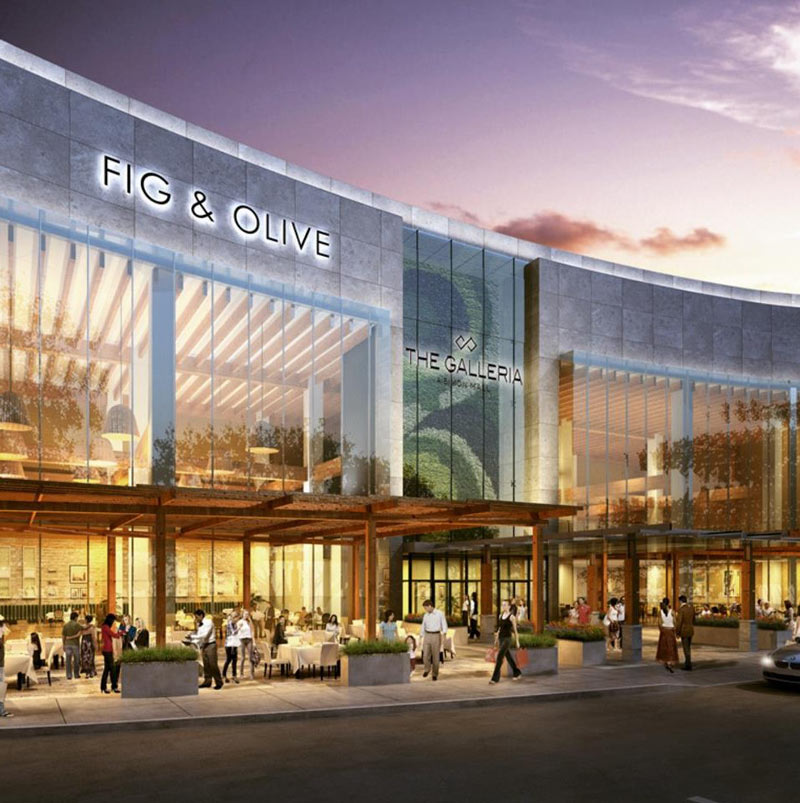
 Now hanging in the newly remodeled central nook on the Galleria’s curved facade along Westheimer Rd.: these strips of hexagonal rings spotted early last week by a passing bus rider. (That curved wall is where Saks Fifth Avenue used to be, before the store scooted into the boxy new building next door.) The rendering up top was released last fall, around the time Simon Properties confirmed that Nobu and Fig & Olive would be taking up 2 of the 4 restaurant spaces shown.
For comparison, here’s what the entry through the Philip Johnson-designed facade looked like as of last August, after the new windows had been cut (but before the top edge of the facade got trimmed off):Â
***
Earlier renderings of the redo featured what appeared to be a glassed-over plant wall in the vertical space, instead:
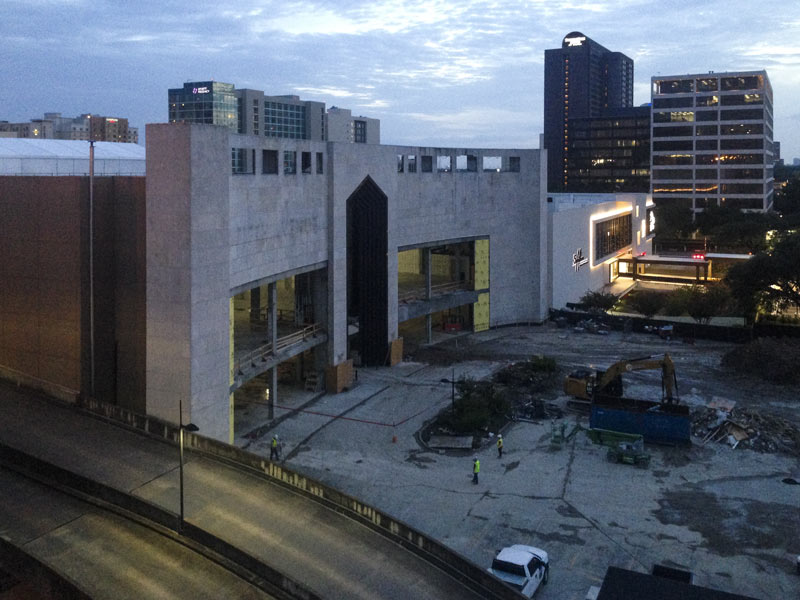
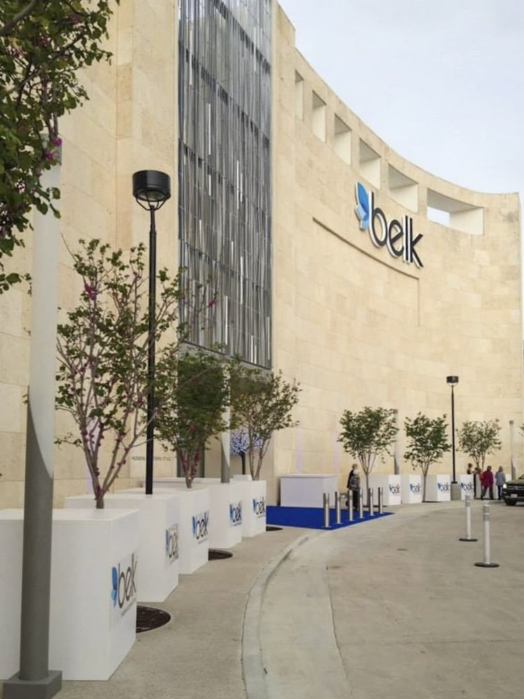
Meanwhile, upstate: the almost-matching facade that previously held the Saks Fifth Avenue in Dallas’s Galleria has been given a different treatment in that city’s redo. (The space has also been turned into a Belk).
- Previously on Swamplot: A Grander Galleria: More Retail, More Restaurants, More Revenue — And a Residential Highrise Too?
Images: Simon Property Group (renderings); Swamplot inbox (top 3 photos); Belk (bottom photo)



An egregious remuddle.
I’m so sorry that Hines sold the Galleria to Simon, an operator with no architectural taste whatsoever.
Looks great, but I would have preferred Hot Topic anchor this spot.
Oh, no! A slightly curved wall is getting a makeover, how will the world of architecture ever survive?
Are they going to hand out wide angle glasses to make it look like the rendering? Or maybe just skip the remodel and hand out augmented reality glasses?
You’re telling me the anchor tenant is Fork, but not Börk? Get the hell outta here.
It’s a shame Bork didn’t make the cut after the initial renderings.
In all seriousness, why did they trim the top off the façade, which I thought looked pretty elegant? It looks worse now.
At least the old Saks space won’t become a Belk….
Phillip Johnson must be turning in his grave. The original evokes a medieval castle, what with the crenellations and an entrance promising a portcullis. I understand how the owners might want to tone that down.
They should of gone all the way and removed the entire facade rather than deface it the way they did. Totally ruined the theme Philip Johnson designed and altered it to the same old schlock every other development uses.
I’m letting my snarkiness fly ….First of all Simon Properties is phucking up the whole shebang by “altering ” the facade aka making it look tackier than it already is. The boring ,safe “design” will impress NO one. And as usual ( based on personal in store experience ) retail is DEAD. I guess the weekends jam the Mall,but way less customers buy in person ,versus online. The Galleria is a tourist trap, first and foremost. And a shrine to over priced crap no one really NEEDS .. Wanting that stuff is fueled by commercialism. The proposed high rise ,IF it ever gets built-which like a lot of proposed projects in Houston are just speculation- would possibly be built OVER the relocated Macy’s store. Imagine being able to take the elevator to the Mall when you want to buy something you want but DON’T need. But it’ll help the economy.