
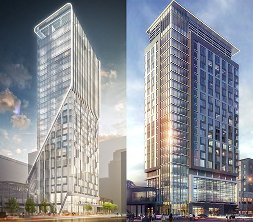
The company that’s adding a new hotel to GreenStreet, the renamed and reconfigured Houston Pavilions mall downtown appears to have made some dramatic changes to the design of the tower. Midway Companies first showed off the sleek design by Gensler for the Hotel Alessandra (shown at left) last March, describing a design that featured a top-floor lobby, with a bar on the same floor and a pool under a retractable roof. Renderings of the design are still featured in marketing materials for GreenStreet’s retail redo.
But HAIF user Urbannizer, who’s had a pretty solid track record of discovering renderings of proposed projects if they’re available anywhere, posted a revised rendering to the online architecture forum late last night. The image, shown at right, shows what appears to be the latest design for the Alessandra, which will be operated by the Valencia Group. The Valencia Group already operates Midway’s Hotel Sorella at CityCentre.
Here’s a slightly larger view of the newer, far more rectilinear design:
***
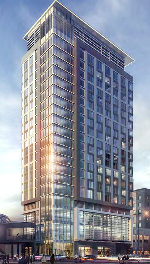
In addition to straightening out the curves, replacing the previous configuration’s hoodie with a hat, and diminishing somewhat the number of zigs and zags in the window patterns, the new design appears to be for a slightly shorter building — approximately 22 floors, judging from the rendering, down from 25.
- GreenStreet Redevelopment + 25-Story Hotel Alessandra [HAIF]
- Previously on Swamplot: Demolition Work on GreenStreet for the Swoopy New Hotel Alessandra Begins Next Week; New Mod Downtown Highrise Hotel Alessandra Will Slam Dunk Former Yao Ming Spot at GreenStreet
Renderings: Midway Companies
Soon, they’ll be taking my advice and moving the project next to the Katy-Mills Outlet Mall. If I had any say in the project, which I do, since internet commentators are super influential in this world, They should reduce it to 4 floors, with 1 elevator and surrounded by surface level parking. Now, the exciting part about my redesign would include a restaurant, in a different building, a full 100 ft away. That restaurant would be exclusive and unique to the cultural and youth hotspot of the Katy Mills Mall. The restaurant would serve international cuisine, such has french toast, and Belgium waffles. International travelers will be salivating over the divine offerings of this restaurant, dubbed Denny’s.
Lame
Looks like they also wiped the Vaseline off the camera lens.
Blah.
Looks a bit like BG Place. I miss the swoops and curves already.
The redesign befits the overwhelming conservatism prevalent in town – one in which genericism is applauded. Architectural embellishments are for cities where a far more creative, progressive spirit dominates.
Disappointing!
As much as I like the ethereal rendering of the 1st one, it does look far better suited for Midways Citycentre Space Park. i believe the redesign fits the downtown setting better.
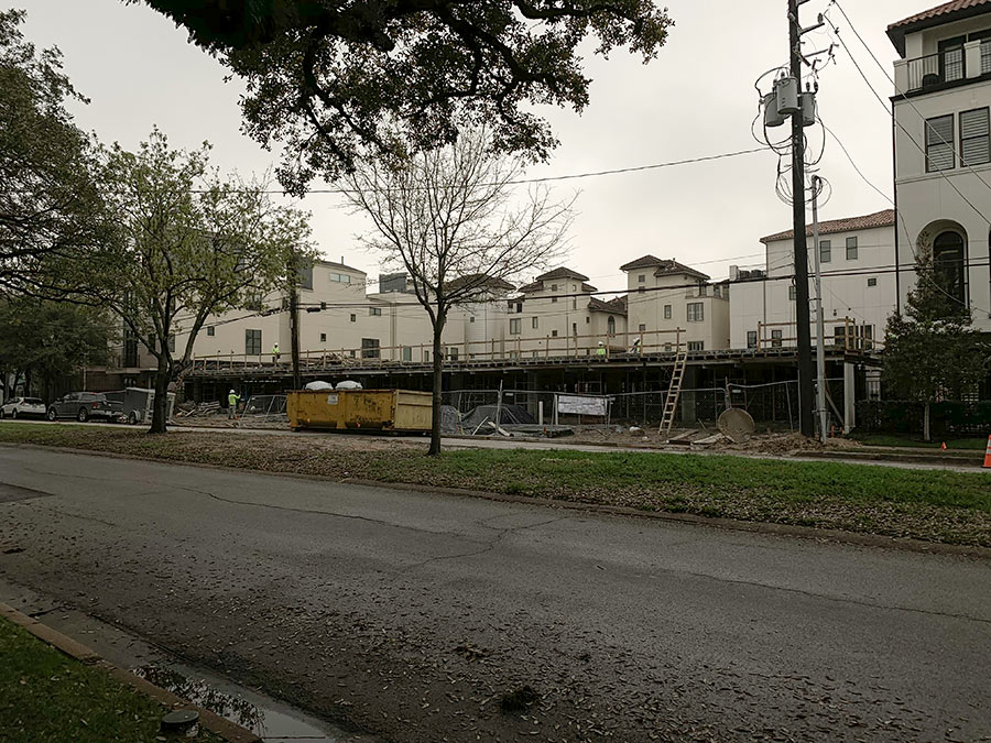
It looks like they are tearing down and rebuilding the adjacent buildings on the right.
The new version isn’t terrible but what a shame. The first version was so unique and interesting.
Sucks. The old design was unique and beautiful. This isn’t ugly, but it looks just like at least 2 other buildings downtown already.
This is tragic! Yeah, we were going to build a cutting edge spectacular building , but instead we decided to build a shitty rote spec building. How in the fuck do you go from the first design to THIS! It’s like going to look at Bentley but then buying a used Saturn. This is just absurd. I was excited about this building, now I couldn’t care less. Awful.
This is lameeeeeeeeeee. I had a feeling they were too lame to actually follow through with an interesting and unique design. Now it may as well be Residences at Market Square or The Southmore – they all look blandly similar in design…
*
@NotCommonsense – Let’s follow your lead and scrap it, reduce it to 4 floors and move it to Katy Mills Mall. Include direct access ramps to and from the Grand Parkway, Westpark Tollway and I-10 so you don’t need to deal with pesky streets or traffic lights. Additionally – let’s build a direct tolled limited access lane in each direction between Bush Intercontinental Airport via BW8 and 1-10 so that all who arrive in Houston and rent their midsize cars (or who opt to upgrade to a “Texas sized” SUV) can be quickly and easily directed to our true cultural center – Katy Mills Mall! Convenient airport connections, easy freeway access, fine dining at Denny’s, and plentiful surface parking for all! :P
I’m sorry, but this is just too funny. Is this related to an energy downturn somehow?
boring.
I like the ? better than the !
Wow…….good architecture and tall buildings just scare the hell out of developers in houston. Everything going up looks exactly the same and is 25 stories or less….BORING
@dfw36:
You are spot on. With the exception of 609 Main, I’m hard pressed to think of anything really impactful that we have to show from this recent boom. Literally everything has been a glass box with a minimum of two façade treatments. If someone unfamiliar with Houston showed up and looked at everything under construction, it would be hard to convince them that this is the famous city with lots of wealth and no zoning. When a developer builds a building, it is a 100+ year product that will not only be part of the skyline but part the visual image that people leave the city with. But it’s all derivative architecture and none of the developers with the power to be bold are willing to do it. With these I feel like I’m looking at Rothko paintings – all just boxes with different shapes and colors.
What a shame,the first design was an eye catcher,there are not too many buildings in Houston that make heads turn,this is a downgrade,developers should get rid of the highrise cookie molds,this new design is too similar to the buildings going up on Market Square and the one by Minute Maid park.
Should we blame the change of this new design to the oil price$$$ ???
The first design was way too blingy. The second design is just a little too blingy. All of this ornamentation will look dated very fast.
Wow, I can’t believe the entire Swamplot commentariat agrees on something.
*yawn*
What a dud! Green Street really needed an architectural showstopper to create interest. Being so poorly located, the place needs all the help it can get.
@ Sandbox: Saying that it reminds one of a Rothko painting would be quite the compliment. Nobody except for Rothko did what Rothko did. The problem with the new rendering is that it is what everybody else does.
Blah. Boring design, especially considering the location. Houston is so rurban. Blah.
No big deal. Why waste a good design in that spot? Anything they build there will be hidden anyway unless it’s over 70 stories.
Bold and unique becomes dated and ugly once the Emperor orders a new set of clothes. Getting rid of those ridiculous curves and zigzags probably has to do with the realities of sunlight and reflection in a subtropical city. In London, one of those bold new skyscrapers had a curved glass facade that literally turned it into a deathray that melted cars.
.
The new design also has a more practical design feature: a covered front and sidewalk. This was something prevalent in pre 1940s downtown buildings, and keeps pedestrians cool and shaded.
I find it interesting to consider what the value is of an eye-popping, exclusive design for a building downtown or in any business district. I would think that there is some value worth considering – less so for an oil company, but more so for a retail, residential, or entertainment venue.
Growing up here, we all knew the common names of the more remarkable buildings around town – Transco Tower, Shamrock Hotel, JP Morgan/Chase (because it’s the tallest), but few others were household names. When we’d drive down the freeway, we would recognize those while ignoring all the others.
Now that I’m all grown up, I would think that there is still some value to a unique building; maybe a premium on rents, or higher visitor traffic…I dunno – thoughts?
Midway and everyone else involved with this redo has no huevos!!!
1st design captured by imagination 2nd design not
*my
W…………..T…………….F………………..???????????????????????????
That looks turrrrrible!
‘Learning from Las Vegas’
Robert Venturi & Dennise Scott Brown
Nuff said!
Agree with others, they took one of the few unique designs I’ve seen lately for Houston and converted it into generic blandness.
Where they are really missing out is not seizing the opportunity to make this thing taller by adding condos to the top floors that have access to the hotel’s amenities. That’s been done successfully in multiple US cities, including Dallas, Austin, and San Antonio, in addition to the usual suspects like NYC, LA, and Seattle. Houston developers seem to live in their own little world and don’t often look outside it for good ideas.
Gosh, disappointing but not surprising. They took the architecture from Beltway 8 and I-10 and added a few stories. Must have had lunch with the guys at Metro National and realized that you can build faster and cheaper by just tweaking previously built buildings. This is a total yawner, but is what I have come to expect in Houston. We are beginning to look like an old communist block city, with rows and rows of unimaginative buildings designed to not compete with or stand out from anything surrounding it, but for the cheapest possible result. Ugh, what a piece of crap. Hope it doesn’t get built. Let this “building boom” end and hope for better next time.
The bland new design will be easy to re-brand after the Alessanda hotel fails to catch on. Valencia needs to figure out that they need to make this hotel super-interesting design-wise in order to compensate for the lame location.