Note: Story updated below.
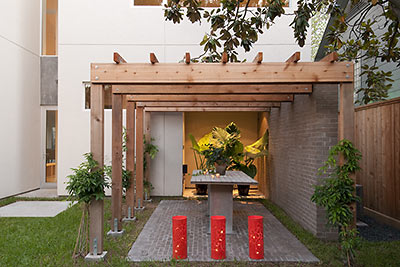
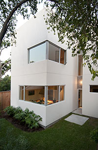
Developer (and Swamplot advertiser) Carol Isaak Barden says to give her latest project another week or 10 days before it’s ready — the paint isn’t quite dry yet. But all the peppers, candles, and watermelons are certainly in place for these fancy photos she sent us.
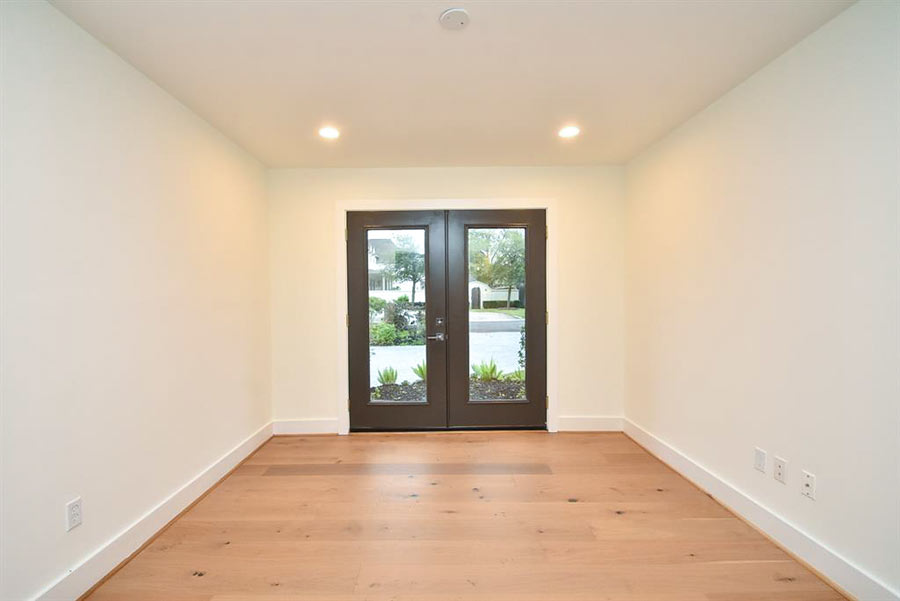
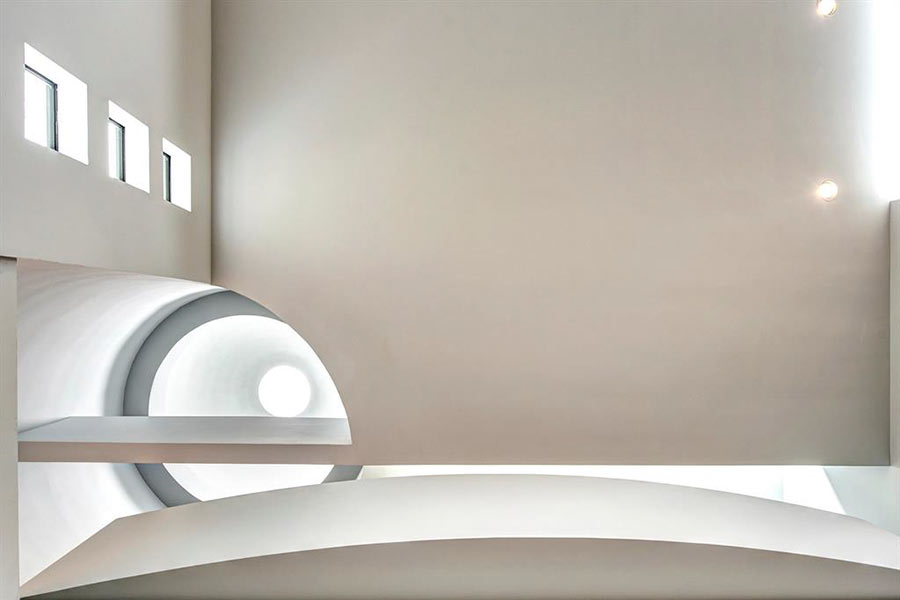
Barden calls the home, which is available for sale in a non-MLS kinda way, the “Tree House.” The architects are Erick Ragni and Scott Strasser. The 4,150-sq.-ft. home (3,500 if you don’t count the oversized garage) is on a 50×100-ft. lot at 1608 Indiana, across the street from HISD’s Wilson Montessori School.
What’s so tree-ish about it?
***
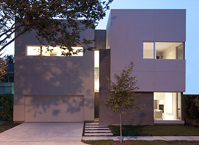
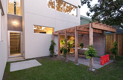
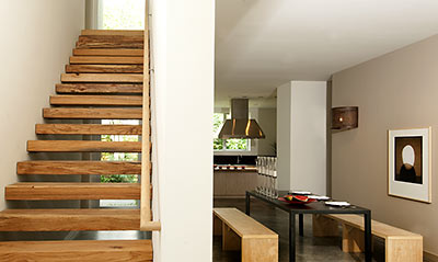
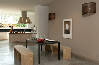
Well, Barden says she planted 2 dozen new trees on the site itself, plus another 10 across the street. All the finish wood inside was reclaimed — much of it from a water oak that fell in Fort Bend County during Hurricane Ike and was rescued by Houston’s local “urban forest recovery” specialists, TruTimber. The backyard pergola was built from reclaimed cedar.
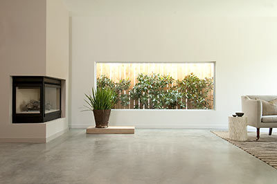
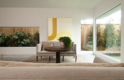

Furniture for the shoot was carted in by Found for the Home. The store did the same thing for Barden’s last spec-house project, the Wabi Sabi House.
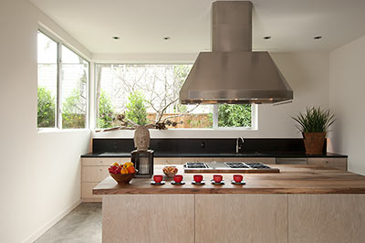
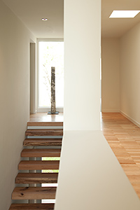 What else is there to know about this place? Well, for one thing the attic is downstairs. All 3 bedrooms are up, and there are 3 1/2 baths. Plus, Barden says the Laundry Room is “enormous.”
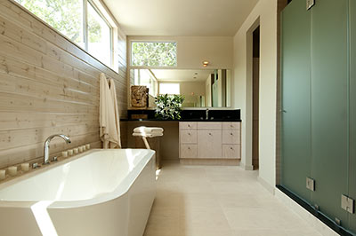
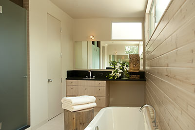
Update, 9/1: Wanna take a tour?
- Carol Isaak Barden
- Urban Forest Recovery [TruTimber]
- Found for the Home
- Previously in Swamplot: Redo, Rinse, Repeat: Brun Bungalow, Makeover Magnet, Wabi Sabi: Sold!, Inside the Wabi Sabi House, Not Lived In Yet: The Wabi Sabi House, Menil Townhome Sales Looking for a Lift, Menil Townhouse: Almost a Quarter Off
Photos: Don Glentzer


Any word on the price range? What a splendid home!
beautiful. I *LOVE* it!
We are lucky to have this woman doing what she’s doing! Long live Carol Isaak Barden!
My favorite accessory is the decapitated head on the coffee table. Oh … wait … NM. Sorry.
PS: If you buy this house, do you get the Aaron Parazette painting for free?
*sigh*
It’s gorgeous. Too bad I’ll never afford a house like this in my lifetime.
That is clearly not a decapitated head. That is Rick James’ wig. Know your art, and your artifacts!
A little sterile, perhaps, but beautiful, and I waaaaaaannnnnnt it. Unfortunately, as has been pointed out, the lucky person who buys this place will no doubt be RICH, BITCH!! (Sorry, Eric made me do it.)
Sorry kids, but this place is missing something.
Ah yes, it’s missing turrets.
^ :D
Yes, something indeed is missing…color.
“The 4,150-sq.-ft. home (3,500 if you don’t count the oversized garage)”
Come on. Has a garage ever been counted in a homes square footage by anyone other than a develper trying to pretend his/her creation is something that it’s not? Is that back patio considered “livable” space too and included in the square footage?
Nice place though. Keep ’em coming, CIB.
Anyone have a pic of the dump that met its doom to make way for this one? Urban renewal at it’s finest if you ask me.
What’s missing is a home theater. Bough house, anyone?
Bough house– I like that.
My wife and I snuck through this house during its late construction phase, about a month ago. Pictures don’t do it justice. Every window casts leaf shadows on interior surfaces. It’s a serene beauty. Can’t wait to see Wabi Sabi 2!
The interior is indeed beautiful but I will love the developer who will figure out a way to hide garages. To me, a street facing garage is an absolute deal breaker no matter how stunning everything else is (and this house is stunning).
Bernard, the former occupant of this lot was a 2024 sq. ft. 1930s duplex. Sold in July 2006 for $257K and probably torn down not long after.
i want to live there.
Too bad it’s all stucco on the exterior.
Some day people in Houston will realize that stucco is not an appropriate material for this humid climate.
This house is indeed sterile and it is frankly boring to any quality builder. I love this site but it is indeed typical that the majority of contributors to this site want to mock truly interesting architecture and ooh and aah about a house such as this one which is plain, without imagination and boring. My father who was in the commercial window covering business for 45 years, used to tell me that white and off-white were the chosen colors of the architecturally destitute. I never agreed with my father on too many things but on this I believe he was right. It is okay to like this womans product because everyone is entitled to an opinion, but on this and other websites she has been elevated to cult status and that is a pile of crap. She is building something different for the current time but it is truly simple and plain and as another builder, I am not impressed with the product nor am I excited by Ms. Bardens talents.
This is built for looks, not actual USE, right? Consider unpacking the groceries in high heels – you’d better not accidentally step in between those Zen-garden concrete blocks on the pathway. Oh, and pushing a stroller over them is gonna get annoying pretty quickly. Hope nobody ever breaks a leg and is on crutches or in a wheelchair – mighty tiresome to have to go up & down those stairs all the time – and is there a handrail on the second stair? Hope the elderly parents never come to visit!
It’ll be a shame to cover all those windows, too, but who wants to be your neighbors’ nightly entertainment?
That little patio outside? It’s too small to be of real use – wonder why they didn’t extend the brickwork at least under the posts of the pergola?
To top it off – the mature trees in this picture look like they belong to the neighbors, where they and the house they shade will probably be demolished in a few weeks so another vapid box can be built.
I can’t wait to see what this house looks like in 20 years when those baby trees in the courtyards have gotten bigger and their leaves start piling up.
The above two comments take some of the sting away from the fact we’ll all be dead in 2012. Cheers!
So Wayne, why don’t you submit something you’ve built to show all of us, the CIB sycophants, what it really is all about?
This house has a very specific type of buyer in mind just as the faux Tuscan McMansion does as well as the psuedo-Victorian in the Heights. It certainly won’t appeal to the masses and I am sure Ms. Barden is quite aware of that.
I prefer my stucco painted in the sage-green-grey tone embodied by mold/mildew.
No problem with those “baby trees” the city will take them when they have to widen the street in a few years. It always baffles me when trees are planted in the city’s easement…..that $150 you$just spent on a tree (if it is a worthwhile tree, it might be worth that much not at HGC) could be dug up shortly by a city crew. Also, new homeowners, when you (or the developers) plant those “baby trees” next to a house…….it causes foundation problems….
I still love it.
I have enjoyed reading everyone’s comments, and extend an invitation to all you bloggers to visit The Tree House on Sunday afternoon, September 6th, 5:00 p.m., 1608 Indiana. (It is a no-shoe zone, I provide the booties.) ) I would especially like to meet the most critical bloggers – Flake and Wayne. I will be there until 5:30 p.m. with my pit bull. Looking forward to welcoming you!
I rode by today… seems like rugrats could be a problem in the immediate neighborhood.
None of the previous criticisms leveled are valid.
1.) Making sweeping claims as demonstration of inferior product is a common empiricist debate strategy to discount the ego/desires of the future home owner.
2.) The windows privacy issue is as stale a debate and left best in the 20th century. Condo cool has always applied phenomenal transparency to enhance the awareness of the occupant.
3.) The hiding of the garage is a moral statement that would not make demographic sense w/r/t price point and location. It takes a sweet balance of traditional modern values with postmodern identity to achieve something people here will call home.
From the pics it’s seems a pretty good update of the working class bungalow parcel to upper class condo. You really have to experience a place like this to make good spatial and programming judgments in architectural terms.
Clean design work, nice outdoor meditations. Hope to make it out this sunday.
Beautiful clean lines and a very zen feeling to the whole place…in an age of clutter, excess, and too much information, this would be a peaceful escape…isn’t that what a home should be? Well done, Ms. Barden!!
A+ in my book, and wish there were more homes like this, and fewer builder atrocities that have a hodge-podge of styles and big boxy rooms with no “feeling”…when are we going to stop building charmless homes with turrets and Victorian doors with leaded oval windows slapped onto colonial vernaculars….architects, save us!!!!!!!
I loved this house!
An admirable element common among Ms. Barden’s homes is a peaceful ambiance, carefully evoked via a magical harmony of space, proportion, and light. This ambiance – to this writer is – not of sterility, nor of lassitude, but of an undercurrent of energy generated by a pleasant, rhythmic aesthetic. The terrific photographs above cannot can scarcely recreate this feeling. The extreme effort and care given to the design of her homes is rare among Houston developers. She is a gem to be appreciated, as are the homes she crafts.
Whoops – pardon the typos. What I meant:
An admirable element common among Ms. Barden’s homes is a peaceful ambiance, carefully evoked via a magical harmony of space, proportion, and light. This ambiance – to this writer – is not of sterility, nor of lassitude, but of an undercurrent of energy generated by a pleasant, rhythmic aesthetic. The terrific photographs above can scarcely recreate this feeling. The extreme effort and care given to the design of her homes is rare among Houston developers. She is a gem to be appreciated, as are the homes she crafts.
It’s one year on from the last entry and we are the ones lucky enough to live in this house designed by some of the most creative people in the country. FYI, It’s liveable, not sterile and exudes a sense of calm in the middle of Houston. I use the white on white tones as a base for the accents of color of my personal decor (a lot more colorful than how it was dressed for the photos), and have not had any problems with strollers, bikes or wearing high heels around here! My favorite features are the organic forms of the wood in the stairs and kitchen island. The stairs have been no problem, even for kids. And the mature trees are actually on our property, not the neighbors. @Eric: you’re right, the trees do cast beautiful ever-changing shadows throughout the day. Houston needs more contemporary architecture, it’s a modern city!
The Tree House (at 1608 Indiana) will be open on Saturday, January 26th, 11:00 – 5:00 p.m. for the Modern Home Tour. Despite the many critical comments, the occupants (who have furnished it beautifully), are so happy living there, and would not want to be anywhere else. Designer Scott Strasser will be joining me for the tour along with other artisans who worked on the project. Much of the interior wood (including the stairwell) came from one very large tree that fell during Hurricane Ike.