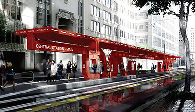
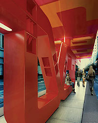
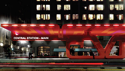
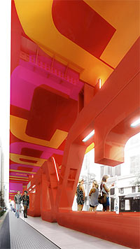
 The reddish steel structure shown here is UH architecture grad Neil Denari‘s design for the new light-rail transfer station on Main St. between Capitol and Rusk downtown, where the new East End and Southeast Lines currently under construction will intersect with the existing rail line. Besides Denari, whose firm is based in LA, 3 New York and 1 local architecture firm were invited to dream up schemes for the long open-air, 11-ft.-wide rail platform. A jury selected by Metro will pick the winning design, but Metro is still asking for rider comments on each of them.
***
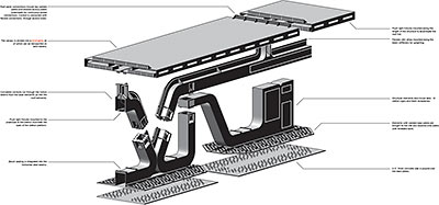
The lightweight canopy below is meant to turn the flow of rainwater into entertainment for waiting passengers, showing off the local rain product by funneling torrents directly into underground pipes through 6 lit-up and partially cut-out columns and 2 suspended chains. This design is from Snøhetta, the same firm with offices in New York and Oslo that’s also competing to build the next building for Houston’s Museum of Fine Arts.

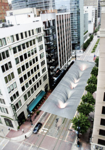

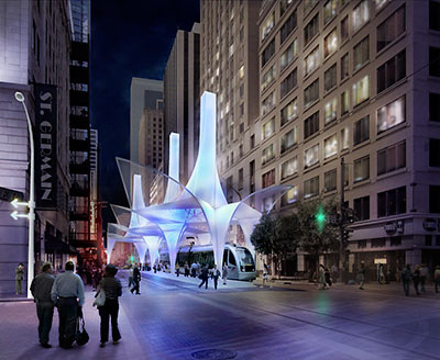
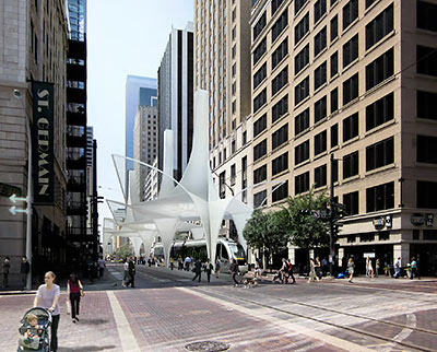
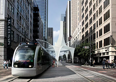
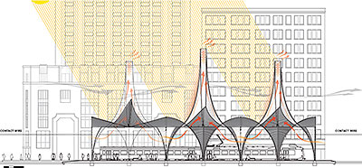
From SHoP Architects: A metal-clad triple-chimney structure, spreading supports wide onto the sidewalks, and featuring Big Ass Fans mounted at the base of each vent to prime a cooling stack effect.
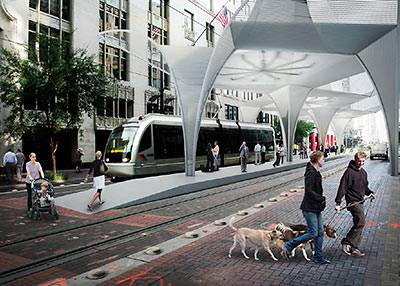
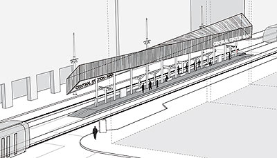
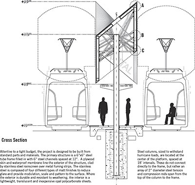
The design from LTL Architects features a steel frame wrapped with stainless steel panels, tilted up at 2 opposite corners to face oncoming trains:


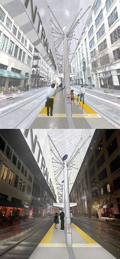
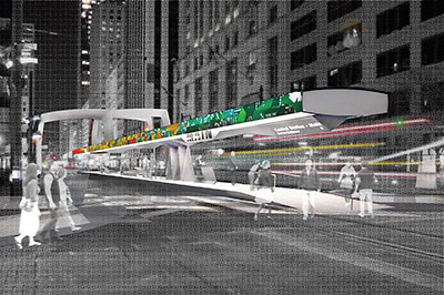
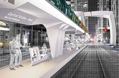
And from Houston’s Interloop—Architecture, there’s this long canopy, covered with a mosaic of recycled highway traffic signs, and suspended over the traffic median from spider-leg-like columns perched on the sidewalks. The firm’s design also relocates the crosswalk to the middle of the block.



- Central Station—Main Design Competition [Metro]
- Houston Central Station [OffCite]
- Houston Central Station – Design Proposals [Architangent]


Very interesting to see these exercises in design. I like SHoP’s “chimney” proposal.
While I do appreciate the recycling-take by the Houston folks, I must say that the one with fans in my choice. The toilet-paper one relies on rain… really?!?…Really? The boxy one even bores the guy in the rendering. The red one is a little too Lego-ish/Total Recall/Blade Runner for me – very heavy. The sign one seems to be a floating overhead compartment.
An open air 11ft wide stop does not a station make. Good design, let’s just not call it something silly like Central Station.
where do we vote? SHoP Architects and Big Ass Fans FTW
They forgot to put homeless people and bums in the renderings.
Tough call, I think I like the LTL design best. Hopefully someone with a more discerning eye than the typical METRO rider will ultimately be the “decider.”
I like the first & last designs best. Make it colorful- nothing too dark. The idea of using recycled street signed is pretty cool, if done tastefully. I didn’t notice any of the designs keeping bums from riding for free. Other cities have a system to prevent freeloaders— why don’t we? I think it would help keep it nice.
Those are nifty.
My request: Just build it so the trains don’t crash into each other.
Beyond that, I’m easy.
Where are the homeless and the thuggish Metro cops?
They need to make sure that whichever one wins does not become a sail in a wind tunnel during a hurricane…
This is Houston. I vote for the ginormo fan design. I also like the idea of the recycled highway signs, but it looks sloppy in the rendering.
FIRST CHOICE = #1. SHoP Architects. Go Submit Comments/Vote: http://www.gometrorail.org/go/doc/2491/515699
@Craig: Guess you should tell countries where they have had stations which are basically what you describe. Any intended stopping place for a train qualifies as a station. Your definition seems to have completely arbitrary requirements.
Wow. All the attention paid to overpaying for specifications for paint, sheet metal, concrete, and bent pipe while we outsourced engineering and manufacturing of the guts of our train sets.
Too bad our wise decision-makers haven’t figured out how to outsource their jobs.
Snohetta, to me, represents that part of downtown the most and gives it an advanced look. Shop looks very suburbanish and I think we’re trying to go downtown, instead of the suburbs when downtown. Snohetta, also has cool water design and architetural design at the roof. Snohetta is also about half artificial light and natural light. It’ll light very bright and nice. Snohetta should be the design, but try to read all the designs before saying what you think is the best. The site lets you give an opinion of what you think, but the votes are the 5 people that choose and they’re just trying to listen to best decide.
Big Ass Fans! Big Ass Fans!
Or that colorful recycled highway sign one.
The water one looks kinda cool, but, you know, the drought
Big ass fans or the first one. It does look like legos, but I like legos.
Lots of hoopla and waste of money on a glorified carport for a toy train system…
Make it a shelter from the sun, the heat and the homeless and maybe you will have something.
Love the idea of fans…question whether something light weight will stand up to tropical storms/hurricanes…and question if it can handle our occasional gully washers/floods. The red one will soon become a target of our graffiti artists. Recycling is a great idea but not so attractive in practice. So hard to choose…but would vote for Shop’s as it is both attractive & functional.
As the condo manager for The Capitol Lofts, 711 Main Street, I am hopeful that Metro does not use the pole tent design with the “Big Ass Fans”. I like any of the other designs better than this one that looks like smoke stacks to me, the recycled street signs sounds like the most popular.
As a random person…, I hope they incorporate Big Ass Fans into whatever design they go with, those things seriously move some air and would be very nice on a hot houston day.
Do we have a winner yet?