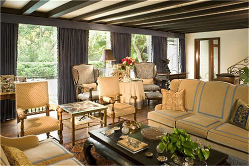
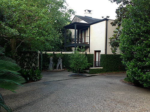
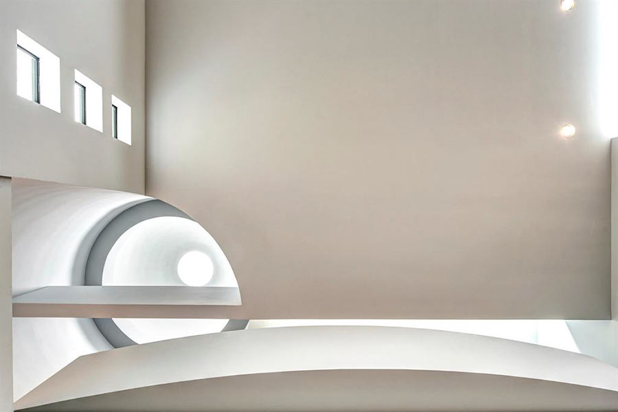
Yet another re-listing of a 1949 home built by architect Hamilton Brown for his own family on the sloped loop of Tiel Way in River Oaks has freshened up the property’s market presence once more. But the price point is the same — it’s been hovering for a year at $2.825 million, having debuted at $3.75 million in 2010. Asking prices in the interim bounced down in listings by various agencies, hitting $3.25 million, then $2.95 million in 2011, and $2.875 million in the early part of last year, after a 3-month dalliance with $3.2 million in the fall of 2012. Like the wedge lot it occupies, the well-screened home is broader toward the few-frills front. Structural elements remain a focus inside (above) and out.
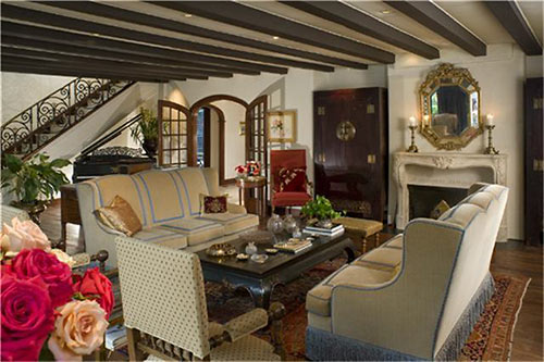
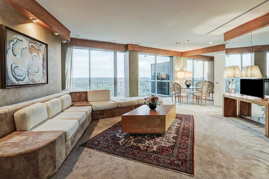
Despite the pedigree of an extensive renovation by architect Howard Barnstone (he did work on the property for LeRoy and Lucile Melcher, its later owners), there’s not a massive amount of Modern left to the house — at least if the interior decor has anything to say about it. The property was further altered in 2001 or 2002. Is that when all the beams attached themselves to the ceilings?
***
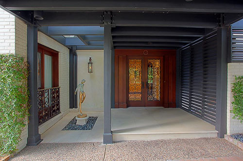
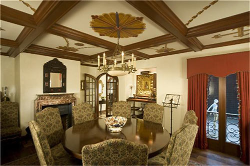
The golden gams of the entryway’s exterior art installation (above) add some kick to the view from the adjacent dining room, which, given the hand-painted ceiling flourishes, is mighty ornamental itself:
Elsewhere on the first level, darkened beams roll in rhythm overhead in many of the rooms:
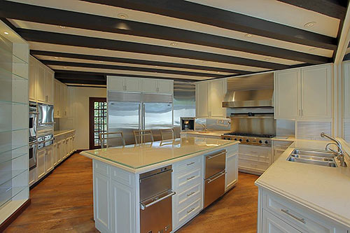
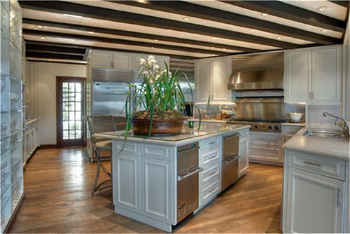
Solid slabs of limestone form the kitchen’s countertops. The island’s gets a glassy overlay.
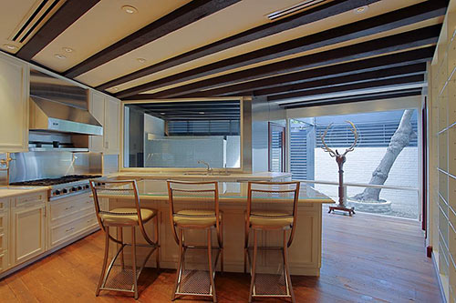
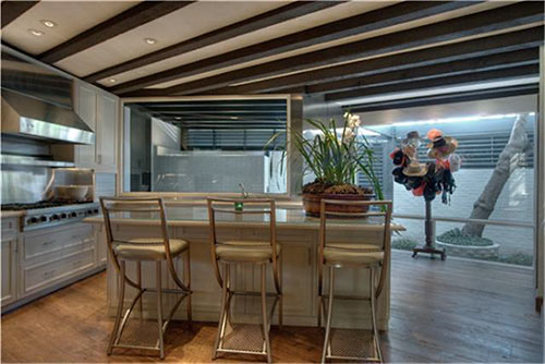
Too stark? The listing photos warm up the kitchen with alternative staging:
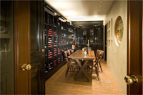
Guns and rosés (also whites and reds) are found in this climate-controlled wine room:
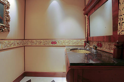
The home has 4 full bathrooms as well as this better-be-tidy powder room, where walls of Italian silk are a daring choice for the splash zone:
Antique longleaf pine flooring, mahogany millwork, and lost-wax iron and brass castings are among the 5,101-sq.-ft. home’s finishes:
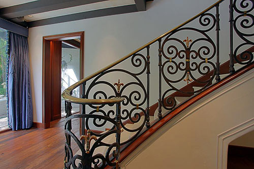
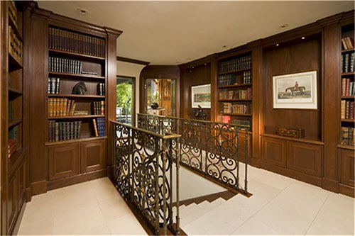
The library-like landing (above) has balcony access:
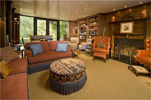
The media room piles on the paneling and features another of the home’s 4 fireplaces:
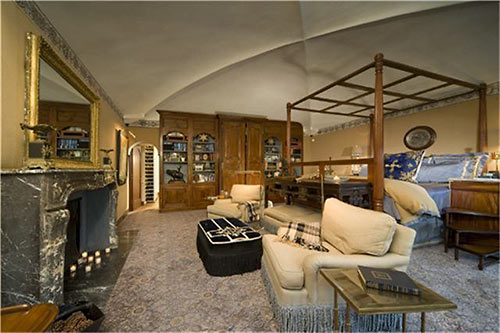
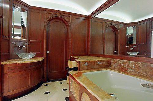
Upstairs, the 3-bedroom home’s master suite comes with a cross barrel ceiling vault and 2 bathrooms. Here’s one of them:
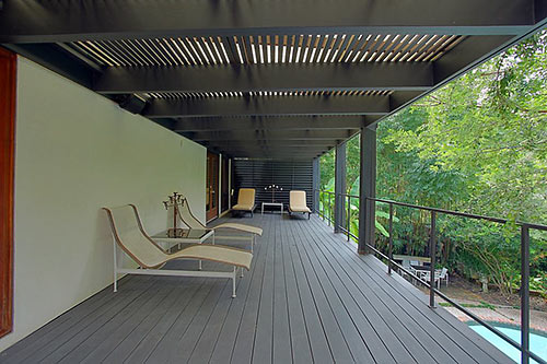
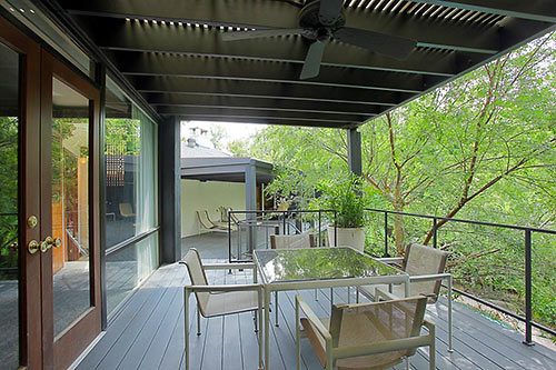
There’s also this balcony:
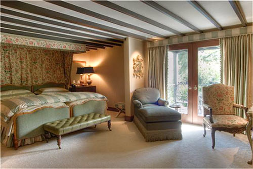
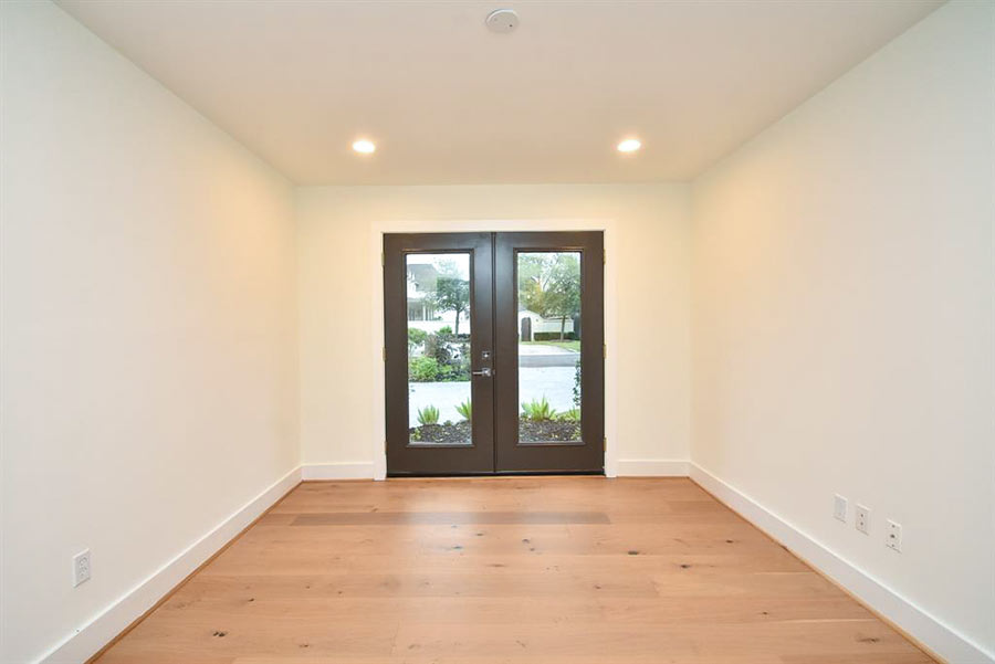
One of the bedrooms is downstairs. While the beaming ceiling of this current guest suite suggests it’s this one . . .
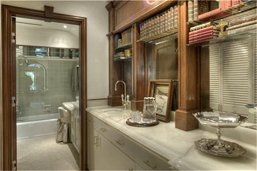
might the balcony say otherwise?
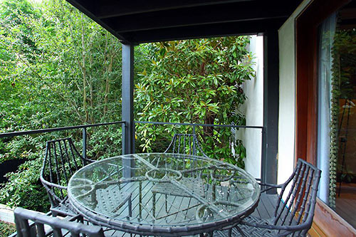
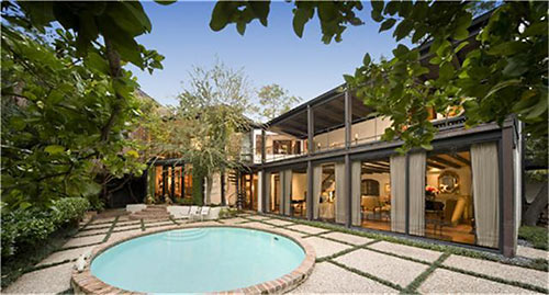
The back of the home consists of steel-framed window walls and balconies facing the rounded pool, grid-like patio, and remaining sloping grounds:
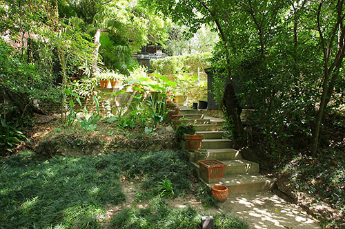
A concrete staircase leading into the 16,906-sq.-ft. lot’s more rugged territory also heads toward the dog run. This north-facing property is across the curving street from lots that abut a stretch of Buffalo Bayou near the bridge across Shepherd Dr.
- 13 Tiel Way [HAR]


I actually really like this house, though yes, the beams are a bit oppressive. Really when does a house cease to be the house the original architect intended after the alteration after alteration deem it unrecognizable? I have always liked the modern houses of Tiel Way, it’s like stumbuling into a Houston version of Trousdale Estates in the heart of River Oaks.
Overall, I like the home. It’s tasteful and classic and not everyone wants to live in a house with painted white beams. But, IMO, the kitchen is awful and out of place.
.
I also think you mean 77019 vs 77009. :)
They were built to last back in those days. America could use a dose of that workmanship today.
@Attorney Mario Madrid, what utter nonsense. Materials of today are infinitely better than that of 60 years ago … lumber is straighter and of higher strength, concrete is better, all windows and doors are more energy efficient, pipes are stronger, no more lead, asbestos or poisons used in construction etc. Construction standards processes are also heads and shoulders above last century. So, I”m glad they don’t build them like they used to.
—
One saving grace of some of the old houses that seem to stand the time is constant maintenance by the owners, not the original build quality.
Beam me up, Scotty! This House is schizophrenic! Love the balconies, though.
A lovely home:though I would paint the ceiling beams a lighter color. Tiel Way has flooded before: the down slope homes were under water several times and the street was a river. A cool retro home in a dicey location. @commonsense: today’s construction standards are a crap shoot if you have a shady contractor / subcontractors ( perfect example being 99.9% of all the new construction townhouses /condos/apartments- I wouldn’t live in any of them-they’re curb appeal ready but the quality of most NC is crappy ,to say the least . NC will be the slums of Houston in 20-30 years,especially if the various owners defer maintenance.BTW, Lucile & LRoy Melcher were friends of my parents.
I like it all. A lot. And I don’t’ usually like “eclectic” that much. But how often do you have two architects with the initials “HB” work on the same house? Are we sure that Herman Brown didn’t live in this house too?
@Patrick, usual drivel from uninformed person who know nothing about construction. You couldn’t tell the difference between Techshield and Catnip but pass quality judgement based solely on the hatred and green eyed envy that the progress is passing you by.
Yep, it’s beamy! Way to run with a theme!
But I find the house very comfortable.
Attorney Mario could clarify that what he values is attention to and effort toward detail,
and,
Commonsense could take a chill pill (in general.)
IMHO