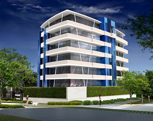
A representative of Riverway Properties, the developer proposing a 7-story condo tower on the vacant former site of the River Cafe in Montrose, says a rendering submitted as part of an application for a variance from the city isn’t an entirely accurate representation of the garage wall the company wants to build in front of the sidewalks on Montrose Blvd. and Marshall St. The rendering of the 3615 Montrose building featured on Swamplot earlier this week showed a blank wall at the base surrounding a single-level parking garage on the ground floor, punctured only by a driveway entrance with an overhead door along Montrose. But Riverway Properties partner Michael Carroll says his company is planning either a “green wall system” or an installation by an artist for the wall.
***
One conceptual design for the green wall is pictured in the revised rendering, shown above. But this rendering isn’t entirely accurate either, because it doesn’t show the proposed vehicular entrance from Montrose, depicted on this site plan:
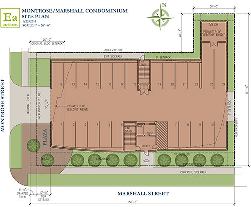
The company has hired the landscape firm of Kudela & Weinheimer “to provide a nice street scene along Montrose and Marshall,” Carroll tells Swamplot. “Additionally, we are in talks with a nationally recognized artist to design the architectural features and the garage wall along Montrose. We hope to create a unique and emblematic Montrosian feature on the building’s first floor façade. Specifically, a feature where people would want to stop by, take pictures, and/or take in as a work of art.”
As Swamplot reported earlier, the developer is hoping to obtain a variance from the city to allow it to bring the front of the building 15 ft. closer to Montrose Blvd. than the development ordinance would otherwise allow. City rules do allow certain developments providing retail space on the ground floor to be built along major thoroughfares such as Montrose Blvd. without any setback at all. But other uses must seek a variance to come closer than 25 ft. to the front property line.
As currently planned, the building would have 2 condo units per floor, each measuring approximately 3,000 sq. ft.; each would have a private entrance from the elevator.
- Previously on Swamplot: Latest Condo Building Planned for Former River Cafe Spot Offers Montrose Blvd. a Garage Wall Streetfront
Rendering: Riverway Properties. Site plan: Element Architects


Lipstick on a pig.
most all homes in this part of town refuse to properly maintain their own sidewalks and curbside frontage creating countless endagerments for elderly folks and baby carriages that can be found constantly rolling right down the middle of our dangerous streets and yet everyone gets in a fit about a wall facing a sidewalk. i’d gladly take a wall next to the sidewalk over unmaintained plants smacking me in the face or causing me to abandon the sidewalk altogether because the owners were too cheap to buy a home with adequate green space or bother to maintain it.
i know a wall is ugly, but it’d still be a vast improvement over what a large percentage of property owners consider to be acceptable in this part of town.
Can’t wait to see this ’emblematic Montrosian feature’. Let the speculation begin!
OK, but it’s still a freaking wall.
This reminds me of the other townhomes around montrose. Almost all glass exteriors on multiple levels but surrounded by a 10′ stucco fence.
We like looking at you, but don’t want you to be able to get near us. Not so much of a ‘nice street scene’ but more of a surgery room with an observation deck. But like I think of all the Urban Living, Croix or whoever new builds, I wish they came with a note that said, “Thank you for moving to the neighborhood with the most character in Houston. And building something completely void of it.”
This is one of the few places in Houston with rules about development. How about the developer who bought this piece of land knowing those rules, actually builds following the rules? Either build retail on the first floor or shrink your building.
They should not give a variance. Otherwise every other developer will want to do the same thing and destroy the character of Montrose.
This is new to me. I have never been satisfied with any proposed justification of the excessive 25′ setback. I think every building should be allowed up to the sidewalk (future sidewalk if their are current plans to widen). But, what is the possible justification if it is only required for non-retail? What are the “certain” retail development that are allowed to build up to the sidewalk?
DD,
Because the setback requirements are ridiculous on their own, and even more so in an urban setting.
I like that they reintroduced the median with planting. Where is the guest parking?
I think it looks great. I love it.
What would you rather see, another Tuscan boring-ass cheap, shoddy build?
I mean, really, people. Get into it.
Kind of looks like where the Micronauts would live.
There’s already plenty of ground floor retail in Montrose–putting some here is unnecessary.
Uh, yeah –no to the variance, the rules are there for a reason and this building is hideous. It looks like some kind of cheesy “futuristic” building you would have seen at some expo in the 60’s–just awful.
I like the green wall, and I like the building too–I agree that it’s at least not some Tuscan tragedy or Lovett homes nightmare. The only thing that worries me is having one elevator, even though the building isn’t super tall. If it goes out the people on the top will not be happy. Guest parking will be an issue but at least two spaces per unit is fair as long as there are no more than 12 units.
I like the wall. Too bad about the ugly building.
“no to the variance, the rules are there for a reason”
I am starting to feel like a broken record.
The R.O.W. already extends ~10′ from the curb, in the Major Thoroughfare Plan Cross-sections. What is the justification for keeping buildings 35′ from the curb.
10′ is not an adequate distance from building face to curb in a pedestrian environment. 20′ from the curb (which they are proposing) would be fine if there was going to be some retail or pedestrian use.
If you don’t agree with the setbacks then how about proposing an overhaul to the development guidelines so everyone can build closer to the street. Why give a variance every time? Why even have any rules if they don’t need to be followed?
The developer just wants to break the rules so he can build a bigger building than is allowed without having to deal with the retail component. So allow the developer to break the rules just so it only benefits him and not the community? We all have to share the same environment, so we all should get a say in how our world looks, not just the ones with the ability to develop.
I’d rather have a green wall near the sidewalk than a surface parking lot in front of the building.
10″ is not adequate in a pedestrian environment? And exactly why is that? This isn’t exactly Manhattan with thousands of people walking the streets daily. That gives more than enough room for 3-4 people to work side by side. The Chinese Consulate up the street is certainly as close and it hardly makes a difference in walkability.
I’ll let someone else tackle the statement about “we all have to share the same environment, so we all should get a say in how our world looks, not just the ones with the ability to develop”. Nice in theory but that just isn’t the way of the world.
“10′ is not an adequate distance from building face to curb in a pedestrian environment.”
So Downtown, Midtown, 19th Street, White Oak, and Westheimer East of Shepherd (disregarding the horrible state of the sidewalks), are bad pedestrian environments?
“20′ from the curb (which they are proposing) would be fine if there was going to be some retail or pedestrian use.”
Why do you believe the extra 10′ of lawn or frontside parking contributes to a better pedestrian environment in the presence of retail?
Why do you believe the extra 25′ of lawn of frontside parking contributes to a better pedestrian environment in the absence of retail?
“If you don’t agree with the setbacks then how about proposing an overhaul to the development guidelines so everyone can build closer to the street.”
I have.
“Why give a variance every time? Why even have any rules if they don’t need to be followed?”
Why have any rules that make the city worse if they are followed?
“So allow the developer to break the rules just so it only benefits him and not the community?”
Following the excessive setback rules harms the community by making density harder, thus making it harder for people to live close to where they want to, and by making the pedestrian environment worse.
JT,
Even in Manhattan, or at least the areas I was in, the setbacks/sidewalks were about ten feet.
The City’s Transit Corridor Ordinance, while not applying to these stretches of street, attempts to quantify a sidewalk width standard for pedestrian-friendliness in terms of a building’s distance from the sidewalk. That amount is 15 feet back-of-curb (regardless of how much right of way falls outside the curb, unless it’s more than 15 feet). The reason for that amount is to make enough room for: (1) a 6-foot continuous “clear zone” free of obstacles that would be the main walking path; (2) street trees – we want shade, but trees also function as obstacles; (3) other public right of way obstacles and fixtures (like the utility boxes and telephone poles everyone complains about); and (4) amenities like benches, cafe seats, waste receptacles, lights – I call them amenities, and they are, but they also can be obstacles. I personally would have been willing to shrink the required width to 11 feet or so if the building provided awnings in lieu of street trees (of course the awnings can’t encroach into the right of way, at least without a special permit).
Note that all of these standards would apply whether the frontage was retail or not.
So the developer, upon facing a backlash for creating a deeply unfriendly and un-urban frontage for their building, rushes back to the architect. “Quick, get your best $9/hour intern to photoshop in some ivy on that wall. That will appease the stupid residents of Montrose.”
Doesn’t change the fact that the prison wall they propose is in no way pedestrian, urban, friendly, or good. Until the city encourages development of ground floor retail and holds projects to setbacks etc, we’ll be duped by penny-pinching developers.
Did I honestly just read someone that said that a building looks like some futuristic building from the 1960’s like it was a bad thing?
I’m hoping that this style modern does not start a trend of demolitions of what little we have left of traditional bungalows in the midtown area. ….of course we all know how Montrose is already diverging from it roots as a cozy human scale bungalow enclave to a Los Angeles style 3 story disproportionately huge modern teardown district. For heavens sake this belongs on a cliff overlooking Topanga Canyon where it can sit, by itself , in the bushes.