
The Menil Collection released details of the low-slung design L.A. architects Johnston Marklee have put together for the new Menil Drawing Institute, which is being touted as the “first freestanding facility in the United States created especially for the exhibition, study, storage, and conservation of modern and contemporary drawings.” And staring at the renderings, the institute’s future sure looks bright. There’s the bright exterior walls, lit by the Houston sun; the white steel-plate roof that’s supposed to look like it’s hovering over the building and 2 surrounding courtyards — “rather like a folded sheet of paper,” in the architects’ words. But the inside of the building, where the drawings are displayed, it’s going to be dark.
***
That’s for the drawings and other works on paper on display, which are typically extremely sensitive to light. So the entrance to the MDI is meant to bring visitors into the dark slowly, in sequence — with the tree canopy, some shaded courtyards, and then the public spaces inside, which will provide diffuse sunlight and artificial light surfaces concealed in creases of the walls and ceiling. “Upon entrance to the gallery,” explain the architects, “90% of the exterior sunlight has been filtered out through the architecture, and visitors can seamlessly adjust to the low light levels within the exhibition space.”
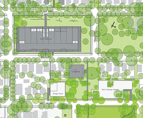
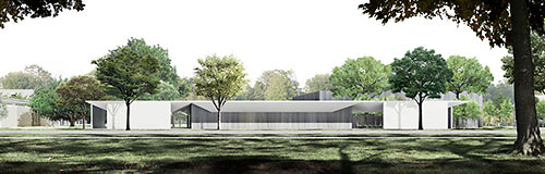
The building will be only 16 ft. tall; it’ll hide behind the row of bungalows on Branard St., a block east of the Menil Collection building. Its street entrance will be along a new section of West Main St. run through what’s now the back third of the Menil’s Richmont Square apartments. Here’s a view of that southern approach:
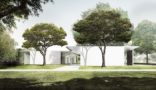
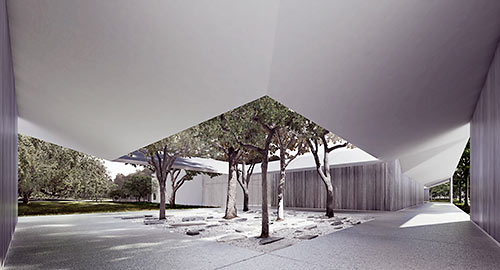
But most of the images released today document the pedestrian approach from the end of Mulberry St., as you might walk south past the Cy Twombly gallery on your right. The image at the top shows this western facade as you turn to your left. As you arrive, you’d see something like this:
Though the walls show up in the renderings as some sort of smooth white surface, the architects explain that the building will be clad with deep gray Port Orford cedar planks; renderings of the material in shaded areas show their vertical orientation.
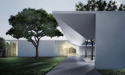
Walk further and this western courtyard comes into view:
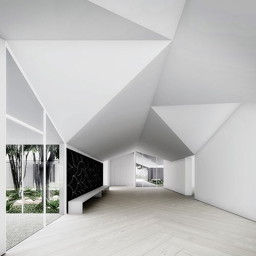
Inside the museum, there’s this partial view of the 24-ft.-by-96-ft. “living room,” along with an area labeled the scholar’s cloister:
The building will measure a total of 30,150 sq. ft., and is projected to cost $40 million. Johnston Marklee is also designing a new physical-plant building fronting West Main St. west of Loretto Dr., which will be called the Energy House.
- Previously on Swamplot: Menil Drawing New Drawing Institute onto ‘Back Third’ of Richmont Square,  Johnston Marklee’s Small, Thin Courtyard Building for Drawings at the Menil, New Menil Building Likely Going South, Replacing Richmont Square: The Low Cost, Bohemian Option, The Menil Looks at Richmond, What the New Collection of Menil Collections Might Look Like
Renderings: Menil Collection/Johnston Marklee


Ugh! Concrete box modern. I saw better designed boxes with impoverished people crowded into them when I was in India. Amazing what people believe is good archecture….
This is so cool. Can’t wait to see Steven Holl’s design for MFAH’s new building.
Looks like a tilt wall light commercial building along the beltway, since when design made with a straight edge and a pencil special?
This look very low key, which is good for the neighborhood. And it seems like it will be good for the art itself, which is the important thing. Museums should be good places to show art. I realize that sounds pretty obvious, but apparently that has been forgotten in recent years, not least by Steven Holl. I’m NOT looking forward to the Steven Holl building. His museum in Kansas City was described by Jerry Saltz as ” all lobbies, ramps, ridiculous angles, emptiness, atria, and almost no art. I walked more than two football fields to reach the art. And this space is three floors tall.”
This is a major disappointment. It’s so unassuming and austere, like a 60’s high school in Loma Linda. Seriously, why didn’t they get Renzo Piano to design the addition? His original building for the Menil is iconic and his new addition to the Kimbel is awesome, far superior to this amateurish design.
I agree, I’m not at all looking forward to the Steven Holl addition, I’ve seen his work in Kansas City–in a word: awful
YAWN!!!!!
WHY NOT LOCAL, and why so vanilla?
Nice. Triggering peace and stillness.
Not everyone can grasp minimalist architecture.
Lol, that’s what they all say when they know a design is underwhelming and amateurish –yeah, you just aren’t enlightened enough to grasp the “minimalist” free thinking of these geniuses–yawn–it’s the same BS people say when you say Le Corbusier was horrid and Walter Gropius was worse. One of my favorite architects is Richard Meier, so it’s I’m hardly adverse to austere minimalist–but give spare me–this building is awful
Seems it will it nicely with the other buildings.
The entire Menil campus is unassuming…. Don’t think a few of the posters have set foot there. This will perfectly fit in with the campus and neighborhood.
@Shannon, have you ever been to the Getty or the High museum? Richard Meier is the king of “all lobbies, ramps, rediculous angles…and no art” his buildings are a menace to art and giant monuments to his own ego! The Getty was so blinding outside that he was forced to accept the texturing of the stone facade. While I will wait to experience the actual building to grade the building, it looks like a nice compliment to the original building and the Twombly Pavillion.
I’ll withhold full judgment until I can actually walk through/around it, but these renderings certainly extend the Menil’s indoor-outdoor motif in a way I find encouraging.
I worked at the Getty, so yes, I’m familiar. I think the building is spectacular –but if you actually read my comment I said that the Menil should have hired Piano, I simply said I was a fan of Richard Meiers work and having had the privilege of working in one of his buildings I can honestly say that I loved every second of every minute. Look, I think the Guggenheim is a cool building, but it’s not the greatest museum for Art either. I think this building is a lazy design and when you compare it to Piano’s work on the Nasher it’s laughably out classed. It’s low slung granted, however it doesn’t complement the original Piano masterpiece–to see a new building work as a complement to an original great building look no further that Ft Worth. This new building for the Menil is underwhelming and frankly a complete bore. It adds zero to the aesthetic of the Menil campus–thankfully it looks as if it will be a bit hidden, like your sisters ugly new baby you try to photoshop out of family portraits.
Shannon, I don’t think you are seeing the references on this building to the main museum and the Philip Johnson Menil house. This is a subtle design for a delicate medium. From what I hear Johnston Marc Lee are very thoughtful and sensitive to clients needs. Just look at their projects and you can see how creative they are at finding solutions. I think this building will unfold over time and use and will become a Houston architectural icon. Mrs. de Menil took at chance at hiring a young French architect in Piano, I think hiring Johnston Marc Lee is very much in this same spirit. And you know JML are feeling the pressure of the Piano buildings legacy.
Sorry Shannon, you’ve done nothing here to change my initial impression.
Stephen Fox, the authority on Houston design, has issued his assessment. He writes that the “museum could easily turn out to be overwhelmingly non-monumental.” You can read the full review of the (original) Menil design here:
http://offcite.org/2012/09/24/stephen-fox-a-clapboard-treasure-house
Just amazing to me how people can judge a piece of architecture without ever having seen it or been inside it’s spaces. All that has been shown are a few crude renderings that many of the posters here have probably only viewed on their iPhone. Don’t tell me that that isn’t juvenile.
I expect that this will be fine and thoughtful addition to the Menil Campus. I hope that I’m right.
Is my math right? $1,326.70/SF WOW.
I like the low-key approach, but I think the renderings are confusing a bit: “the architects explain that the building will be clad with deep gray Port Orford cedar planks” , so a bit more complimentary to the Menil than you would take from looking at the renderings. Still, a bit average looking.