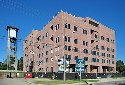
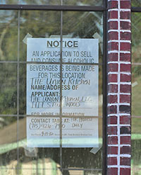
 A ground-floor restaurant spot in the almost-complete 6-story brick condo building at 1111 Studewood St. will be taken by the third location of the Union Kitchen, the Leader‘s Charlotte Aguilar reports. A sign in a window facing north onto E. 11th 1/2 St. indicates a TABC application for that space is currently under review. A broker from Personette Properties says a model unit for one of the building’s 20 residences should be ready for visits by December 1st — and move-ins by the first of the year. 1111 Studewood Place is also working to sign up a fitness facility and a medical office for the building’s office space, the broker says. The building has its own garage; all the condo units are on the top 3 floors.
- Heights close to getting popular Union Kitchen at 1111 Studewood Place building [The Leader]
- 1111 Studewood St. [HAR]
- Previously on Swamplot: Meanwhile, at the Corner of 11th and Studewood, A Rooftop Party Deck Behind the 11th St. Someburger? Those Lofty Earlier Designs for 1111 Studewood Place, Studewood Place: Some New Building Behind the 11th St. Someburger
Photos: Candace Garcia


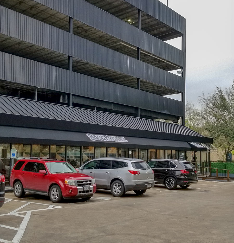
That is one VERY ugly building…
That building is all kinds of ugly! Can’t believe The Heights didn’t oppose this horrid monstrosity.
Hideous. It looks like a bankrupt project from the 80’s.
This building is so ugly, it’s name in Hebrew is Yech! In comparison, the new apartment complexes so many swampies have been complaining about seem like marvels of architecture.
—
On a serious note, I can tell that this building was designed by a crack team of Accountants. Someone got a great deal on that brick first, THEN figured out what to do with it.
I would really appreciate it if somebody could explain the attraction of paying almost a half-million dollars for an apartment in this thing. Low maintainance? No yard to worry about? Is that really it? I don’t see it lasting. If the value of these units doesn’t flatline or go down in 20 years, I’ll be surprised, and the aftermath is going to be one huge, ugly behemoth that nobody is going to want to live near. I feel sorry for the folks who own homes near this thing, I really do. Just horrible.
The “bell tower” amenity doesn’t cure all faults? (People are so hard to please!)
I like the look of all brick…Im sure the heights snobs would prefer it be built out of antique wood siding that would require $2500/month maintenance payments just to keep painted – but then again the heights snobs are never at a loss of words when telling other people what their property should look like. It’s a welcome addition to the neighborhood and when Union Kitchen opens, I for one will be a frequent diner.
Ugly, out of scale, yes. But at least the developers put in some ground floor retail which will be a benefit to the neighborhood. Way too many innerloop apartment complexes are taking the cheap route and building in prime locations (Washington Ave, Montrose, Upper Kirby, etc.) without so much as a coffee shop on the ground floor.
Not a lick of stucco in sight, but everyone’s still up in arms… hard to please is right.
Apparently a few of the units have balconies. I bet they are over half a mil.
It’s the architecture that’s so ugly. I think it would actually be more attractive IN stucco.
That ug-ly building looks like I designed it on a homemade software system and I am no architect.
At least there could be some awnings and a rooftop garden where you see the plants. That might break the flatness up a bit.
Geez, what an eyesore. Just because it’s brick doesn’t mean much when it comes to fugly design.
This will be such an asset to the neighborhood. It will only appreciate over time, just like everything else has in the Heights. There is no evidence to suggest that it will become abandoned building in the future. The Heights is back and home/lot sales indicate that it is extremely desirable and everyone wants to live there.
Define “Almost Complete”??
This thing’s no where near complete.
While the building is just a hulking mass, a little stucco or cast stone to break up the monotony of the brick would have done wonders.
Someone got a great deal on that brick first, THEN figured out what to do with it.
My guess is they got a good deal on those builder-grade, all-one-size windows, too.
it’s no renoir or gotham, but how many similar condo blocks are there like that in the entire country? it looks better than most all other condo’s being developed today so i’d consider yourselves lucky if i were you.
yes, it could look better but then it could end up empty because nobody would want to pay that much to live in a condo in the heights when they could just choose southampton and then we’d all be complaining about a blight in our premises.
i’m sure it’ll offer amenities to an income bracket that couldn’t expect to find anything similar in a similarly priced heights home. at least you guys could be happy we get increased density to raise more taxes for better infrastructure and transit options, but i guess that’s too much of a compromise for the heights folks.
I thought this was going to be a retirement place. Or was that somewhere else, like where the Fiesta was?
@ GoogleMaster – the retirement place-to-be is currently occupied by the not long for us Fiesta up at 13th and Studewood.
@ Al – the bell tower was already there. It was the result of the neighborhood going ballistic over a cell tower going in, and is the disguise for said tower, making it the Ma Bell Tower. And the only ringing for which it is responsible is in your purse or pocket.
Surprised that there are no positive comments about the mixed use design of this building. Seems like every story here talking about new apartments in the loop draws scorn from those who desire mixed use, and excuses from the developer crowd saying that mixed use isn’t economically feasible. So here we have, at a commercial intersection in the Heights, a mixed use residential/office/restaurant development and 17 comments without anyone talking about how wonderful mixed use is.
I will say that’s not the most attractive midrise I’ve seen put up in this city though…the new buildings over by San Felipe and Mid Lane are a nicer style to me.
@Shady: See comment no. 8.
@Joel: No, it is ugly and it would not cost much to have designed it with a little trim here and there to keep it from looking like a reform school in Gary, Ind. from 1940. I think the developers thought that it would have an “old meets new” look that would appeal to younger style conscious people with money to burn. But, the final product falls flat on its face.
Mixed use doesn’t make a silk purse out of a pig’s ear project. Houston has plenty of mixed-use buildings all over town with occupancy above and vacant store fronts below — because it means little in Houston’s car-centric culture without lots of free parkign visible from the road (and that cuts against the effect the new urbanism is going for). Plus, you can’t depend on your renters or owners to sustain the stores within the mixed use. As much as everyone at West Ave might wish to shop exclusively at Tootsies, they probably can’t afford to. Rents from mixed use make a project look better to the banker funding it, but that doesn’t mean those storefronts won’t be vacant or boarded up five years into the project.
Shady, #8 pointed out the mixed-use. I think the building looks like a really boring factory.
I have lived 2 blocks from this property for 13 years. Prior to the construction of this building, it was an over-grown lot of broken concrete, 18-wheeler parking, and a handful of 55-gallon drums full of who-knows-what. While I am not interested in living in such a building, it is on a commercial thoroughfare, provides mixed commercial/residential, and provides enough parking to keep people from parking in front of neighboring houses. what would you have done differently?
If I may answer Galaxie’s question–and until March of this year, I also lived a few blocks from this thing–it seems to me that developers might take some cues from the other commercial buildings in the area. I guess it is something of an aesthetic question, which I think is perfectly legit, but this monstrosity bears no resemblance to any of the historic structures within the vicinity. Will the trend in the Heights be toward these kinds of structures? I’m all in favor of mixed-use development, but is a six-story structure really appropriate here? Is preserving the old character of the neighborhood important at all? Maybe not. I live in Oak Forest now, so maybe my opinion doesn’t matter anyway. I can say that I have a pang of nostalgia for the old neighborhood, but driving by this thing a few times a week is helping me get over that. I guess my biggest complaint is this, though: would other neighborhoods, with perhaps stronger deed restrictions, allow this kind of thing? Why should older communities like the Heights be forced to just put up with it?
This project got a Building Permit without anyone really hearing about it. That’s what happens with NO zoning, and you can’t hope for Deed Restrictions to always be in place. Yes, it’s ugly and banal. Sounds like there is also some office space above the retail as well (“condo units are on the top 3 floors”)? If you looked at the early renderings, it would have been a LOT better looking. Clearly there was some “value engineering” done to make budget work. I think the rooftop pool is still in the deal though.
Old School, my apologies for missing your commentary as I was scanning through these at lunch.
As far as the design goes, one of the regulars on here has said before that Houston often just has to settle for “it’s not too bad, and I guess it could be worse” design.
And I agree with Galaxie that it is better than the drums of unknown waste that sat there several years ago. That’s Houston for you–truck parking and maybe toxic waste in the middle of a neighborhood of $300k+ homes.
I kinda like it. I bet it will look better once complete… It is much nicer looking than the neighborhing nearly falling down rotting strip center business. I also prefer this to the newish apartments on Yale. This building isn’t complete yet either.
I think it’s a great building. Someone here said it looks like an old factory. Well, that’s just perfect for The Heights because it looks like an older building was repurposed into loft apartments. I think the brick is appropriate for the era and the clean lines lend to an era gone by. It will look great once all the construction is complete. Can’t wait to take a tour.
Could be the younger, taller brother to the AT&T building.
I don’t especially like it but I can see where some would think that it belongs right where it is.
To the first few comments stating “monstrosity” and “ugly” I suggest you visit the corner of Michaux and Euclid in the Heights if you want to see UGLY new construction.
This building is uniquely Houston. That alone makes it beautiful to me.
The way it towers over its adjacent landscape and offers nothing to break up its plain brick facade and identical windows, it reminds me of the “projects” (like Cabrini Green) on the south side of Chicago. The street level retail has got to be really inviting to counter the bleakness.
It is not that bad.
Also, the windows aren’t all one size. Look at the third window to the right of the corner.
I’m not saying it’s beautiful.
It is unfair to criticize an incomplete building. If you hate it when it’s finished, fine, but at least give it a chance. The developer is obviously trying to make it fit in with the neighborhood, but to make financial sense it has to be big. Expect more tall residential projects in the Heights – the area is too hot and too expensive for it not to happen.
I applaud the developer for being willing to put a lot of money at risk to make this happen.
I’m not sure how they’re planning to make it look better. If there were any windows surrounds, stone caps, or embellishments, they would have been built into the brick wall. Unless they do a lick and stick later OVER the brick.
—
In my opinion this does not look at all like this was the INTENDED look, it’ just the way it happened. In Soviet Russia, this is an apartment block.
@ Bill B – well said!!!
Will this building ever be finished???
we ride by this building at least 3 times a day, and our concern is will it be finished soon. there have not been any workers there in awhile. it’s too late to whine about the design, plus there are lots of ugly houses and bldgs in this town and people live in them just fine. the mixed use bldg idea sounds interesting but what about the parking situation. As it is now, Liberty, Da Capo, Someburger and the new Ruggles have limited parking. the developer must have convinced investors the project was a good idea and they will be able to sell 2BR units for 430,000. the property taxes and maint. fees will be high for this place too. where are all those well qualified buyers ?
I signed up to be contacted about this building, but nothing from the realtors. Something is holding up the works. Don’t know if they will be able to get the $450K they are asking for these. Does anyone remember what the starting prices were for the Flood Condos at 102 Quitman? You know, that building you won’t be able to get home to during the next heavy rain.
Doesn’t appear to be nearing completion and we are in Feb…Does anyone know if anything is holding this project up?
It slipped past me in my original reading that this is intended to be condos. Condos just do not do well in Houston and often end up in foreclosure (old Gulf Publishing location, plus Yupon at Westheimer) or re-partmented (Mosaic). If you want a place in the inner loop that’s new, shares walls, and requires little weekend maintenance, you’d be better off with a town home. At least you have a chance of reselling a town home when you’re done with it. But who wants to buy a used apartment in Houston?
Old joke from the ’80s that still works:
Four words. Which one does not fit, and why?
AIDS. Herpes. Gonorrhea. Condominium.
Gonorrhea – because you can get rid of it.
The Union Kitchen restaurant lease negotiations for 1111 Studewood were terminated last fall. The Leader’s Charlotte Aguilar “jumped the gun” in saying this was a done deal. Nonetheless 1111 Studewood is moving forward these days. The first condominium models will be ready to preview to the public in less than 6 weeks. They will prove the doubters on this board wrong as they are some very cool units with high ceilings and really attractive build-out. Several restaurants are presently vying for space on the ground floor of the building; although it’s too early to get specific.
Darn shame. I would have liked to go there, I love UK, however, I hate that building and everything it stands for. If you can’t do like Liberty Kitchen, Ruggles Green, Lola, Down House, Sale Sucre, D’Amico’s, et al, meh! You should have gone over by Walmart along with the other franchises.
What do I hate most about these developers? They benefit from the view from their development without one iota of consideration for the view in return.
What’s the scoop on this ulcerous eyesore? Here it is almost July 2013 and we still have plywood in the window frames. Anyone have a clue?