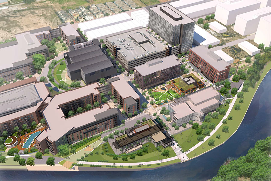
DE-MAD-MEN-IZED DOWNTOWN EXXONMOBIL TOWER REMINDS ME OF MY DOCTOR’S OFFICE, COMPLAINS CHRON COLUMNIST Lisa Gray, already on record as a non-fan of Shorenstein Realty’s plans to remove all the distinctive sun-shading fins from the soon-to-be-former ExxonMobil Tower at 800 Bell St. downtown (and incorporate all the space they occupied into the floor plates), says the sleek new video (with only semi-robotic, live-action scalies!) put out by the San Francisco real estate company (embedded at right; click in bottom right corner to see it full-screen) reveals that the renovation plans for the building are “even worse than I thought.” What’s the problem with removing what’s left of the building’s Mad Men-era accoutrements, and sheathing the recaptured space with shiny glass? The video shows that Downtown architecture firm Ziegler Cooper’s resulting design will be “a dead ringer,” she claims, for the Memorial Hermann Medical Plaza tower at the northern tip of the Med Center at 6200 Fannin. That building was designed by the firm’s Uptown-ish rival, Kirksey Architecture. [Houston Chronicle; previously on Swamplot] Video: Transwestern


That was an excellent marketing video; however it cannot possibly be like Lisa Gray’s doctors office because there are no fat people wandering around.
The old Humble Oil Tower has always been Houston’s coolest mid-century modern, it’s really a shame that it’s being stripped down and neutered like Jon Hamm being forced to dress off the rack at Wal Mart. What’s next?– Mies’ Brown Pavilion?–I can just see the blue glass now. I was really hoping this would all fall thru, but alas it seems they’re determined to ruin this beautiful building. NYC and Chicago have respect for their Mid Century Modern skyscrapers, it’s a shame Houston, as usual, is tone deaf. When in 20 years people start really appreciating this style it will be too late, it will all be gone, long replaced by some blue glass Zeiglar Cooper “Masterpiece”.
Is Lisa off her rocker? The Exxonmobil tower is one of the biggest eyesores in Houston and the animation of the renovation looks to be a huge improvement!
As grumpy cat would say: “Good”
.
This building is ugly.. glad someone is finally doing something to fix this crooked tooth in the middle of the city..
Well, he’s right.
Retro one of the hottest things going. Mad Men. Suits. Drinks. Business.
What is Houston going to do?
The one prime example of the great modern 60s and we are going to watch some stupid (probably out of town) developer develop it to look like a stupid 2nd rate re-do nothing.
Sad Houston.
I was in the Petroleum Club about two weeks ago. I had not set foot in the building in about twenty years. The building is really decrepit. I imagine that the utilities and telecom infrastructure are completely out of date as well. The new building curtain probably is being installed to reduce utility bills and to increase rentable space on each floor. This is important because some rentable space will be lost on each floor as they update the telecom infrastructure. Newer office buildings have taller mezzanines between floors to run the cables and ducts. They can’t increase the mezzanine volume on an extant building so it will have to come out of the floor volume and off the floor space.
Those “sun-shading fins” are useful. They block sunlight and lower cooling costs. I’ll miss them.
Never seen so many white people in an office building like that.
For once I agree with Shannon! We do not need one more non-descript glass rectangle in Houston, and it does look like MH Tower in the Med Ctr. There is nothing ugly about that building. It is a wonderful statement to a previous era of architecture. One day, the young’uns on this site will be complaining about all that ugly early 21st century crap put up during the last energy boom. Ugh! The bland sameness of it all!
Mid century masterpiece? I don’t think the old Humble Oil building should be compared to a Mies building by any stretch. The only admirable architectural quality of this building is that it does have some passive shading devices. However, large horizontal overhangs really are only effective on the Southern facade. The video mainly shows the North of the building which has no need for the shading devices. Hopefully ZC is designing in something for the South and West facades….
What it should be compared to is the old Park Towers on the west Loop. Remember those dated, arched eyesores? the were renovated with nice new glass curtain wall, which may not win any design awards but is certainly an improvement over the freeway exhaust stained concrete.
Also, least we forget, this is all driven by money. And lease space = money. And in the case of the Humble Oil building and the Park Towers, by infilling exterior space you add lease space thus you add Money$$$$.
Eric, downtown Houston skyscapers are full of “white” people, take a stroll into Wells Fargo sometime~
What’s up with all the dudes in dark suits with dark shirts? Are they projecting the new 800 Bell to be the center of douche baggery in Houston?
To all the Lisa Grey’s on this site, all you people who comment about architecture thinking architects actually have total control over what a building looks like… here’s some reality for you. First, stop thinking Howard Roark’s approach is ever happening, I mean ever. The architecture “design” industry only has a job if there is a paying client. Paying clients that own and maintain skyscrapers typically know what will and will not sell space and beyond them, office-space brokers know even better. The options for ridiculously outdated buildings like the ol’ Humble are demolition or complete and total renovation. I know a lipstick job on that building wouldn’t have me biting at the chomp to lease space there and I love mid-century modern. Fact is, I need a decent lease footprint to accommodate the modern open-office style of today and the needs outweigh the wants every time. Beyond that, if Don Draper were doing business today – he’d be doing it from a balcony on a blue-glass building, pack of Luckies in his pocket and a glass of scotch in hand over the rail.
I think the design is kind of cool but the problem is they’re using the same color glass as every other new building. All it needs is some contrast. This rendering found here: http://farm4.staticflickr.com/3732/11120495416_af3b013742_o.jpg looks great.
@actualarch: I had no idea that those towers used to look like that. The look is certainly cleaner and updated, but some character was definitely lost.
Interesting fact: This building was the tallest West of the Mississippi River when it opened in 1963, surpassed 2 years later by Dallas’ First National Bank Tower.