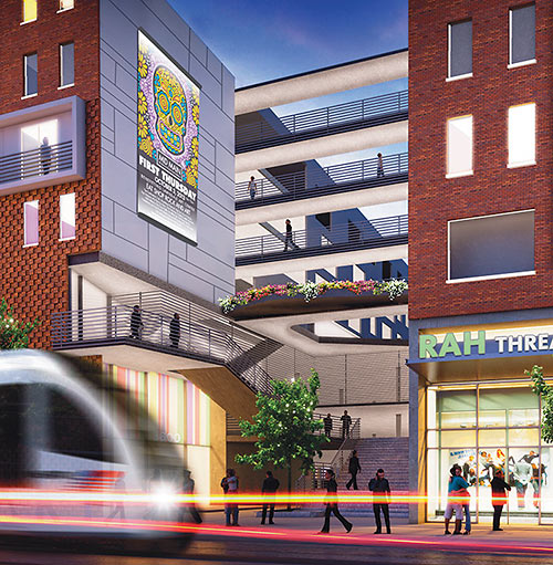
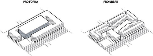
Architect Rob Rogers tells The Architect’s Newspaper how the Mid Main apartment-and-retail development he’s working on for the 3500 and 3600 blocks of Main St. in Midtown will break the mold behind the typical garage-wrapped-with-apartments scheme, which he calls the “Houston Wrap”:
***
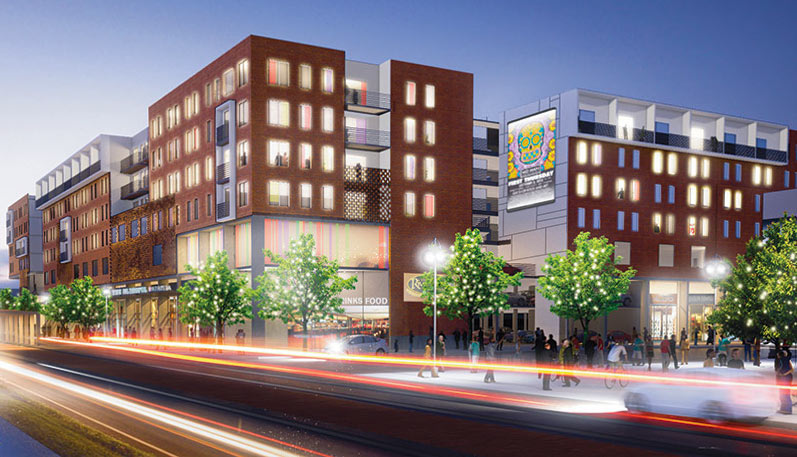
The goal, explains writer Meghan Hendley-Lopez, is to open up the project’s central courtyard spaces to the street: “Activity on Main — whether it be passing vehicular traffic or pedestrians visiting the surrounding businesses — will be visible to residents, while passersby on the street will be able to see what is going on in the community spaces of the multi-level development.” Another goal is to extend Midtown’s lone typically bustling blocks of activity — home to the Continental Club, the Big Top Lounge, and Natachee’s — to reach a couple blocks north, and to connect it all the way to the planned site of Midtown arts facility MATCH.
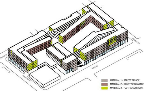
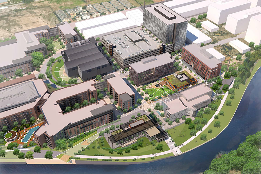
To do that, a lower-profile parking structure will splay over a larger area of the site than is typical; its top will serve as a podium and courtyard surface that overlooks the neighborhood in spots. Openings and entrances in the street-facing sections are aligned with the street grid, says Rogers, who’s firm, Rogers Partners, is designing the project with architect William Cannady and Gensler for RHS Interests. The major public entry to the development, which will include 30,000 sq. ft. of retail space, will be directly across from the Ensemble/HCC rail station.
Inside the complex, which Rogers calls Houston’s first real transit-oriented development, apartments are organized to avoid long interior hallways and encourage interaction between neighbors and podium-level retailers. There’ll be plenty of balconies too.
- Mid-Main Movement [The Architect’s Newspaper]
- Midtown’s latest mixed-use development to break ground next quarter [Houston Business Journal]
- Previously on Swamplot: Big Plans Around That Rail-Riding Midtown Development Emerge, A Look at Plans for a Train-Centric Development on Main St. in Midtown
Images: Rogers Partners/RHS Interests


They get points for that Uncle Charlie poster in the mock-up alone.
Great. When’s it breaking ground?
The referred-to bustle is due south of this site.
@detroux: You’re right. Wording wasn’t clear, so we’ve adjusted the sentence.
My main concern here is whether or not Rah Threads can survive in a market so decisively dominated by Bork.
I think they identified a nominee for the 2013 Swampie for design cliche: The Houston Wrap.
Soooo much potential in Midtown with projects like this going up. It is very exciting to finally see developers recognizing that they can add value through architecture that helps build connectivity instead of the usual rote-like development of strip mall on one block, Houston Wrap on the next (ooooh, I really like that term).
Really like this design. Been lurking around Swamplot for a while and a lot of people complain about the lack of originality on every new complex that is being planned. This design definitely should satisfy those wanting a change and hopefully encourages another developer to stay away from the “Houston Wrap”.
Here is another picture of how the development will lay: http://rogersarchitects.com/wp-content/uploads/2013/07/3-splayed.jpg
It’s not just a Houston thing. It’s called a Texas Donut and that term’s been around for years.
Very exciting. I look forward to seeing how this plays out!
Can’t wait for this project to start. This shows that some developers actually do care about their surrounding urban context and know it’s just as much about the surroundings as it is the actual building. Rents will probably be crazy high though and the only ones who will be able to afford it are the petro engineers who get their rent paid. Mid Main does show though that there is a large demand for this type of development and only when supply increases will these places become more affordable.
Looks nice. Can’ help but think the Snohetta designed transit station would be a better fit here. Just a thought. Also I’ve heard MidMain is developing a office tower as well across the street has any one seen those renderings? Probably time for Ensemble Theater to consider a new Building/Design as well. You see what can be done with a little vision? peace
I am excited for this development and the renderings look pretty.But after reading about how the architect is breaking the Houston Wrap mold, I fail to see what is so innovative here. The architect drew the interior apartments on a slope? Broke a section of apartments off to go East-West (instead of North-South) next to Natachee’s?
“while passersby on the street will be able to see what is going on in the community spaces of the multi-level development.â€
I’ll be able to watch people swim from the sidewalk?
The term “wrap” is not exclusive to Houston or Texas. It’s a common theme in many parts of the country where standard garden-style apartments with surface parking do not allow enought density to make the project economics work.
Of course land prices in Midtown have already forced developers to go beyond wrap. A wrap design for this site was likely tossed out on day one. “Podium” style (all units built over the concrete parking structure) is the next step up the density ladder. For the architects to compare this project to a wrap is misleading.
An example of a “podium” style apartment complex can be found next to CityCentre on Queensbury. The garage is a concrete structure, with 5 levels of living space above. This structure is close to being completed.
While being crazy excited about this project, I just hope that the area still maintains its funky vibe. My hope is that the developer does his best to keep rents down to allow even more artists to move into the area.
Ill be excited only when they break ground.