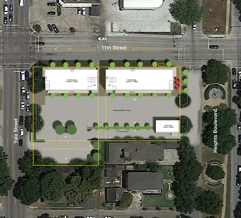
Fresh from the architects (Kirksey), here are revised plans (above) for Heights Central Station, the retail-and-office center MFT Interests is planning for the site at the corner of Heights Blvd. and 11th St. (and Yale) in the Heights where the former main post office for the Heights still sits, awaiting its fate. And whaddya know, the strip-mall-style parking that in the previous plan for the new development was shown fronting Yale and 11th St. has now been stripped away, allowing twin 10,000-ish-sq.-ft. 2-story buildings to front 11th St., right on up to the sidewalk:
***

A standalone 1,200-sq.-ft. coffee-shop-type building is shown fronting Heights Blvd.:
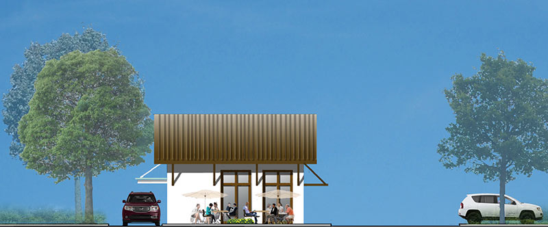
And the parking lot is in back:

- Previously on Swamplot: A Peek at What’s Up Next Once the Former Heights Post Office Comes Down; Newly Freed Up Yale St. Post Office Now Being Romanced from Heights Blvd., Too; A Last Romance for the Yale St. Post Office; Jilted Heights Post Office Spot To Move On as a New Mixed-Use Lowrise Complex; Last Chance Looms To Mail On Yale; USPS Now Says It Will Close and Sell the Heights Post Office; This Could Be the End of the Heights Post Office
Drawings: Kirksey Architecture


Purple City doing work – first I-45/pierce elevated, now this. The coffee shop is stupid. Nothing says classy like a line of cars idling in a drive-thru line for coffee or chicken nuggets.
This is a great move. More street frontage retail is necessary in this city. Got to create a sense of place!
Drive thru coffee shop is brilliant for this area. And I dont drink coffee.
Have the architects looked around that neighborhood? the design does not compliment nor adhere to the quaint, historic, and eclectic style that is what defines the Houston Heights. – Too bad :(
The original design had the line for the drive-thru turning north, parallel to Heights Blvd. This version is much better and keeps the drive-thru line pretty hidden from the street. I would imagine that the folks behind the coffee shop have seen the dozen plus cars in line at the Starbucks drive-thru and Yale at I-10 every morning and want a taste of that action.
I think this redo was largely in response to the first run at a COA from HAHC. It is a huge improvement. So, on Yale St., you will see the very stark contrast of life in the historic district with this project getting a much needed nudge to a design more consistent with the original neighborhood and Terry Fisher’s monstrosity a few blocks down on Yale St., which would have never made it past HAHC had it been in a hsitoric district.
Leslie, they probably looked around and saw hundreds of 3k-plus sq ft, Faux Craftsman, Faux Victorian, Faux Colonial, Faux Historic, etc., “bungalows”, that have replaced (or bastardized) most of the real Craftsman, Victorian, Colonial, Historic bungalows and realized that the Heights “style” is all fake anyway, so why bother replicating more Faux. They instead designed a building that represents its own era, 2016. Too good. :) Don’t fret, in 100 yrs, this will be “historic” too.
@Leslie. You’re right. It isn’t nearly as trashy and undistinguished as most of the existing structures on Yale. What were they thinking?
If it looks like a duck, quacks like a duck, why would you call it a faux duck?
Wow, like a real city and everything. I like it.
While not perfect. Much better. Thank you to the developer for listening.
there are a line of about ten beautiful oak trees along 11th street that will be taken down if this scheme is implemented. bad planning and total disrespect for the beauty of the heights.
While I wish it had a little more heights funk, I’m still stoked that the developer revised the plans to move street front. At least it doesn’t look like ever other boring stip mall. Now be a good neighbor let the students at Hogg paint a mural on the side….
Be a really good neighbor and save the trees that are already established!
“Heights funk”? Please, the heights, as is above mentioned, has turned into a contrived dog and pony show. A mural by elementary students doesn’t do anything except placate your NIMBY little hearts. You can’t generate character on demand.
Works for me.