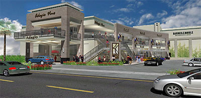
And here it is: Weingarten’s two-story replacement for the northwesternmost River Oaks Shopping Center building at West Gray and Shepherd the company tore down last year.
One goal of this design seems pretty clear: Build a wedge building that helps forge a split between the two tiny groups that might otherwise join together to raise a stink about Weingarten’s larger redevelopment plans for that shopping center, the River Oaks Theater across the street, and the Alabama Theater Shopping Center further south on Shepherd. Preservation-preferring sentimentalists, ready to grumble that this isn’t the curve you expected or the black-and-white Art Deco-ish look you wanted, say hello to your design-elite friends, who are already breathing a sigh of relief that the new building at least isn’t going to be fakey retro. No, it’s not the cleanest Modern thing they’ve seen, but they know it’s the closest they’re likely to get from Heights Venture Architects. Look, Ma! No cornice!
There’s no sense catering to that second group too much though, because Weingarten will need them to be somewhat dispirited so the rest of the strategy can work. No, this wasn’t the wedge we expected, but hey, it’ll do! And it’s sure to draw attention away from the parking garage. Now remind us why we wanted to save that theater again?
After the jump: Close-ups! Site plans! Come back, Jamba Juice — all is forgiven!
***
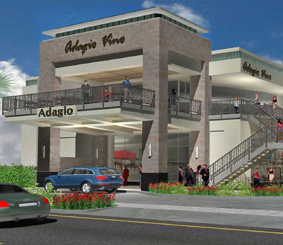
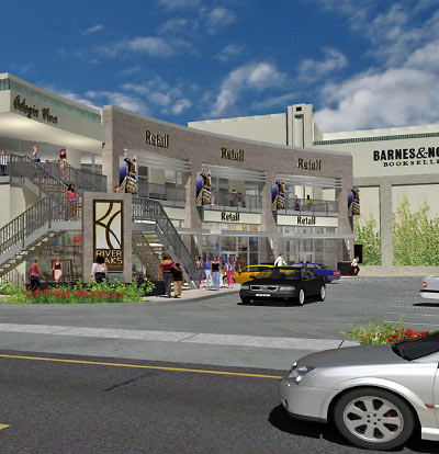
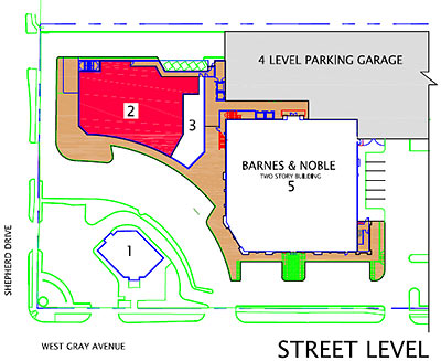
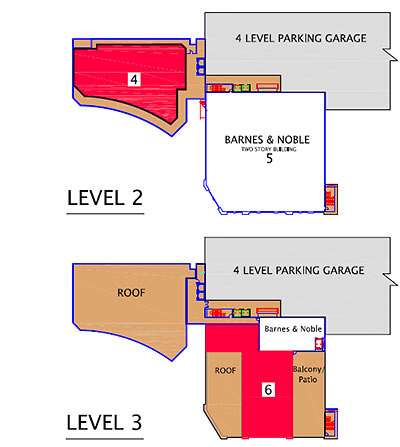
- River Oaks Shopping Center [Weingarten Realty]
- Daily Demolition Report: The One Where the River Oaks Shopping Center Goes Down [Swamplot]
- How To Demolish Houston Landmarks [Swamplot]
- That Enormous Parking Garage Behind the River Oaks Shopping Center [Swamplot]




Well, I guess I can be pleasantly surprised in that it isn’t every bit as ugly and soulless as I expected it to be. It’s actually more so.
*gag*
No taste. No intelligence. No sense of beauty. No sense of urbanism. Total hack work. Belongs in the San Fernando Valley. Or Sugarland.
What’s with all the Audi’s in the rendering? I drive an Audi, and I have better taste than that!