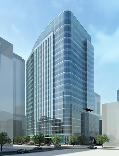
Corner views of the 23-story office building Hilcorp has been planning for the now-rubble-filled site of the former Foley’s (and more recently, Macy’s) retail box on Main St. between Lamar and Dallas surfaced on a few websites last week. The drawings of Ziegler Cooper’s design show a glass-faced structure doing the half-podium trick, blending 7-or-so garage levels into the main tower shape on one side, but letting it stick out on the other. That “other” side faces Main St.; on the Travis St. side (pictured above and in the last rendering below), the hide-a-car floors fit into the building’s northwest-facing curve, which pulls back to make room for a vehicle drop-off driveway loop and a couple of corner plazas. But what’s happening on the rail side?
***
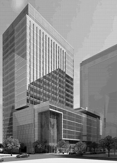
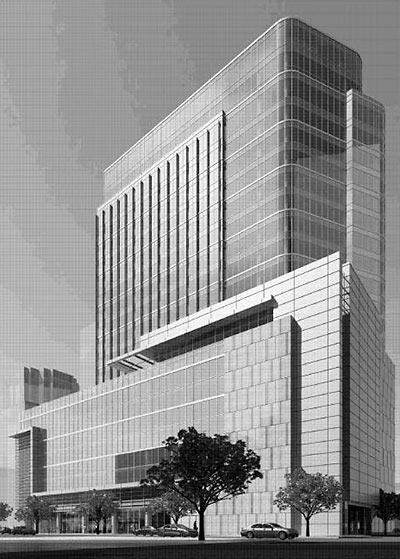
The lines are straighter here. Are those possible retail spaces facing the Main St. Square light rail station? The renderings don’t make it entirely clear what’s meant to go at the base of the Main St. garage stack, but a note on the site plan indicates an eagerness to widen the sidewalk (tellingly labeled a “pedestrian walkway”) if that block of Main St. succeeds in kicking out cars altogether. On top of the garage, there’s a roof terrace closer to Dallas St. and a “multi-purpose room” closer to Lamar.
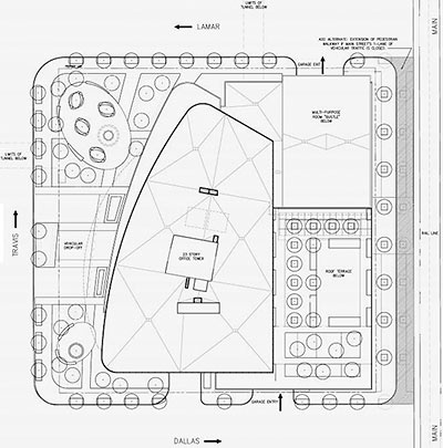
Meanwhile, standing in for Foley’s window displays, a sizable sculpture-ready plaza at Lamar and Travis will allow panoramic views of the 3 other parking garages already facing that corner.
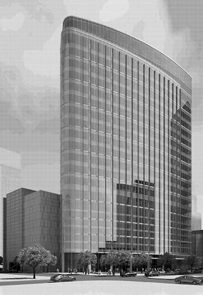
- Hilcorp’s Super Secret Tower? [Going Up City]
- Macy’s Downtown Redevelopment [HAIF]
- Previously on Swamplot: You Can Watch the Macy’s Implosion, But You Can’t Stand Here, Metro Taking Cover Now that Macy’s Implosion’s Impending, Taking Chunks Out of the Downtown Macy’s, Hilcorp Shows Employees the 20-Story Tower Replacing the Downtown Macy’s, A Few Last Looks at Macy’s,Macy’s Downtown: While Supplies Last!, Mayor Parker Announces the Death Sentence for Downtown Macy’s Building,Macy’s Announces It Will Close Downtown Houston Store, The Mostly Glass Building That Won’t Be Replacing the Downtown Macy’s
Site plan and renderings: Ziegler Cooper Architects


The big boats are docking further up the ship channel these days… I like it! Thank you for covering up the garage, my personal pet peeve.
I think they should put a park or plaza in the old Macy’s space. The openness of it really uncovered some hidden beauties (buildings) surrounding the area. Specifically the building on Dallas.
….but, the new building’s rendering looks pretty cool so I can live with it.
I like the sleek design and the effort to attractively deal with the necessity of parked cars. The price of land downtown seems to be taking care of the blight of surface lots. The future streetscape will look a lot more attractive and organized.
The NE corner of Main and Dallas can get pretty rough… Smart to position the plaza on the other side.
Proportion wise I think the tower would look much sleeker at least with another five or seven floors up there. The confusing and heavy massing on the street calls most of the attention out on this attractive building but hardly a tower.
Meh.
So, by putting the garage facing Main St., are they planning a quasi-setback to allow more sunlight onto Main Street Square? Or did they plan to turn the “tower’s” back to Main and instead have the front door on Travis?
I also wonder who they plan to market the office space to? Law Firms? It doesn’t seem to have more than maybe 400K square feet, so you’re not going to attract a multi-national corporate headquarters.
Either way it sucks that the Macy’s building is gone. But this does look sleek-ish. If it doesn’t have retail on Main St, I think I’ll hate it then.
ShadyHeightster,
Hilcorp is building it for their own corporate headquarters, so they won’t be marketing it to anyone.
I’m disappointed, this was an opportunity wasted. With all the uproar over the filth and loitering around the Main St Square Station and the lofty proposals to transform Dallas St. this design and layout missed the mark. What we needed was a sense of openness with a public plaza, a combined Metro Rail station, access to the tunnel, retail and offices with a parking garage on Travis. Though sleek, it continues our love affair with blueish-gray glass buildings. I would venture to guess the city, Metro, Center Houston and the Downtown District applaud this as renewal. However it seems the heart of downtown will continue to encourage the homeless to gather and visitors to avoid the area all together. As having the misfortune of being a homeless veteran for some years, I can honestly say the way to discourage the homeless is to increase the foot traffic. Something about crowds that even makes the wildest of predators think twice. Instead we get a garage next to Main to go along with the other 10! within a block or so of the site. So Main remains dark and void of destinations, the perfect breeding ground for panhandling. Hilcorp should reevaluate their plans, doesn’t make much sense to me to take one of the most prime locations downtown and build a 20-story building when you have the potential to build a “main attraction”. This city oozes a lack of innovation and imagination. Seriously how can a place with so much wealth and culture be so bland and plain? Oil revenues build modern wonders of the world on the Persian Gulf and what does our Texas Tea offer here? A retractable roof stadium that never opens and a downtown wondering how to be the “Center of Town”. peace
lame
It’s sleek and elegantly bland. At 23 stories no one will even notice it so it’s really almost invisible. It seemed silly to bother tearing down Macy’s for a building this small, heck they’re building 2 larger buildings on Post Oak. Still, I suppose it could have been worse.
Double Kaka
While the rendering is quite nice, the vantage point of most of these offerings dosent exist. Most of the time it is from where a building would obstruct the view or where one would be standing in 5 feet of water. They also left out the toothless panhandlers and the ubiquitous pools of urine I had to endure on my way to the Starbucks on Dallas.
If it’s not built of diamonds and 120 stories, hilcorp needs to get out of town. We demand better. And free beds for the vagrants. And an In and Out Burger. And mariachis outside 19 hours a day. I mean, this a marquee location.
Yep, What SimplySid said.
Surely there will be first floor retail w/this new project.
But, will it have really cool escalators?
#10
I’m very sorry you had to go through what you have, I can only imagine the hardship, but you are off the mark for that corner. I am well versed with panhandling (albiet the other side), and as you put it, a dark place with no destination, which it is not- look no further than across the street south, is no way a “perfect breeding ground for panhandling.” What that corner can be, is violent, and another big office development even with retail per business hours only is not going to solve the problem. Unfortunately, I don’t offer a solution, and all too often, most solutions are to push it somewhere else.
: That’s quite a lovely new building, isn’t it?
: Yes, it is.
: What does it say to you?
: It restates the negativeness of the universe. The hideous lonely emptiness of existence. Nothingness. The predicament of Man forced to live in a barren, Godless eternity like a tiny flame flickering in an immense void with nothing but waste, horror and degradation, forming a useless bleak straitjacket in a black absurd cosmos.
@ Dana-X: Yeah, it does have that effect doesn’t it. There’s no sense of triumphalism or originality, no fictional subtext at all. It’s a place to waste away one’s life behind a desk.
It’s an honest building.
Let them build and pay property taxes. It’s all good.
The building is too short and too fat. Looks like it should be in the Medical Center somewhere. Fail.
If they don’t do retail on the ground level, then it’s going to be yet another wasted opportunity to liven up downtown. Discovery Tower at the park could have added to the life of Discovery Green Park. There’s only one opportunity left at discovery green for it to be surrounded by retail.
I like it!
The design will let in a lot of light to street level and make the whole area more “people friendly”. I think we should all applaud Hilcorp, but from reading some of the above comments I seriously doubt that will happen …. many people have no vision of what a great city should look like.
I find it hilarious how many people are begging for ground floor retail when there are countless vacant ground floor retail spaces all over downtown. It’s not just old buildings, but even a lot of the newer buildings have vacant space for retail on the ground floor (a couple nice buildings near me that fit that are the Main@Walker garage and the Stower’s building).
That said, I’m all in favor of ground floor retail, but I can definitely understand developers not wanting to put it in when so much of what is already out there is not being used.
The renders show an expanse of blank wall that looks to be 40 or 50 feet long at the corner of Main and Lamar. That is going be a great spot for graffiti and homeless to lean against.
Uninspiring corporate emptyness… the one side curved is nice though, but even more organic lines would have been nice.
I like the design, but was it really necessary to tear down a building for another of this size? There are plenty of surface parking lots further down main around Houston House that could have fit this and it would have been more of a standout there rather than just wedged between a bunch of equally sized buildings where it will now be.
Its too bad Hilcorp didn’t go in as the lead tenant on some bigger new building like 5 Allen Center or the new Skanska project instead of scraping Foleys for this stumpy fugly building.
I like the design. I would of especially liked it if it was double in height.