02/17/11 3:32pm

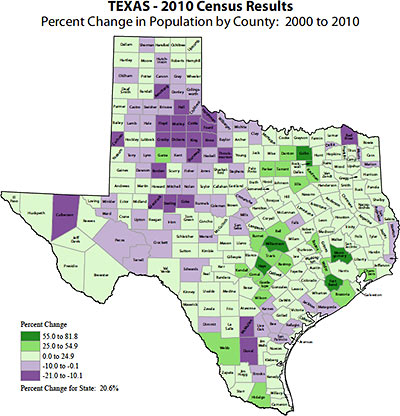
Houston’s population grew by just 145,820 over the last 10 years and now stands at 2,099,451, according to the U.S. Census Bureau, which released some Texas data from the 2010 Census today. The City of Houston’s 7.5 percent population growth rate was lower than the double-digit rates achieved by San Antonio, Austin, and Fort Worth, but still ranks ahead of the city of Dallas, whose numbers barely budged. (From 1990 to 2000, Houston’s population increased by 19.7 percent.) It’s a slightly different story for the surrounding areas: Harris County is still the most populous county in the state by far, growing 20.3 percent since the last census, to 4,092,459. But nearby Fort Bend, Montgomery, Waller, Brazoria, and Chambers counties all grew faster. Fort Bend County’s 65.1 percent growth rate over the last 10 years ranks it as the second-fastest-growing of the largest 20 counties in the state (Williamson County, north of Austin, is filling up faster by only a few percentage points.)

CONTINUE READING THIS STORY

02/16/11 12:28pm

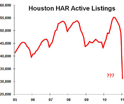
One of the more surprising stats in the latest residential home-sales data released yesterday by the Houston Association of Realtors, Swamplot’s numbers expert is kind enough to point out, is a whopping almost 40 percent drop in the number of listings that were active last January. Whazzat mean? That there were 40 percent fewer active listings this January than in January 2010? No, it’s screwier than that: The latest HAR report says that there were almost 40 percent fewer active listings in January 2010 than their own reports told us a year ago. Revising last year’s numbers down so dramatically, of course, makes it a whole lot easier for the local real-estate organization to announce at least one piece of news in this month’s press release: Listings are up 13.7 percent over this time last year!

But the new report doesn’t mention any adjustments. And it makes similar — though less dramatic — changes to last year’s data in several other categories.

CONTINUE READING THIS STORY

12/16/10 11:48am

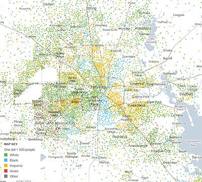
Remember those cool dot-by-dot renderings detailing the racial and ethnic distributions of 100 or so cities Swamplot featured a few months ago? Eric Fischer’s eye-opening map of Houston showed a city striped with different-colored pie-shaped wedges, but didn’t have much you could dig into. Working with data company Social Explorer, the New York Times website now has a version that displays much the same information, but it’s interactive, and allows you to zoom in on individual Census tracts. The “Mapping America” project covers the entire country and allows exploration of other metrics related to ethnicity, housing and families, income and education. Nothing’s included from the 2010 Census yet, though: the data comes the Census Bureau’s annual American Community Survey through 2009.

A few notable Houston-area snapshots include this map to same-sex couples:

CONTINUE READING THIS STORY

09/29/10 10:58am

A few tidbits on the Houston-Sugar Land-Baytown area from data released yesterday by the American Community Survey. The ACS is an annual survey conducted by the U.S. Census Bureau that’s separate from — and much more detailed than — the 2010 Census. (It replaces what used to be the Census’s “long form”.)

There’s more!

CONTINUE READING THIS STORY

09/22/10 6:31pm

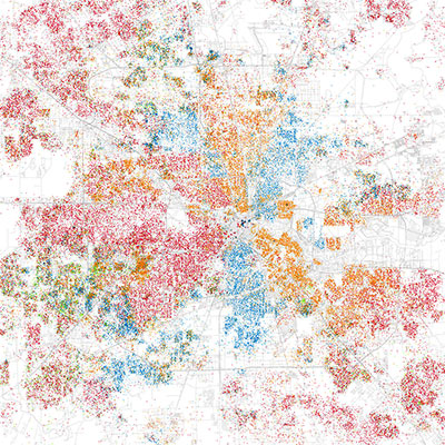
Inspired by a similar map published earlier this year and meant to help visualize the segregation of Chicago’s neighborhoods, dot-happy data explorer Eric Fischer has now produced similar maps for 102 U.S. cities. Here’s his map of Houston — which we’ve taken the liberty of darkening a bit to make patterns more apparent. The maps are based on ripe old data from the 2000 Census, the dots colored according to the racial and ethnic categories provided by respondents. Each red dot represents 25 White people, each blue dot 25 African Americans, each green one 25 Asians, each orange one 25 people identifying themselves as Hispanic. “Others” are rendered in gray.

09/09/10 8:25am

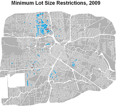
Using data from Houston’s planning department, University of Maryland grad student Chris Dorney has put together a series of diagrams showing which blockfaces in the Inner Loop have restricted lot sizes — and when they’ve done it. His maps start in 2002, when the predecessor to the city’s current Minimum Lot Size ordinance first went into effect. The ordinance allows residents of a single side of a single block to restrict homeowners in that block from subdividing lots below a certain size; its cousin, the Minimum Building Line ordinance, does the same for front setbacks. Dorney explains:

Each [diagram] shows the Inner Loop and indicates blockfaces with special minimum lot size restrictions already in place (red dots) and new for the given year (blue dots) (i.e. blue dots turn red the following year). There are clear spatial patterns to the adoption of these ordinances which it would be interesting to know more about. Perhaps most interesting to people from zoned cities is why every block has not decided to enact such restrictions…a zoning ordinance would likely cover every block uniformly.

And here they are:

CONTINUE READING THIS STORY

09/09/10 8:08am

WHY HOUSTON THINKS IT’S A TOURIST TOWN The single biggest group that visits Houston is . . . wait for it . . . Houstonians, according to a recent survey commissioned by the Greater Houston Convention & Visitors Bureau. That’s probably because the survey counted local residents as tourists if they spent the night in a hotel or made a special trip of 50 miles or more. 58 percent of Houston visitors last year were from Texas; the next biggest source of visitors — accounting for 8 percent — was Louisiana: “And the No. 1 reason travelers report they come to Houston? Last year, 51 percent reported they come to visit family and friends; that is a higher proportion than the other cities in the survey.” [Houston Chronicle]

07/07/10 3:03pm

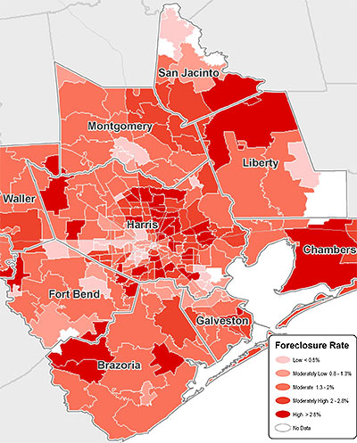
The foreclosure rate for the Houston-Sugar Land-Baytown area keeps rising, but it’s still well below the national average. As of May, 1.64 percent of all area mortgages were in some stage of foreclosure, according to data firm CoreLogic. That’s the highest level in quite a while, and a little more than half a percentage point higher than the rate last May. The national figure is 3.15 percent.

Also in CoreLogic’s latest report: 6.03 percent of area mortgage loans were 90 days or more delinquent in May, almost a point and a half higher than the same period last year, but down a bit from a peak in January. The nationwide rate is up to 8.22 percent.

Map: CoreLogic

06/23/10 12:04pm

HOUSTON’S HOLD ON NUMBER 4 2,257,926 people now live within the incorporated limits of the City of Houston, according to estimates released by the Census Bureau yesterday. The “incorporated limits” standard means Houston can still claim to be the nation’s fourth largest “city” (after New York, L.A., and Chicago) — even though Dallas and Philadelphia both boast larger regional populations. But the new numbers, which reflect a population increase of 14.4 percent from 2000 to 2009, are not 2010 Census population counts. They’re extrapolations from 10-year-old data, updated with adjustments from legal boundary changes, building permits, and county population estimates. Numbers from the 2010 Census won’t be widely available until April 2011. [U.S. Census Bureau]

06/18/10 8:01am

PRICE DROPS ARE UP! Been noticing more local home sellers slashing prices? It’s not just that HAR listings now highlight them: Real estate website Trulia notes that one-quarter of all homes it tracks in the Houston market (mostly through MLS) dropped their asking prices over the last year. That’s 32 percent more price cuts than for the previous year-long period, and qualifies Houston as one of the top 5 cities Trulia follows where asking-price reductions have been on the upswing. The average price cut here: 9 percent. [Trulia, via Houston Business Journal]

06/02/10 9:29am

THAT FLOOD OF DOLLARS Flooding means big bucks for Houston! And just think of how much more cash we could be raking in here if more than 1 in 5 households bought in: “Since 1978, Houstonians have received more than $1 billion worth of flood insurance checks, according to the National Flood Insurance Program. That ranks fifth among cities and counties nationally. Harris County, not counting Houston, ranks seventh. Flood Control District spokeswoman Heather Saucier cites the figures as proof that locals who have flood insurance use it. ‘If you don’t live in a mapped floodplain, It doesn’t mean you don’t need flood insurance. It means you get cheaper flood insurance,’ Saucier said. She said most insurance companies carry it, and since agents just pass through NFIP policies at set rates, no shopping around is necessary. Congress has let the flood insurance program lapse, but Linda Delamare, the federal government’s senior regional insurance specialist for Texas and four other states, said the lapse is temporary. Congress routinely reauthorizes the program in short order, and consumers should still pursue policies, she said.” [Houston Chronicle]

05/21/10 11:52am

COMMERCIAL BREAK The dollar volume of Houston-area commercial property sales for the 12 months through March was $2.36 billion, almost exactly half the figure for the previous 12-month period, reports LoopNet: “In the Houston office market, only $830 million worth of deals closed in the period ending in March 2010 compared to $1.37 billion a year earlier, while the price per square foot dropped to an average of $110 compared to $172 a year earlier. The square footage price in the Houston retail market has dropped the most precipitously, down to $69 in the most recent period from $143 a square foot for the year ending March 2009.” [Houston Business Journal]

05/10/10 5:45pm

University of Houston architecture professor Susan Rogers explores the Bellaire-Holcombe corridor from Highway 6 to the Med Center and finds a donut in her path.

For each census tract that intersects Holcombe or Bellaire Blvd., Rogers tallied the total number of residents born outside the United States and those residents’ country of origin, using 2000 Census data. The results surprised her:

Most of the action is in the zone between the Loop and the Beltway. “The diversity drops steeply inside 610,” she notes:

I had graphed the street from just 610 to Hwy. 6 for a talk on the links between Asia and Houston and then decided to add the rest as a potential “contrast” – what I found when I completed it absolutely astounded me – the absolute drop is so stark – and of course the income graph is nearly the exact opposite . . .

That graph showing median household income in the same census tracts:

CONTINUE READING THIS STORY

04/28/10 10:02am

OH YEAH? WELL, JUST WAIT UNTIL WE BRING IN RANDAL O’TOOLE FOR A BOOK TOUR OR SOMETHING A couple of readers have written in to note one result from this year’s Houston Area Survey. In response to a question worded “Which of these statements comes closer to your own view? — We need better land-use planning to guide development in the Houston area; or: People and businesses should be free to build wherever they want,” 72.9 percent chose the first option and 21.3 percent chose the second. That’s in line with results from previous years. [Houston Area Survey, via Swamplot inbox]

04/27/10 2:41pm

HOUSE SHOPPING IN THE CHEMICAL DISCOUNT ZONES: FINDING HOUSTON’S LESS-TOXIC NEIGHBORHOODS “A commenter on your blog who says he works at a chemical plant recently wrote that a neighborhood 1 mile from a chemical plant ‘is never going to be an “OK” neighborhood.’ Is there a single citywide map that shows where all these plants are, so I can find a place to live accordingly? And how far do I have to be from a chemical plant to be ‘OK’? 5 miles? 20? I presume there’s no absolute answer. But there’s got to be a de facto ‘discount’ on homes in neighborhoods that are within certain radiuses of the toxic stuff, right? If so, how far do the discount zones extend? Could someone draw that map for me?” [Swamplot inbox]