03/06/13 11:30am

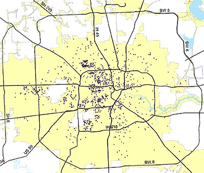
Each of these purple specks — or black holes, depending on your perspective — represents a demolition permit issued by the city in 2012. The planning and development department has posted this and a few other maps online with an overview of demographic data.

After the jump, you can see in more detail the demos inside the Loop from 2012 and 2011, juxtaposed with other maps showing the permits for single- and multi-family construction. You know. For balance:

CONTINUE READING THIS STORY

11/15/12 1:35pm

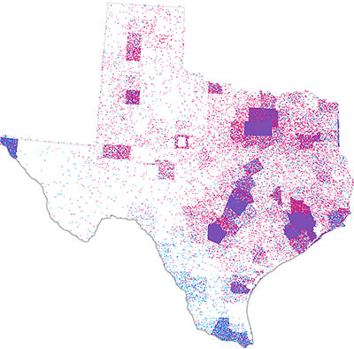
Extracted from a national map by datavisualization wiz John Nelson, here’s a map of Texas showing where votes for Romney and Obama came from, plotted point by point, by county. Using data from the Politico website, Nelson plotted a red dot for every 100 Romney votes and a light blue dot for every 100 Obama votes. Clumped purple masses fill the counties that envelop the state’s major metropolises.

Nelson tells future-fan website io9 that more typical red-blue political maps accentuate geographically large but population-light areas. “This method avoids the geo-social visual bias of large geographic areas having small populations overwhelming the overall picture. In this way both the relative volume and geographic distribution are apparent, as well as the partisan proportions throughout,” Nelson wrote of his national map, pictured here:

CONTINUE READING THIS STORY

08/31/12 3:53pm

AN UPDATED GUIDEBOOK TO HOUSTON BUILDINGS NEW AND THROUGH The third edition of the Houston Architectural Guide won’t be available officially until October 8th, but the Houston AIA is now taking pre-orders through September at a discounted price (PDF). The latest version of the encyclopedic catalog and tour guide, updated by Stephen Fox, will include 340 new entries covering structures that have popped up in the last 13 years — plus a whole bunch more from the last edition, moved to the back-of-the-book “now demolished” section. [AIA Houston]

06/14/12 9:45am

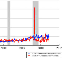
WE’RE BUILDING MORE HOUSES IN HOUSTON “The New York Metro areas has more than 3 times as many workers as the Houston metro area,” notes UNC professor and Forbes economics blogger Karl Smith after looking at a bunch of graphs, “but can’t keep up with the pace at which Houston is permitting new housing.” One of the several charts Smith assembled from Federal Reserve data shows that the number of construction permits issued in the Houston metro area surged ahead of the number issued in the New York-New Jersey-Long Island area beginning toward the latter end of 2007, just as the recession hit, and has stayed ahead. (The pace of new permitting in both cities accelerated in 2005, but fell off in New York a couple years later, after a big spike.) Over the last couple of years the Houston area has accounted for between 3.5 and 6.5 percent of all newly issued U.S. housing units. [Forbes]

09/13/11 10:10am

National attention may be focused on Central Texas-style barbecue, but food writer J.C. Reid says it’s time to put Houston barbecue back on the map. Logical first step in his Houston Barbecue Project, then: this interactive map of urban BBQ joints within Beltway 8. The project’s mission: “to revisit, document and recognize the East Texas-style of barbecue as it is embodied in the urban barbecue joints of Houston, Texas.” Reid drew the Beltway boundary just to limit the project’s first phase — he’s writes that he’s interested in expanding exploration to Houston’s outskirts and beyond once he — and any fellow BBQ adventurers — are able to document more of this city’s smoky inner sanctum.

What about the argument that city of Houston health and environmental codes are incompatible with good barbecue?

CONTINUE READING THIS STORY

06/16/11 12:20pm

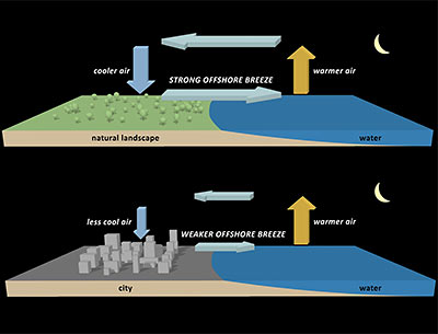
A new study from the National Center for Atmospheric Research documents how Houston’s vast expanse of paved surfaces allows the city to hold onto locally developed air pollution for longer periods of time, and prevents breezes that would otherwise naturally develop from sending all that nasty smog and stuff to outlying areas. Concrete and asphalt paving helps by soaking up heat during the daytime. This keeps land areas relatively warm overnight, which means there’s a lower contrast between land and sea temperatures during the summer. The result? Much less of those smog-stealing nighttime summer breezes. During the daytime, Houston buildings help to block local winds and keep things more still in the afternoon. Just another way standard development practices allow Houston to be a responsible steward of its own locally produced airborne products.

CONTINUE READING THIS STORY

06/14/11 2:29pm

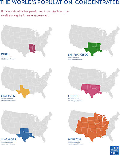
Houston wins again! If the world’s current population — all 6.9 billion of us — were packed into a city as dense as Paris, or Singapore, or New York, or San Francisco, just look how piddly it would be. This handy chart from Tim De Chant’s Per Square Mile blog shows how sad, too: The Gateway Arch in St. Louis would probably get lonely, and the Minnesota Twins would lose their all their fans. But what if we all spread ourselves into a city with Houston’s density? Much better, this:

CONTINUE READING THIS STORY

06/08/11 9:30am

PARKER: HOUSTON LOTS MUCH BIGGER THAN WE THOUGHT Acknowledging that the city underestimated the cost of the average homeowner’s drainage fee by $3.25 per month, Mayor Parker blames faulty estimates of the size of the typical Houston residential lot. The city had presumed that the average Houston home had a 1,875-sq.-ft. impervious footprint and sat on 5,000 sq. ft. of land. But appraisal district data and satellite images now show that the typical Houston home sits on a 7,500-sq.-ft. lot and has 2,850 sq. ft. of impervious surface. [Houston Chronicle]

05/13/11 12:06pm

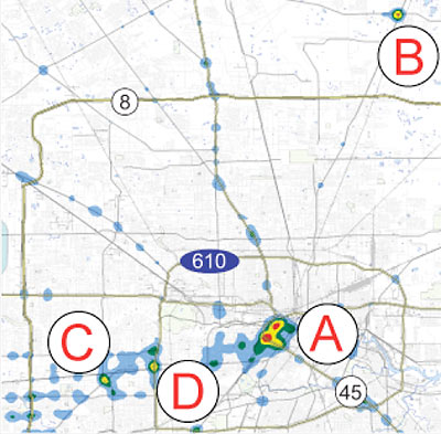
Texas Watchdog crunched 2009 car-crash data from TXDOT to find the parts of town where wrecks were concentrated. The heatmap above resulted from plotting location information from almost 100,000 Harris County incidents, most of which included exact coordinates. The winners? Two separate sections of Downtown and the intersection of FM 1960 and Hwy. 59 north, near Deerbrook Mall. (One of those Downtown hotspots, centered on Metro’s Main St. headquarters, includes the Pierce Elevated.) Also noteworthy spots for wreckage buffs: 2 sections of the Southwest Freeway — one at the West Loop and the other at Hillcroft.

Downtown also topped Texas Watchdog’s separate breakdowns for accidents involving road rage and collisions involving cellphones. But second- and third-place winners in these categories produced more local champions: Westheimer at Hillcroft, the Galleria area, and 59 at Kirby all ranked highly as sites for road-rage incidents. For cellphone-related accidents, the top areas were Montrose, an area just south of the Galleria and southwest of the 610-59 interchange; and the route from the Johnson Space Center to I-45. The northeastern corner of the 610 Loop at Liberty Rd. won the fatality division outright.

Map showing wreck concentrations: Jennifer Peebles/Texas Watchdog

05/13/11 10:41am

HOUSTON BITES THE MOST Dogs bit mail carriers more times in Houston last year than in any other U.S. city, the U.S. Postal Service announced yesterday — in advance of National Dog Bite Prevention Week. 62 dogs got a taste of a Houston postal employee in 2010; San Diego and Columbus, Ohio, ranked second, with only 45 incidents each. The nationwide tally: 5,669 canine attacks on mail carriers in more than 1,400 cities, costing the agency nearly $1.2 million in medical expenses. [USPS]

04/11/11 5:16pm

OAK FOREST: NEW WEST U OR MINI BELLAIRE? The Chronicle is out with its annual survey of area home prices. Sadly, this year’s online version doesn’t allow easy cost-per-square-foot comparisons, leaving Houstonians who like to build and buy their residences in bulk without much to oooh and aah over. Consolation: The accompanying neighborhood profiles include a peek at the controversy that’s apparently been raging through Oak Forest: “‘I call it the new West University,’ said Jason Light, owner of the Light Group, a local real estate firm active in the Inner Loop area. . . . Marlene Casares and her husband, Jalin Casares, looked all over town before settling on Oak Forest, she said. A year ago they bought a new 4,300-square-foot home. . . . ‘It’s like a little mini Bellaire, but with better prices,’ she said.” [Houston Chronicle]

03/10/11 3:32pm

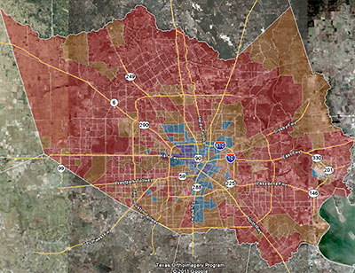
One of the big local stories of the 2010 Census was the decline in the number of majority-Anglo areas throughout Harris County. This map from consultant and Census obsessive Greg Wythe diagrams the trend pretty clearly. The areas colored red are where the portion of the local population identifying itself as Anglo dropped 10 percent or more; the areas where that group’s share of the population dropped by less than 10 percent are marked brown (Wythe says he started out painting them orange, but the satellite photo in the background made it darker). Areas marked a light blue are where the percentage of Anglos increased by less than 10 percent. And the dark blue (okay, purplish) areas show where Whites have been rushing in: Anglos’ share of the total population jumped by more than 10 percent in those areas.

“If you were to measure solely on the basis of the number of Anglos,” he explains, “you’re likely to see a lot of growth in areas where there’s growth in general. Cypress is an example — they grew in every demographic because they grew a lot, period.” But Wythe’s map tracks the changes in percentage of the population, not population growth.

The big exception to the overall trend of declining percentages of Anglos? The Heights.

CONTINUE READING THIS STORY
02/28/11 6:40pm

COMMENT OF THE DAY: THE SLICE OF HOUSTON WHERE NOBODY’S HOME “I did NRFU (Non Response Followup) surveys for the census in the wedge between 45 and the Ship Channel and this doesn’t suprise me at all. LOTS of people don’t answer the door. Lots more told me of one, two, or three residents when in fact an evening visit’s observations yielded six or eight.” [Some d00d, commenting on Houston to Census Bureau: Count Again]

02/24/11 11:34am

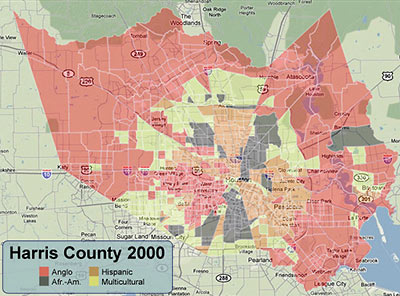
Sprinkling a little color on census tracts that came up majority Anglo, majority Hispanic, majority African-American, and those where no group is in the majority, blogger and consultant Greg Wythe finds that last category has grown considerably in Harris County over the last 10 years. A good chunk of what was a solid-red block around Cypress and northwest Houston, for example, has gone multicultural yellow in the 2010 map. Wythe says the 2010 Census didn’t identify any majority-Asian census tracts — though 3 of them came up in the 40-to-45-percent range. He also put together these interactive versions of the same maps, so you can zoom in and around your own favorite spots:

CONTINUE READING THIS STORY

02/23/11 6:42pm

Elected officials will have to wait until June to file formal challenges to Houston’s omigosh-where’d-everybody-go? low population count in the 2010 Census, but the grousing has already begun. Houston’s population came in just a Florida recount under 2.1 million; that’s about 160K fewer people than the Census Bureau’s own American Community Survey figured were camping out within city limits the previous year.

Census maps show a huge section of east Houston — most of the area inside Loop 610, east of Interstate 45 – lost population, as did sections of southwest and northeast Houston.

Those areas are predominantly Latino and African-American, populations that historically are most likely to be missed by the census. . . .

[State Rep. Ana] Hernandez Luna said some people, especially immigrants who are here illegally, may have been reluctant to participate, despite assurances that the information would not be shared with immigration agents.

“We’re all a bit skeptical when we’re giving so much detailed information about our household,” she said. “For those that are undocumented, they want the least amount of contact they can have with the government.”

Meanwhile, an analysis of the Census data prepared by Houston’s planning dept. shows that census workers counted 71.7 percent more vacant housing units in the city in 2010 than they did in 2000.