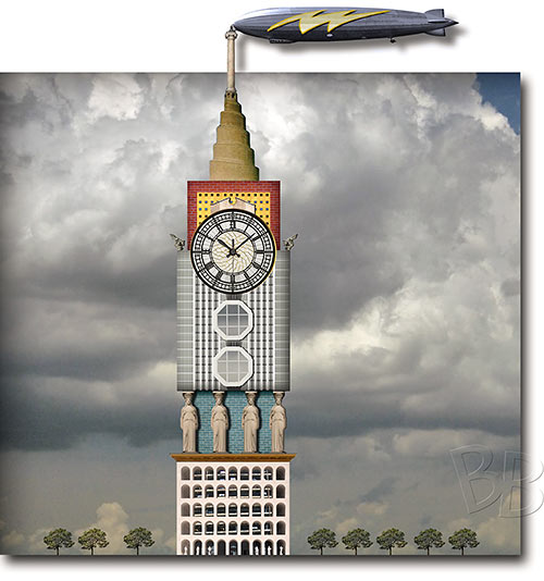
There is always excitement surrounding an announcement of a new Randall Davis condo tower — before the design is revealed. Everyone wants to know: What mixture of far-away buildings and long-ago eras will the architecture reference? And what affordable materials will it be constructed from? From atop what garage launch platform will it point toward the sky? And even more simply: How grandiose will it be? Late yesterday, only a few hours after posting news that the developer had announced the impending arrival of a condo highrise adjacent to GreenStreet downtown, Swamplot received the humble design submission pictured above from reader Bill Barfield. He claims to have created the rendering “after much research.”
- Randall Davis Aiming Downtown Condo Highrise for the Corner of Rock n’ Roll and the Blues [Swamplot]
- Randall Davis coverage [Swamplot]
Rendering: Bill Barfield (bill_b)


Looks Legit.
*Stamps drawing*
Build it.
In comparison to the already realized Mecca main clock tower, this design actually looks quite modest. I hoped for a far more radical proposal.
Seems legit.
Love this idea! The first rendering sure looks like a Randall Davis project!
Haha, seriously!
He needs a new architect, big time. Something modern and sleek, please, thank you.
And something that looks attractive from the side that faces the Hilton, since the Hilton will look on directly.
Can’t wait for a dirigible ride.
@Luisa
Do you even Randall Davis, brah?
I wonder what it’ll look like inside?? I’m thinking, maybe a neo-classical look with lots of white marble and maybe some zebra print accents. As for furniture, I’d go with a Machine Age, aviation-inspired look in the lobby. Oh, and a bunch of huge chandeliers to really class up the joint. They can probably do that for you at Rooms2Go.
I will lay in front of the bulldozers.
Funny but I honestly prefer this monstrosity to the craploads of boring blue glass buildings coming up everywhere. Something controversial every once in a while in this overly conservative city would be nice.
This wins the Swampie for best post of the year. Hands down.
I’m nominating Structural Engineer’s comment for a new city slogan.
@ East End Eddie
I wouldn’t call his projects controversial, it’s the textbook definition of gaudy. The Cosmopolitan has actually grown on me with the color choices of glass it looks very clean in the morning and afternoon light. The Parking garage podium it rests on is a different story. I guess they could be worse? Maybe he could have stuck with the beige stucco (faux-mediterranean), theme of 1200 Post Oak, the condo towers surrounding Uptown Park, the Hotel Granduca, and the Dominion on Post Oak that have beset our Uptown skyline in the early 2000’s.
The Renoir Lofts were executed nicely, but you can almost tell their budget fell short on the northern portion of the building. If you are going to do these grand designs, might as well stick to them on the entire project and not just a few sides or leave out the garage.
I think that I saw that building on the opening credits of “Monty Python”
Ha ha ha ha. . . you are silly Luisa. . . . Everyone knows Randall Davis doesn’t use an architect. I was told years ago that he uses the students at San Jacinto Junior College drafting department and obviously by the looks of all his buildings it’s true.
This post wins the Internet.
“It’s …”
Bwaaahahaha…good belly laugh to start my day. Thx!
Well, it’s better than that Embassy Suites that’s over there…
AAgghhh….My eyes are burning.
@upper Kirby neighbor – Past Randall Davis projects have been designed by Kirksey, Ziegler Cooper, Brand + Allen, among others. Have you seen the Dakota Lofts or Hogg Palace downtown? They are nothing to scoff at.
@arch-daniel
Both the Dakota Lofts and Hogg Palace were repurposed existing buildings. We’re scoffing at his new construction projects.