Here’s another helpful online tool from the civic hackers at Sketch City, this one for would-be volunteers: a crowdsourced, interactive map showing which shelters near you are in need of what resources — and which ones might need people to come over and help out. Each icon on the map represents a shelter or providing organization that’s helping evacuees who’ve been put out of their homes by Harvey flooding. Click on one and a panel on the left will indicate any supply needs or volunteer needs identified by the site. (A larger, full-browser-width version of the map is here.)
The map was put together by Amanda Shih, Dr. Neeraj Tandon, and Chris Ertel, and is linked to data assembled and continually updated by a group of dozens of local and not-so-local volunteers hooked up to the project by Sketch City, a Houston nonprofit technology group. (The same bank of is behind Sketch City’s other new mapping project — one that simply identifies available Harvey shelters to people seeking them.) The volunteers have been making regular phone calls to update the information in a shared Google Doc. (If that kind of call-and-type-from-home work is your preferred method of volunteering, go ahead — you’ll find a direct link to the underlying spreadsheet in the map.)
- Harvey Needs [Sketch City on Github]
- Previously on Swamplot: The Quickest Way To Find the Nearest Hurricane Harvey Shelter That Isn’t Already Full


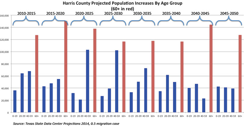
 “. . . One of the reasons that Houston manages to buck trends affecting other central cities is that Houston is orders of magnitude larger than many central cities. Within its incorporated city limits, Houston could contain all of Manhattan, Chicago, San Francisco, Washington DC, Boston, and then have room enough left over for Santa Barbara. That means that Houston contains its first-ring suburbs, most of its second-ring, and even some some third-ring; and then it also does this funky “limited-purpose annexation†scheme in the northwest suburbs and has a special non-annexation deal with The Woodlands to keep those areas as an unincorporated buffer zone from which they are still somewhat able to tap commercial property tax revenues from those areas. And as demographic pressures push and pull people across different regions, Houston has to adapt to all of those trends simultaneously, but it also has a diversified-enough tax base to be able to do so — you know, presuming that its elected officials never do anything especially stupid like capping revenues and also underfunding pensions for decades.” [


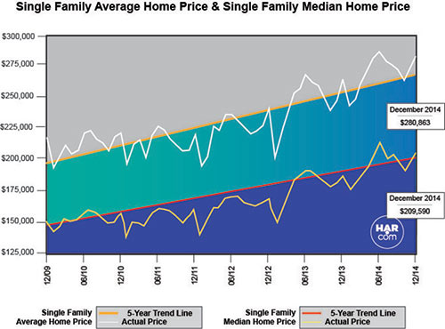
 Inspired by a report from Harvard’s Joint Center on Housing Studies that compares household income to the percentage of income used to pay rent for various income levels, Chronicle biz reporter Lydia DePillis charts similar stats for Harris County. “Houston is slightly less cost burdened than the national average,” she concludes, “with 46.7 percent of its renter households paying more than a third of their income on rent.” According to her analysis of Harris County data from the Census Bureau’s American Community Survey, “the disparity between high and low-income areas is still present: In the third of ZIP codes with the highest median household incomes, 31 percent of renters pay more than 35 percent of their income on housing. In the bottom third of ZIP codes, the share is 49 percent.”
 New number crunching from the Pew Research Center suggests that around 57 percent of the folks between 18 and 34 in the 77045 Zip Code may be living with their parents. (77045 includes both residential areas and the


 “Has anyone posted a map of the residential streets that flooded yesterday? I’ve seen neighborhoods mentioned wholesale, but I also understand it was hit-and-miss from street to street. Thank you!” [
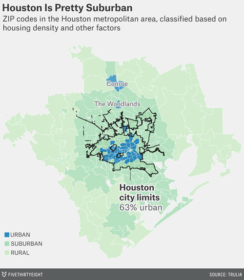 In a guest post for ESPN’s FiveThirtyEight, Trulia’s chief economist trots out a bunch of maps and charts that purport to show that
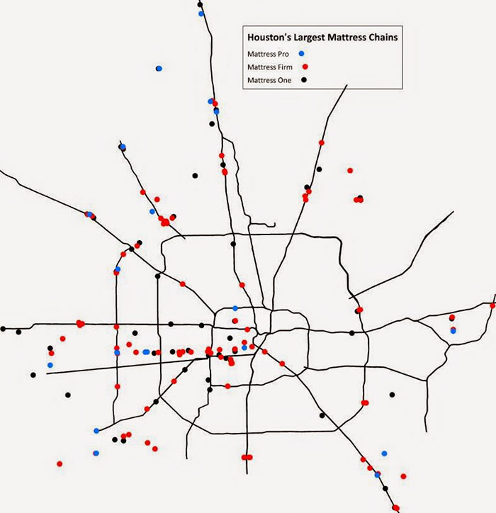

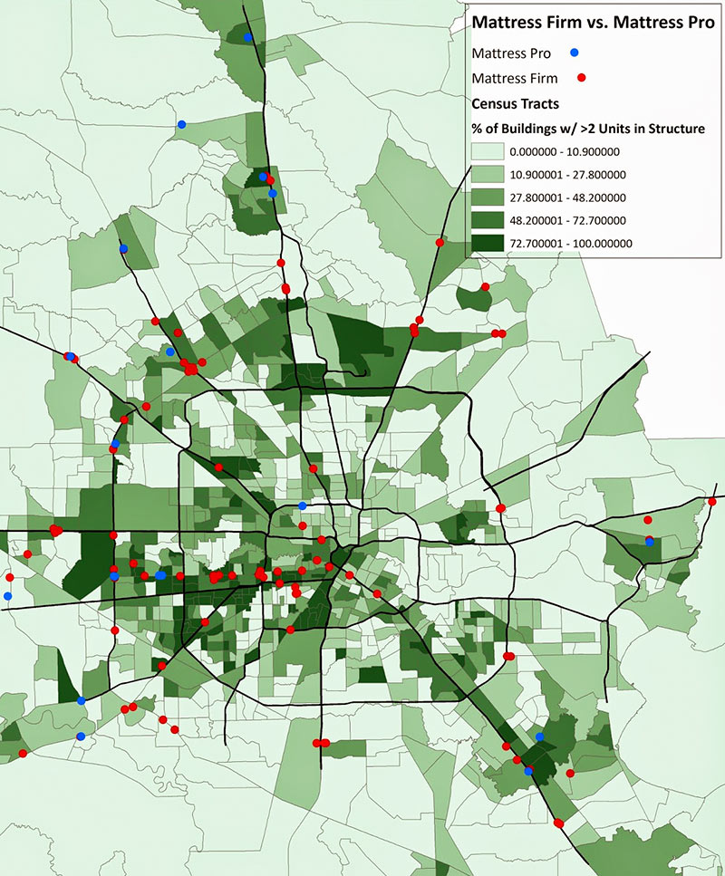


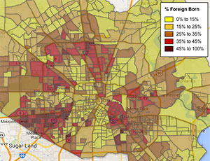 Armed with a few stats, Monica Rhor takes a look at Hillcroft Ave, ground zero for the Great Houston Influx: “
