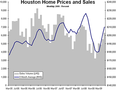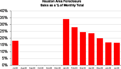
HAR’s real estate sales report for July is out! And Swamplot’s housing-market reader-analyst uses the data to piece together a better picture of Houston’s still-somewhat-mysterious foreclosure scene:
The press releases in 2009 have included a running commentary on the % of foreclosure sales in the month. This month’s release featured an interesting nugget — foreclosure sales from the prior year’s month! It is new information, and a few future monthly releases of it will allow us to fill in the data gap in the graph [above].
The foreclosure graph can be looked at in two ways. The glass half full crowd can cite the fact that a wave of foreclosures has been passed through the system — like a painful kidney stone — and it hasn’t led to piles and piles of unsold homes on top of each other in a negative feedback loop. Inventory is down to 6.5 months, backing this view.
And what if you aren’t sure there’s enough water in that glass to, uh . . . pass those stones?


