WHAT’S INCLUDED IN JOHNNY STEELE DOG PARK’S FLOOD-INDUCED REDO  The caretakers of that oft-flooded pet park near Buffalo Bayou now say that “After careful consideration, we are making changes to the Johnny Steele Dog Park to improve maintenance operations and the park’s functionality.” Among those changes: getting rid of the pond in the large dog play area, rerouting the pond in the small dog area so that it flows through both sections, adding a “new seating wall” at the edge of the water, expanding the lawns throughout the park, enlarging the entrance to the large dog area, and creating a new entrance to the small dog area — all of which is expected to be done by early summer. [Previously on Swamplot] Photo: Buffalo Bayou Partnership
Tag: Renovation
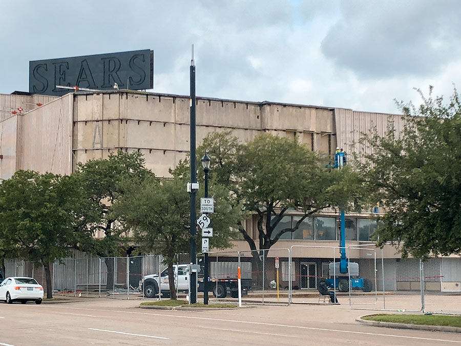
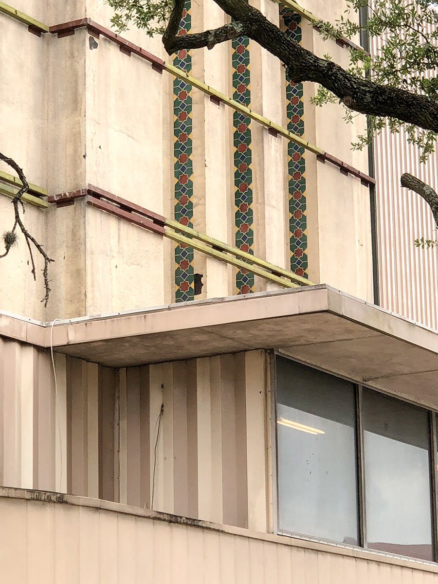
Crews are now peeling back the corrugated metal paneling that covers over the original façade of the Sears building on the corner of Main and Wheeler, exposing some of the 1930s art deco details underneath. The plain skin was added onto the 4-story structure in the 1960s. It remained in place after the company that manages Rice University’s endowment bought out Sears’ lease on the property 6 months ago and the department store closed in January.
Yesterday, Mayor Turner announced that an extensive redo of the building — overseen by Hines and designed by Gensler along with New York-firm James Carpenter — would transform it into a startup incubation center, the anchor of a 4-mile “innovation corridor” planned between Downtown and the med center. The vertical mosaic pattern pictured above on the south side of the building is one of the first hidden touches to see the light of day as part of the work that’s now beginning to restore the exterior.
Also uncovered is the row of metal beams used to mount the outer shell:
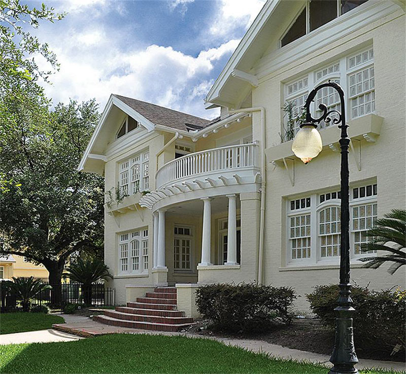
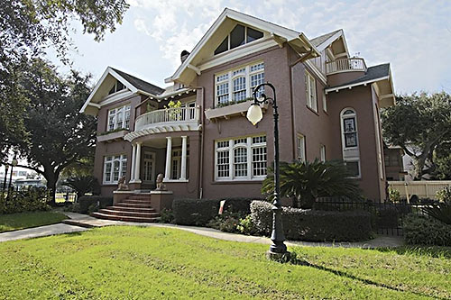 That Burlington St. mansion nestled in along the 527 Spur leading from Downtown to 59 is back on the market this week, though the listing implies that the interior redo and whitewashing is still in progress. The house, built between 1897 and 1908 depending on who you ask, went up for sale in the Westmoreland Historic District early last year for $1.8 million. The current owners bought the property that summer for $880,000 and quickly sent an application to the city’s history folks asking for approval to move some doors and windows around, as well as to add a deck out back and a balcony outside the existing second-story doors to nowhere in the master bedroom. (The bricks, already painted brown, appear to have been painted white instead, as has most of the interior.)
The property is now listed at a smidge under $2.4 million. Not pictured or mentioned in the new listing is the 3-post freeway billboard previously seen sunning itself by the pool on the northern end of the front yard, shown below as it appeared in the old listing:
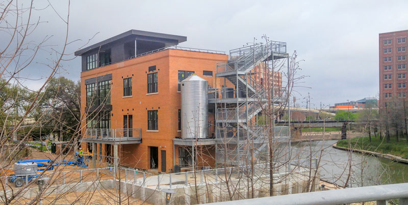
A shiny new cistern is now in place at the former Sunset Coffee building at Allen’s Landing, which Buffalo Bayou Partnership and Houston First have been redeveloping into an office-topped boat-and-bike-rental spot. The 1910 coffee roasting facility has once again donned walls after moving past a Summer 2014 minimalist phase, and is currently decked out in a muted Café du Monde orange.
The no-longer-see-through structure is back to limiting the view from the Harris County Jail across the bayou (visible on the far right, above). A set of stairs are in place alongside the new cistern, along with railings around what appears to be the planned rooftop terrace.

A group called Friends of the Fountain has started an online campaign to raise $60,000 for reversing the recently-halted-after-all changes to the Mecom Fountain, at the roundabout confluence of Main St. and Montrose Blvd. near the entrance to Hermann Park. The group’s crowdfunding page says the money will be used to remove the limestone panels recently screwed around the concrete wall of the 1964 modernist fountain’s elliptical main basin, as well as to repair the concrete and to repaint. A member of Mayor Turner’s transition committee involved with the project also tells Swamplot this morning that around $25,000 of those funds will replace the grant money spent to add the panels in the first place.
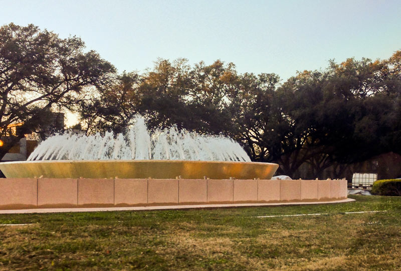
Here’s a late-afternoon look at the limestone slabs that have been working their way around the concrete oval basin of the Mecom Fountain in the last week, which the Texas Historical Commission is hoping that TXDoT and the city will stop applying for the moment, according to the Chronicle’s Lisa Gray. Commissioner Linda Henderson told Gray that the organization approved work to redo the north entrance to Hermann Park without realizing that the updates included work on the fountain itself (which is currently being looked at for potential inclusion in the National Register of Historic Places, and for city protected landmark status).
Meanwhile, the city planning department has been receiving complaints about the work that include phrases like “suburban mall,” Margaret Wallace tells the Chronicle. As of yesterday evening, the panels had already marched around both ends of the ellipse, with a gap remaining on the southwest side:
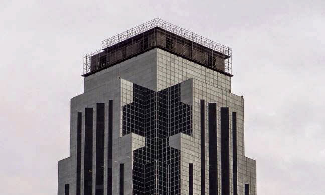
A more senior representative of the Williams Tower’s property management office wrote in yesterday with a correction to Friday’s note about the recent return of the rotating spotlight at the top, after another employee told Swamplot that the beam had been off while a new bulb was being hunted down. In fact, the source tells Swamplot, the entire beacon fixture has been replaced, as part of a redo of the tip of the tower itself.
The current work on the top started in November 2014 and includes the replacement of the “apex roof” (consisting of the sloping panels directly beneath the beacon, and the vertical panels directly below those, above the start of the glass skin). The above photo shows those vertical panels missing late last spring as the swap was underway. The new spotlight turned on in late December, and final touches to the roof should be done by March, if the weather cooperates.
Here’s what the roof looked like back before the work began:
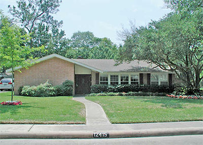
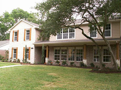
From one of Swamplot’s initial correspondents, K, comes word of a redo in Memorial Hollow she says
looks like a Mr. Potatohead gone wrong — parts and bits and pieces on a foundation that don’t really go together. It still looks to me like the bottom half of an older house that someone plopped new construction on top of.
At first, K thought the house
was being torn down like so many other 1960s-era homes in my neighborhood. It was a one-story, typical little cottage on a big lot — the kind they love to demolish and then fill up the entire lot with a three-story monstrosity. But then I realized that they were, in fact, totally remodeling it. They tore the roof off and blew out the back of the house until only three brick walls were standing.
Then they rebuilt the back wall and added a second story to the house. It looks pretty bizarre now, although I can’t tell if that’s because I was used to the little bungalow that was there before or because the house really does look weird. You be the judge.
Below: More before-and-after photos of this hollow sixties memorial in Memorial Hollow, ready for your verdict!
 Not all recipients of the 2008 GHPA Good Brick Awards will be able to attend this Friday’s historic-preservation awards banquet at the River Oaks Country Club, but some will have better excuses than others. Ken Rice, who along with Sarah Goodpastor will receive an award for the renovation of a 1930 brick duplex at the corner of Kipling and Dunlavy, won’t be able to make it because he’s currently serving a 27-month sentence in federal prison for securities fraud.
Yes, that’s former Enron Broadband CEO and architecture patron Kenneth Rice, who already helped lessen his sentence by testifying against other Enron executives in two separate trials after his 2003 guilty plea. Rice agreed to forfeit more than $13.7 million worth of cash investments, real estate, cars, and jewelry as part of his plea agreement. His sentence included a $50,000 fine.
Rice, 48, could end up serving less than half of his prison term, though.
His lawyers say he hopes to enter a drug and alcohol treatment program available to nonviolent federal inmates that, if completed, could shave up to a year from his term. In addition, federal inmates can reduce their prison time by 15 percent with good behavior. With those two combined, Rice could get out of prison in 11 months.
After the jump, details and photos of a project Rice is likely hoping will count towards that good-behavior credit.
 Channeling Sarah Susanka, writer and architect Duo Dickinson snarks colorfully on Dumb Renovation Fads for Money magazine. Here’s some of what sucks about “the Great Room Craze of the 1980s”:
Weird Windows: All these windows and doorways are on the ground level and . . . also floating up on the second-story space, somehow reminiscent of a burned-out building. Also, how do you light such a space without it looking like a lobby in a Marriott?
Funny, but Dickinson’s targets aren’t just renovation fads—they’re staples of most current Houston new construction. That Great Room Craze may have arrived here late, but it’s making up for it by hanging around for a while. Dickinson’s improved proposal for great rooms (two attached, lower-ceilinged spaces) though, is Not-So-Small: “as much square footage as in a great room but with a more intimate, livable feel.”
Onto the next complaint: Oversized kitchens. “The distance between surfaces and appliances in this kitchen approaches the ridiculous,” reads the caption to a kitchen you might see featured here in, say, Paper City. “You’d need a map just to find the olive oil.”
Dickinson’s suggested remedies are more Susanka-like, but without the cloying detail. Keep kitchen counters no more than four feet apart. Get rid of overhead cabinets and add a pantry . . .
Other complaints include “The Garage That Ate Your Home,” porches that block living-room light, and bad overhead lighting (“Recess Time Is Over . . . the end result of such an installation is a pockmarked ceiling that looks like a meeting room at a convention center.”)
Good luck bringing your fad-stopping sense to Houston homebuilders, Mr. Dickinson. Houston isn’t exactly the trend leader. We’ve still got a real-estate boom going on here, remember?
- 5 Dumbest Renovation Fads [Money]
Photo: David Weekley Homes

