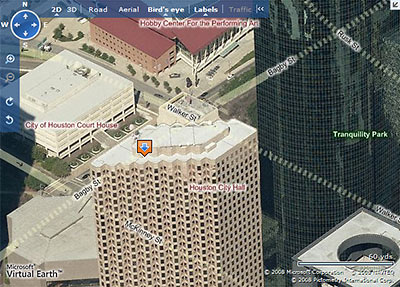
Microsoft has updated its Live Search Maps with a number of new features, the most striking of which is the ability to view a street-map overlay on the maps’ signature 3D aerial views. This should be especially helpful to the armchair pilots among you who have been flying blind through Microsoft’s “bird’s eye” views, trying to figure which street is which as you rotate around a property.
Since HAR’s recent update, Live Search Maps are now linked directly to property listings. However, those maps do not include the new street-highlighting feature. To see this new feature, go to maps.live.com and enter an address, then click on the “Bird’s eye” button at the top. Street highlighting automatically appears, but you can turn it off by clicking on the button at the top marked “Labels.” As before, you can rotate the direction of your view by clicking on the N, S, E, or W in the top left corner.
Now here’s a problem: What happens when the newly highlighted streets run behind a tall building? As our sample image above shows, they don’t just run — they dash!
After the jump: How to avoid traffic online!
CONTINUE READING THIS STORY
")


")

")
") Note: Story updated below.
Note: Story updated below. 


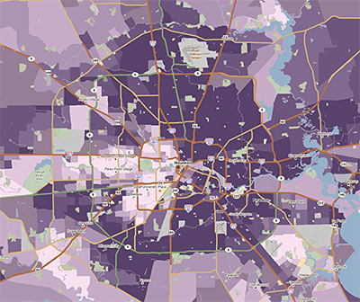
 Zip Code maps, super neighborhood maps, crime maps, city boundary maps — if there’s a city-produced map of Houston you’re looking for, you’ll find it at


