07/15/14 4:45pm

Heat Map of Houston Multifamily Properties by Rose Lee

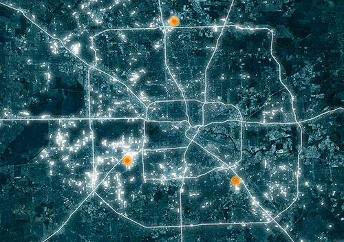
Before delving into the communities residents have built for themselves at the St. Cloud apartment complex on Hillcroft in Gulfton, Thai Xuan Village on Broadway near Hobby Airport, and Greenspoint (each marked in orange on the map), UH architecture prof Susan Rogers tries to present the big picture of Houston’s multifamily situation — accompanied by the above heat map showing (according to HCAD land-use data) where the apartments are: “315,357 is the number of multifamily apartments housed in buildings comprised of 10 or more units. Forty percent of this housing, or just over 140,000 units, were constructed between 1960 and 1979. Today, this housing is home to more than 20 percent of Houston’s two million residents. The units are dispersed in roughly 600 separate complexes, with an average of 250 units, and typically constructed at densities of 30-40 units per acre. Not surprisingly, the new projects are located predominantly outside the Loop and many are in a downward spiral of disinvestment.”

Map: Rose Lee

The New ‘Projects’?
07/10/14 5:00pm

Judgmental Map of Houston

Comedian Trent Gillaspie began his internet cartographic ventures by assembling an annotated map of his then-hometown of Denver, which he posted online hoping to highlight the humor in some of his gentrification-comedy routines with what he hoped would be considered outrageous labels for every neighborhood. “Some are judgmental, some are humorous, and all of them have a little bit of truth,” he explained to Business Insider earlier this year. “As long as you offend everyone you possibly can, it ends up making it OK.” Gillaspie then tried to open up his method to other cities — asking other comedians (and would-be comedians) to put together similar surveys of their own cities. A total of 47 labeled maps of various cities currently comprise the Judgmental Maps website, with varying levels of humor and “light racism,” as Business Insider’s Karyne Levy politely puts it.

The latest effort, submitted to Gillaspie’s website and tagged by its author, identified only as jr.ewing.78, targets Houston. We’ve sliced the map into thirds, for easier reading, below:

CONTINUE READING THIS STORY

Judgmental Maps
07/03/14 10:45am

New city of Houston rules restricting the size, refinancing, and payment terms of auto-title and so-called payday loans went into effect on Tuesday. A total of 309 payday lenders had registered with the city by that date, somewhat shy of the total 361 such institutions the city had previously identified. And the Houston Chronicle has scooped up all the collected data to build the interactive map shown above, which shows the locations of the newly registered cash outlets. Unfortunately, the map does not directly indicate which locations are in strip centers or adjacent to nail salons.

Mike Morris’s accompanying report on the new rules includes this nugget demonstrating the valiant efforts of the payday-loan industry to reduce traffic in the area, by removing the overfinanced vehicles of its customers from already taxed streets: “In the 10-county Houston region, home to a fourth of the state’s 3,240 such lenders,” Morris writes, “data show borrowers refinance more and pay on time less than state averages, and that more than 100 title borrowers have their cars repossessed each week.

Map: Houston Chronicle

Highly Interesting
03/21/14 1:30pm

Urbane Neighborhood Culture Map of Houston's Inner Loop

A map-making trio headquartered in San Francisco has turned out its 11th “neighborhood culture map” of a U.S. city. And here we are . . . Houston! Well, after a fashion. How’d the team from Urbane come up with this particular collection of graphic geographic platitudes? Directly from sources: “For this map, we had an army of Houstonian contributors who talked a lot about their local haunts.” Isn’t that enough? “We do very thorough research, interviewing of people from there, and fact-checking to present our best efforts,” the Urbane team explains on its website. “Instead of critiquing our viewpoints, it is helpful for everyone if you would like to help our next project. Nobody can truly be a local to an entire city, can they? Nobody knows everything about every city. Maybe you’re an expert on your block, but it’s rare to find a full city expert.” So there. With its latest venture in Las Vegas, the group is trying another tack: Going onsite and asking passers-by to tag the neighborhoods they know with scribbled-on Post-It notes.

CONTINUE READING THIS STORY

Tag, You’re That
02/25/14 4:00pm

Screenshot of EPA Map of Houston Showing Relative Cancer Risk from Air Toxics

How do you feel about Houston’s airborne cancer hotspots? That’s easy! Just pick up a copy of the latest issue of Cite magazine and run your fingers over the top of it: Cite 93‘s front cover has been embossed with a map diagramming the area’s cancer risk. The places where airborne toxins mapped by the EPA are most prevalent are in the pits.

The mapped information here isn’t exactly fresh — it’s from the 2005 National-Scale Air Toxics Assessment, and the data only account for airborne known-cancer-causing toxins that are tracked by the EPA. Though it’s posted online, the map version isn’t exactly easy to find. But bravely thumbing his nose at Houston’s proud and longstanding tradition of hush-hushing location-based cancer hazards, Cite editor Raj Mankad gives Swamplot readers the secret recipe for finding the browsable map:

CONTINUE READING THIS STORY

Air Toxics, Online
08/16/13 12:15pm

Seems the concerned neighbors around that 17-story office building that Hines is considering building on San Felipe aren’t worried only about traffic. This map, created by a member of the recently formed nonprofit East San Felipe Association — which says it is committed to supporting “reasonable development” in this area around S. Shepherd, Kirby, and San Felipe — suggests another threat to the ’hood: copycatting.

Clearly speculative, the map takes pains to show those sites where other unreasonable highrises could pop up in response to the precedent that Hines is setting with 2229 San Felipe. On S. Shepherd, for ex., you might see the Red Lion Pub forgo its street-level scale, or Petco abandon the confines of its big box. (But wouldn’t that long elevator ride down give you some quality time to bond with your recently adopted pup?) If this map is to be trusted, it seems like it would be only a matter of time before the bug spreads north and Chipotle throws up a tower of burritos. The last thing the neighbors want, says just one of the messages on that oppositional website that they set up, is for this residential area to become “the next Greenway Plaza.”

Image: Swamplot inbox

07/08/13 10:00am

Last week’s announcement by Chevron of the 50-story tower it plans to add to its blue-glass twins is just the latest development in the 77002. This map from the Downtown Management District shows projects that are recently completed, under construction, or in various states of planning and speculation. Those projects, denoted by purple and yellow on the map, include Skanska’s 34-story office tower that’s replacing the old Houston Club Building, Hines’s highrise on Main, the residential renovation of the Texaco Building, and the 5-story apartment complex near the under-construction SkyHouse apartment tower, among others. You can scroll through a complete legend for the map after the jump:

CONTINUE READING THIS STORY

06/19/13 12:00pm

Putting Google’s Landsat Annual Time Lapse function to work, Texas architect Samuel Aston Williams has created animated .GIFs that give a satellite’s view of how certain cities — Shanghai, Atlanta, Lagos, etc. — have changed during the past 30 years. And here’s Houston.

Image: Samuel Aston Williams via Atlantic Cities

04/03/13 10:15am

Map of Houston from Houstonia Magazine

This is a Houston that no one’s ever seen: The lines in the swamp have been drawn for new monthly magazine Houstonia’s inaugural issue, which landed on newsstands last Thursday. This map’s “competing fiefdoms” suggest what’s really happening here: Those of you north of I-10 are now making a home in “The Hypes.” And that up-and-coming former industrial wasteland east of Downtown’s been dubbed “New Montrose.” West of the Galleria? That’s “Breastheimer.” South of I-10 near Memorial Park and the Loop is “Hogg Heaven” and “Pretensia,” just east, of course, of the mansions in “Pricey Point.” And Midtown’s been divided by the light rail, split into West “Hipstamatica” and East “Yuppie Tenements.”

Drawing: Dan Derozier

03/25/13 10:00am

NOW ON YOUR MOBILE DEVICE: WHY YOU CAN’T BREATHE A team comprising researchers at UH, Air Alliance Houston, and the American Lung Association have launched OzoneMap, an app that “monitors chemical weather,” reports John Metcalfe of The Atlantic blog Cities. And whether the app helps explain your coughing fit or alerts you to the chance of a really pretty toxic sunset, the best part is that it’s only available in Houston! And why Houston, of all places? Besides the industrial flares, that is? Here’s Metcalfe: “The Houston/Baytown/Huntsville region comes in eighth place for most ozone-polluted cities in America, as ranked by the American Lung Association. Persistently sunny weather, a battalion of petrochemical facilities and scads of fuming cars on the road make Houston a nightmare for anyone who’s chemically sensitive. For these folks, walking outside is like playing a lower-stakes version of Russian roulette, with 30 to 40 days of the year fogged with hazardous levels of ozone.” [Cities; previously on Swamplot] Map: Cities

03/18/13 10:15am

Where’s all the new office space in Houston? Here, reports Metrostudy’s David Jarvis. The lemming-like red dots cramming together on the Beltway and Katy Fwy. out toward the Grand Parkway denote locations that are already under construction, totaling 12.5 million square feet of new office space. The green dots denote planned locations that would add 6 million more. The ExxonMobil campus up near the Woodlands, reports Jarvis, accounts for almost half of the new construction.

Map: Metro Study Report

03/12/13 2:00pm

This map from Rise of the Creative Class author Richard Florida’s series at The Atlantic on “class-divided cities” shows where Houston’s working, service, and creative classes live.

Denoted here in purple, what Florida considers the creative class — that is, he writes, “people who work in science and technology, business and management, arts and culture, media and entertainment, and law and healthcare professions” — makes up 33 percent of Houston’s workers; that’s just a little bit larger than the national average, according to Florida, of 32.6 percent.

And what about the service and working classes?

CONTINUE READING THIS STORY

03/06/13 11:30am

Each of these purple specks — or black holes, depending on your perspective — represents a demolition permit issued by the city in 2012. The planning and development department has posted this and a few other maps online with an overview of demographic data.

After the jump, you can see in more detail the demos inside the Loop from 2012 and 2011, juxtaposed with other maps showing the permits for single- and multi-family construction. You know. For balance:

CONTINUE READING THIS STORY