HEIGHTS SHIPPING CONTAINER FOOD COURT A food-truck-court-like conglomeration of shipping containers housing vendors selling waffles, burgers, barbecue, Mexican, Asian, or Cajun cuisine is being planned for a 25,000-sq.-ft. lot co-owned by the proprietor of C&D Scrap Metal at the corner of North Shepherd and 14th St., the Chronicle‘s David Kaplan reports. “Kitchens on 14th,” as designed by Uptown Sushi and Tiny Boxwood’s architect Issac Preminger, is expected to include trees, water features, and communal eating areas in a park-like setting. [Prime Property]
Houston Heights
CLEAN YOUR OWN DAMN TOILET 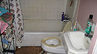 The rent ain’t so bad — just $350 a month for a 600-sq.-ft. single-bedroom house steps from Heights Blvd. and I-10. But you’ll be renting this place “as-is,” and these pics are here to help you figure out what that means. [HAR, via Swamplot inbox]

 Who knew a little late-night tweet from a customer would spark a chain of events that would turn a new Heights restaurant into the topic of international news stories? Here’s the basic outline of what went down over the weekend at Down House: Customer, after a few beers, sends out tweet about bar staff. Off-duty bar manager doesn’t like tweet, calls up bar and asks to speak to customer. After a brief exchange, customer is asked to leave. Queue . . . the TV news! The Huffington Post! Gizmodo! Time magazine! The Daily Mail!
COMMENT OF THE DAY: THE WAY THINGS ARE GOING “So much hand-wringing over a store! Washington Avenue’s already peaking, and will be full of boarded up resturants and bars in a couple of years. The Heights will one day be covered in badly built townhomes, just like here in Rice Military. All that will remain is Wal-Mart. It’s just the way it is. Nobody or nothing can stop it.” [ricemilitaryboy, commenting on Washington Heights Walmart Companion Strip Stand-Ins: No-Names, Off-Brands, and Imports]
COMMENT OF THE DAY: STREET PARKING IN THE HEIGHTS “West of Studewood in the Heights has a lot of unpermitted off street parking facilities on public right of ways or parking pads on streets without curbs. These are ditches that are covered up with cars parked on them. Heights residents will tell you that you cannot park in front of their houses on their pads. That leaves the houses without parking pads open to all the parking. I forsee lots of problems with residents telling people they cannot park in front of their houses when these new places come in. And yes, I see my neighbors telling people to move their cars every day. The Parking Wars are coming.” [Studes2nd, commenting on More Heights Second Locations: Sonoma Wine Bar Aims for Studewood]
COMMENT OF THE DAY: WHAT HAPPENED AT 301 STUDEWOOD  “Tried to get Parks Board to purchase for years but they wouldnt go above $200k. They upped their offer to $600k in September of 2010, while property was under contract with restaurant group out of Austin which has 12 operating establishments in Texas.
Up against about the 8th round of foreclosure with a hard money lender who wasnt satisfied with his usurious rates of 21%+ per annum over three years and under pressure, lender ended up taking the property — taking a parks board offer and walking away with another $60k+ on top. Restaurant group pissed, owner still picking up pieces/dealing with lawsuits that should have been avoided. Restaurant group needed 30 more days, Parks would have taken 60. Lender would give no more time for either.
Should have filed for bankruptcy to stall the foreclosure and let deal transact but family was on last leg….after paying about $60-75k over 9 months to avoid repeated postings for foreclosure, as well as the ridiculous interest rates over the previous two years.
Lender also decided against paying the commission he promised for bringing the Parks Board deal. Real swell guy.
My apologies for the eyesore signs, maybe I will go reface them and at least get free advertising out of the deal.
Parks Board has no plans yet but turned down two offers in January from a Developer with backing out of the Mayors office. Demonstration housing. First offer they turned down was $800k, not sure about second offer but I can confirm it was turned down as well.
In regards to Parks, I had made some traction with GHORBA for an off-road bike park like they have in Austin, The topography, etc. would be rather perfect for that. Not sure where everyone is on the deal but I dont believe it is Parks highest priority at the moment. I will check in with everyone and let you know.” [JE, commenting on This is Woods. Park Is Not Available Right Now. May I Help You?] Photo: LoopNet

Storied Heights hangout 11th Street Cafe, at the corner of 11th St. and Studewood, is now closed, a tipster reports. It’s scheduled to reopen Saturday with a new menu and a slightly different name: Ruggles’ 11th Street Cafe. The Heights location will be the third in Bruce Molzan’s growing Ruggles Green empire — the counter-service restaurant’s second location opened in CityCentre last year.
Photo: Candace Garcia

Is this what the mysterious new 6-story concrete-frame mixed-use building going up behind the 11th St. Someburger in the Heights is supposed to look like? Sort of, but not exactly. The rendering of the project above (and a whole bunch more, below), found on the website of ZDA Architecture in San Antonio, shows a decked-out version of the more boxy structure that’s pictured on this new sign and that showed up on the corner of Studewood and 11th 1/2 St. yesterday:
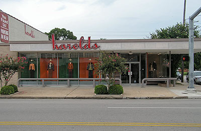
Not even 3 years after the store merged with a local competitor, the owners of Harold’s in the Heights has announced it is going out of business. Harold Wiesenthal founded the independent men’s clothing shop in 1950, a date its storefront at the corner of 19th St. and Ashland St. still screams daily to passersby. Since 2008, the store has been a part of Norton Ditto. Wiesenthal’s successor — his son Michael — left the company early last year.
- About us [Harold’s]
Photo: Gordon Tillman

- 1230 Nicholson St. [HAR]
19TH ST. IN THE HEIGHTS NOT QUITE READY FOR THAT SIXTIES VIBE Contrary to a few emailed and published reports claiming that it opened for business yesterday, the Heights Ashbury Coffee House still needs “a few more weeks” before it’ll be ready, owner Katy Whelan tells Swamplot . . . after an initial “YIKES!” The space at 242 W. 19th St. will be the new home of Staci Davis’s Radical Eats and Deborah Morris’s Juicy in the Sky with Vitamins juice bar. “We promise you we are ALMOST THERE,” writes Whelan. “We will be offering lots of specials for the wait.” [Previously on Swamplot]
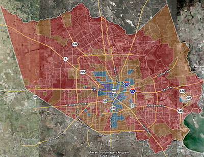
One of the big local stories of the 2010 Census was the decline in the number of majority-Anglo areas throughout Harris County. This map from consultant and Census obsessive Greg Wythe diagrams the trend pretty clearly. The areas colored red are where the portion of the local population identifying itself as Anglo dropped 10 percent or more; the areas where that group’s share of the population dropped by less than 10 percent are marked brown (Wythe says he started out painting them orange, but the satellite photo in the background made it darker). Areas marked a light blue are where the percentage of Anglos increased by less than 10 percent. And the dark blue (okay, purplish) areas show where Whites have been rushing in: Anglos’ share of the total population jumped by more than 10 percent in those areas.
“If you were to measure solely on the basis of the number of Anglos,” he explains, “you’re likely to see a lot of growth in areas where there’s growth in general. Cypress is an example — they grew in every demographic because they grew a lot, period.” But Wythe’s map tracks the changes in percentage of the population, not population growth.
The big exception to the overall trend of declining percentages of Anglos? The Heights.

Planning director Marlene Gafrick is recommending that city council shrink the boundaries of the proposed Houston Heights South and Woodland Heights historic districts before approving them — but only slightly. In this morning’s meeting, Gafrick presented a map of Houston Heights South with “squared off boundaries” in the southeast corner and western edges of the district, and that excludes a number of residences on Oxford St. For Woodland Heights, her map cuts out some properties on Omar St. She proposed making no changes to the proposed boundaries of the Glenbrook Valley district. The actual designation and boundaries of the districts will be up to city council.
- Historic Districts coverage [Swamplot]
Photo from 800 block of Columbia St.: Swamplot inbox
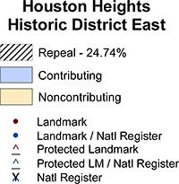 Planning director Marlene Gafrick’s recommendation that only one property be excised from just one of the 6 existing historic districts up for reconsideration (a 7th, Heights South, is going through the same process even though it hasn’t officially been approved yet) is just that — only a recommendation. Houston’s city council can still decide to alter the boundaries of any of those districts. And you can bet the maps provided by the planning department that show the repeal-survey responses and where they came from will be a major focus of attention as council members discuss the issue. Plus, hey — isn’t it fun to be able to see how your historic-district neighbors came down on the issue? Here’s the map for Heights East:
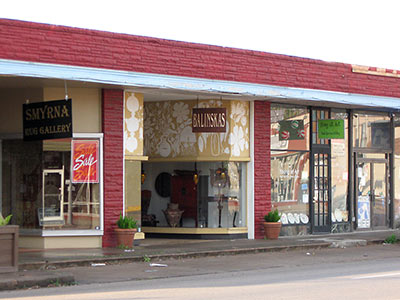
 That little shopping district on 19th St. in the Heights will get its second vegetarian restaurant as soon as Radical Eats opens its kitchen just down the street from Shade. (They serve meat at Shade; it’s Cricket’s Creamery and Cafe across the street that’s vegetarian.) Staci Davis, who’s been selling tamales, tacos, and other Radical Eats fare at Antidote Coffee, Smart Meals, and various area farmers markets, will be moving her food-preparation operation from a drug and alcohol abuse counseling center in a former Holiday Inn by the Eastex Freeway near Little York to a significantly smaller space inside Katy Whelan’s planned Heights Ashbury Coffeehouse in the space at 242 W. 19th St. Whelan originally had plans to name her space the Love Street Coffee Shop; it’s going where Balinskas Architectural Imports used to be. Also sharing space with Davis and Whelan: Architect Deborah Morris’s new juice bar, Juicy in the Sky with Vitamins.

