09/13/16 1:15pm

Some of the bloggers and photographers at clothing and trendy-places-to-go blog Wear+Where+Well (based in but not exclusively on Houston) have pulled together a long list of the mural walls found around town, complete with titles, artist names, photos, and the interactive map above. The list is annotated with an eye for photography conditions, as well as info on parking and on the likelihood of “indigents asking for spare change” nearby. The authors say the list will be updated frequently; info on how to submit new spots you think should be included can be found at the bottom of the document.

Map of Houston murals: Wear+Where+Well

Mural Mapping
09/01/16 5:15pm

Map of Weed Arrests in Early 2016 by Home Address, Superimposed over Median Incomes Greater than $80k

Is there a connection between where you live and your likelihood of getting arrested for weed in Houston? A map from January Advisor’s (and Sketch City‘s) Jeff Reichman adds a few data points to that conversation this afternoon, though he doesn’t appear to push any specific conclusions in his how, what, and why writeup. Reichman gathered data on the folks that Harris County’s public jail records system says were arrested over the first half of this year for minor marijuana possession offenses (instead of just being given a citation for the same offense). The red dots on the interactive map show the arrestees’ home addresses (scootched around a bit to somewhere within the dot’s 300-meter radius, for the sake of anonymity).

The other data layer (in shades of blue) shows census blocks with median income over $80,000 (marking roughly the start of what the US census measures as the top quarter of household earnings in the US, Reichman notes). The blue areas, which get darker as income gets higher, appear relatively arrest-free, though a 2012 study from the NIH suggest that more frequent weed use may be linked to higher socioeconomic status.

Map: Jeff Reichman

Mapping the Green
08/29/16 5:00pm

The larger the dot in the interactive map above, the more frequently the surrounding ZIP code deals with sewage overflows, per to the city’s tally of sewage spills between 2009 and 2014. The map, put together by Rachael Gleason with data prepped by John Harden and Mike Morris, goes along with Morris’s update in the Chronicle this weekend on the city of Houston’s ongoing negotiations with the EPA over what to do about the city’s sewage-related water quality issues, with the estimated cost of required infrastructure upgrades and education programs on the horizon currently hanging out in the neighborhood of $5 billion dollars.

The Chronicle’s analysis also notes that most of the areas with above-average sewage spill rates are home to above-average poverty rates, as well as above-average proportions of black and Hispanic residents than the city as a whole. The map above allows readers to superimpose the spill numbers over each ZIP code’s median income and poverty rate (you’ll have to look elsewhere for maps backing up the other claim, though). Another map released earlier this summer pinpoints more precisely the spots where the sewage flows most freely — areas in purple below have seen a minimum of 45 documented sewage spills in the 5-year data period:

CONTINUE READING THIS STORY

Sniffing Out the Cause
08/18/16 1:00pm

Find Your Watershed map, 2016

This month the Galveston Bay Foundation and Houston Advanced Research Center released their second annual report card on the health of Galveston Bay, boiling down a wide range of measurements into a series of letter grades. The report card, which looks at the bay itself along with the bayous that drain into it, aims to be easy to understand for folks with or without scientific training. Each of the 6 main categories of grade — including subjects like wildlife population trends, pollution sources, and human health hazards — is broken down with explanations of what specific measurements that rating is based on (and more details in the full report, for those who want them).

The agencies have also put together a Find Your Watershed tool, which lets you check in on how your own part of town is affecting the bay’s GPA. (That’s Buffalo Bayou watershed’s report shown above; the bayou did exceptionally well in dissolved oxygen and nitrogen content this term, but failed wetlands.) You can look up any address and see how the surrounding runoff area measures up in some of the report’s subject categories. (Note that the search tool’s map doesn’t use the same color-by-grade scheme that the rest of the report employs — you’ll have to click on each watershed to see the actual marks).

So how did the bay do this year?

CONTINUE READING THIS STORY

Galveston Bay Schooling
08/09/16 10:30am

For at least the 3rd time this summer, the city is back in emergency heat plan mode in the face of the in-the-shade 105 to 110 heat indices forecast across the area yesterday afternoon (and again today, from 1 to 7 pm). The plan kicks in when indices hang around 108 for more than 1 day in a row. A chat with the folks at 311 will get you a ride to one of the nearest air-conditioned chillout centers, mapped above — the majority are public libraries (marked in yellow), with a few municipal multiservice centers thrown in for color (namely blue). The list of centers is also broken out by postal code on the city’s emergency website, along with each spot’s operating hours — in the process providing a quick review of how some of those turn-of-the-decade library hours cuts shook out.

Map of emergency cooling centers: City of Houston

Reading is Cool
06/27/16 5:30pm

Above is Rewire’s interactive map of what happened to most of the abortion clinics in Texas since the 2013 passage of  HB2, parts of which were struck down today by the Supreme Court. The 5-3 ruling this morning overturned a section of the law that would have required prohibitively expensive remodeling of many clinic buildings, as well as a section requiring that abortion providers make arrangements that let them personally admit patients to nearby hospitals.

The latter requirement alone, when it went into effect in November 2013, caused more than half of the state’s 41 abortion providers to stop offering the procedure (including 4 out of 10 inside the Grand Pkwy. at the time). The University of Texas says that the full law, had it gone into effect, would have left Houston with 2 providers (compared to 33 in New York City, 10 in Los Angeles, and 13 in Chicago). Those 2 — the geometrically questionable Planned Parenthood HQ near University of Houston’s main campus, and the Texas Ambulatory Surgical Center in the Heights — show up on the map in green when the Ambulatory Surgical Center layer is activated:

CONTINUE READING THIS STORY

SCOTUS Rules on Texas
05/31/16 10:45am

Construction, Demo, and High Turnover rate map, Harris County, TX

The land between the Grand Parkway and Hwy.-6-FM-1960 contained more than 37 percent of the construction sites in Harris County over the last decade, according to the Houston in Flux report and interactive maps released by the Kinder Institute for Urban Research last week. The maps above highlight regions where demolition and construction permits were issued at above-county-average rates between 2005 and 2015. Red shows areas with high demolition rates, blue shows high construction rates, and purple shows spots where both stats beat the average — areas authors Kelsey Walker and Kyle Shelton refer to as high-turnover (mostly concentrated in the Inner Loop and to the northwest).

Each subsection of the walkthrough embedded above contains a “learn more” link that provides access to (and a quick explanation of) various data types that can be displayed. A section on census-tract-level trends (including building, demo, and turnover, as shown up top) is followed by a section allowing a detailed property-by-property browsing of the data, as shown below:

CONTINUE READING THIS STORY

Drawing It Out
05/27/16 3:00pm

NEED SOME HELP WITH THOSE 268,942 MAPPED HOUSTON PARKING TICKETS? Ticket Map Interactive Tool by Jordan Poles
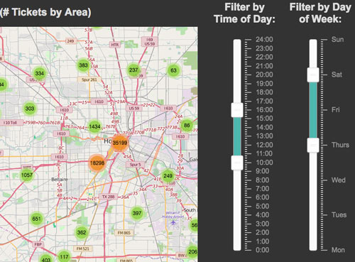
Amateur parking violation scrutinizer Jordan Poles has another new tool for those interested in the where- and when-abouts of parking citations in Houston. Each ticket from the same data set used in Poles’s earlier heat maps is now mapped individually (though thick clusters condense to single group markers at most zoom levels, since there are hundreds of thousands of tickets in the 2014-2016 dataset he uses). So far, the page lets users filter the tickets by time of day (sliders allow any hour-to-hour subdivision of a midnight-to-midnight window) and day of week (running Monday-through-Sunday); Poles plans to keep upgrading the site and to add new analytical features and datasets. [Previously on Swamplot] Image: HOU Interactive Parking Ticket Map

04/06/16 3:45pm

Go ahead and play around with the map above (created by activist Kris Banks), showing the precinct-by-precinct outcome across Harris County for last month’s Republican presidential primaries. Shades of red show the spots won by Cruz (most of them, though a lighter shade indicates less solid support). Precincts won by Rubio show up in shades of blue (mostly clustered on the west side of the Inner Loop), while Trump support is marked in gold (mostly northeast and south of Downtown, as well as strung out along the Westpark Tollway); a few Carson precincts show up in green.

January Advisors’s Jeff Reichmann recently took a look at Banks’s election maps, which include results from both parties’s primaries and a starkly geographically-split down-ballot race for the Democratic district attorney nomination. You can click on each precinct to get its number and a breakdown of the results. Here’s how things looked for the Democrats, with the Sanders precincts in green spangling a field of Clinton blue:

CONTINUE READING THIS STORY

Drawing It Out
03/15/16 5:00pm

Demographic Map of Houston Census Blocks and Public Housing Projects, from Texas Housers

The pale arrow pointing from W. Beltway 8 to Downtown in the map of Houston above is made up of census blocks recorded as more than 50 percent white, according to a post by Will Livesley-O’Neill for Texas Housers yesterday. The Austin-based nonprofit, which researches low-income housing policy around the state, published yesterday’s article as a followup to some previous posts about the mixed-income housing complex that HHA is planning for the site of its own office building on Fountain View Dr. in Briargrove. The demographic breakdown on the other 3 shades shown on the map, from lightest to darkest: 50 to 25.01 percent white, 25 to 5.01 percent, and 5 to 0 percent.

The map also marks the locations of existing Houston Housing Authority public housing developments as red stars, mostly outside of or skirting the majority-white census blocks; the proposed Fountain View housing site is singled out, tagged, and marked with a green star. Meanwhile, the black outline looping mostly around the majority-white areas is lassoing the market areas deemed strongest by the Reinvestment Fund‘s Market Value Analysis for the city.

Map: Texas Housers

Visualizations
01/19/16 12:30pm

UT Houston Campus Site, Buffalo Lakes, Houston

The deal is sealed on the University of Texas’s purchase of a 100-acre hunk of land south of South Main St. as of last Friday. The sale marks the first concrete move toward UT’s planned Houston campus, though closings on the parcel patchwork comprising the rest of the 300-ish ac. likely won’t wrap up until early 2017, according to a press release from the school’s Office of Public Affairs.

The sold land is a forested tract northwest of the wiggly intersection of Willowbend Dr. and Buffalo Spdwy.; the property is split along a northwest-southeast diagonal by a linear drainage feature which makes an appearance in those preliminary campus designs (shown from the north in the image above).

That land was owned previously by Buffalo Lakes Ltd., an entity associated with UT grad John Kirksey of Kirksey Architecture. A plan for a Buffalo Lakes master-planned community (see below) was drawn up more than 4 years ago by Kirksey for the same space:

CONTINUE READING THIS STORY

South Main Master Plans
07/06/15 12:45pm

Following up on last month’s Supreme Court decision highlighting the segregation effects of Texas’s low-income housing programs, Chronicle reporter Jayme Fraser has a few observations about how the Housing Tax Credit program has been administered around here — after studying the above map, which she assembled to show the location and details of every Houston-area property involved in the program from its start in 1987 through 2013. Using federal funds, the Texas Dept. of Housing and Community Affairs offers tax incentives to private apartment developers in exchange for guarantees to keep rents on new or rehabbed complexes below the market rate.

CONTINUE READING THIS STORY

Low-Income Housing Map
06/11/15 3:15pm

Which neighborhoods were hardest hit by last month’s floods? Try looking at this map to find answers. Zoomed out as it is, you can see some overall patterns. But to get a sense of the scope of the devastation in certain Houston neighborhoods, you’ll want to zoom in. Into this part of Meyerland, for example:

CONTINUE READING THIS STORY

High Water Maps
04/16/15 2:00pm

Map of Houston Mattress Chain Stores

Blogger and amateur bedding-sales analyst Christopher Andrews has updated a few of his maps of mattress chain stores in the Houston area (including the one shown above) to include Mattress One (or Mattress1 One, or Mattress 1 One, as the company variously refers to itself). Altogether, that Florida-and-Texas chain, plus Mattress Firm and Mattress Pro (owned by Mattress Firm), operate 166 separate retail locations in the region.


Map: Christopher Andrews

Bed Spread
07/10/14 5:00pm

Judgmental Map of Houston

Comedian Trent Gillaspie began his internet cartographic ventures by assembling an annotated map of his then-hometown of Denver, which he posted online hoping to highlight the humor in some of his gentrification-comedy routines with what he hoped would be considered outrageous labels for every neighborhood. “Some are judgmental, some are humorous, and all of them have a little bit of truth,” he explained to Business Insider earlier this year. “As long as you offend everyone you possibly can, it ends up making it OK.” Gillaspie then tried to open up his method to other cities — asking other comedians (and would-be comedians) to put together similar surveys of their own cities. A total of 47 labeled maps of various cities currently comprise the Judgmental Maps website, with varying levels of humor and “light racism,” as Business Insider’s Karyne Levy politely puts it.

The latest effort, submitted to Gillaspie’s website and tagged by its author, identified only as jr.ewing.78, targets Houston. We’ve sliced the map into thirds, for easier reading, below:

CONTINUE READING THIS STORY

Judgmental Maps