10/31/16 12:00pm

Houston Map of risk management plan facilities from UCS/tejas

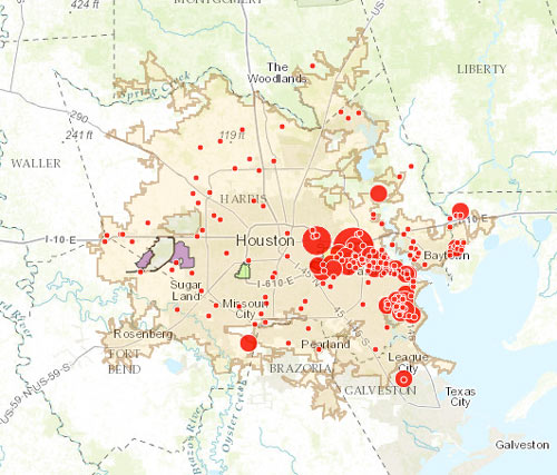
The little and not-so-little red dots on the map above show off sites on the EPA’s list of plants and refineries required to have a Risk Management Plan due to their potential for accidental hazardous chemical releases — with the larger dots showing the places that have already had an accident (or, in some cases, as many as 43). Clicking each dot will tell you what the facility’s name is, as well as how much toxic or flammable material it stores on site (to the nearest thousand pounds or so).

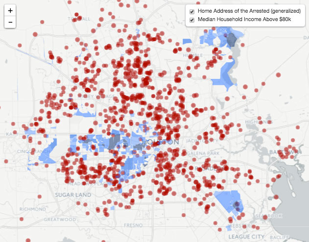
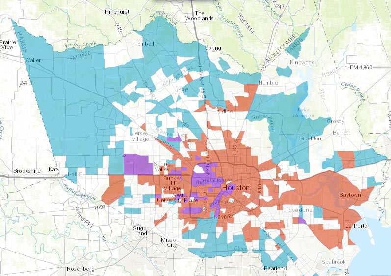
The Union of Concerned Scientists and t.e.j.a.s. put together the interactive map as part of a report released late last week, which compares the EPA’s data on air quality and cancer rates in a few neighborhoods on the west side of town (specifically in Bellaire and in the West Oaks and Eldridge area, just inside Hwy.6 near the Barker reservoir) with the same data in a couple of east side spots (Galena Park and Manchester).

CONTINUE READING THIS STORY

Sniffing It Out
10/12/16 11:30am

AirBnB Mapping Tool Showing Nightly Income as Percentage of Average Area Rent

This patchy map of the Houston region, from the national tool released last week by Airbnb, shades the area’s zip codes by what percentage of monthly rent could purportedly be covered by a single night of Airbnb rental. The map is the DIY-hotel company’s submission to this spring’s federal call for more public data tools related to housing and economics. And the rental rates used for the comparison come from the so-called small area fair market rates set by the Department of Housing and Urban Development, which this summer proposed breaking up the flat city-wide rates currently used for Section 8 housing voucher payouts into smaller pieces (with the intent that offering higher subsidy rates in higher income areas might reverse a trend of concentrating housing voucher recipients into already-high-poverty neighborhoods).

Topping the company’s list in Houston is 77018, the quasi-trapezoid covering much of the Garden Oaks and Oak Forest area; the tool says the federal market rental rate for the zone is $830 per month, but that earnings for renting out a private room in the area via Airbnb average around 22 percent of that amount, or $179 a night:

CONTINUE READING THIS STORY

AirBnB R&D
10/04/16 5:00pm

Jan 2017 FEMA Special Flood Hazard Zone classification changes

The areas in red above mark some of the new additions to the legally-gotta-buy-flood-insurance zones on FEMA’s recently revised flood maps. The agency’s interactive online viewer lets you mix-and-match a few data sets for Harris County (as well as Galveston, Fort Bend, and Wharton), compare the old mapped flood zone boundaries to proposed new ones, or look only at what would change — a FEMA spokesperson told Houston Public Media that about 8,000 properties have been added to the list in Harris County, while only about 400 were dropped.

Those acid-green highlights are areas that have been removed from the special flood hazard zone by the updated map (while blue shows areas that have just changed floodplain classification some other way. Bits of brown and yellow in other areas of the map show places added or removed (respectively) from the floodway. The updates above to the mandatory flood insurance zone (legally called the Special Flood Hazard Area) are set to go into effect in January, as shown above. Buffalo Bayou and its tributaries are pretty marked up:

CONTINUE READING THIS STORY

Flood Insurance Ebb and Flow
10/04/16 1:15pm

FEDS TO TEXAS: STOP PRESSURING SCHOOLS INTO CAPPING SERVICES FOR KIDS WITH DISABILITIES ISD Map The Department of Education sent out a knock-it-off letter yesterday in response to recently published documentation of a 32% drop in the percentage of Texas students getting special education services — down from 12.1% in 2000 to a seemingly-research-free “goal” of 8.5%. Brian M. Rosenthal reports that the push to reduce the special ed enrollment rate (a policy which was never publically announced) came shortly after the legislature cut the Texas Education Agency’s budget by more than a billion dollars in 2003; the 2004 special ed policy change may have saved the state billions of dollars by withholding federally-mandated accommodations for “children with autism, ADHD, dyslexia, epilepsy, mental illnesses, speech impediments, and blindness and deafness.” Though the agency also couldn’t provide any documentation as to why that target number was picked, educators and district administrators have told Rosenthal that the percentage functions as a de facto cap on how many students can receive services, since failure to come in below the 8.5% benchmark docks a school’s performance rating. Meanwhile, HISD’s own numbers have reportedly gone below and beyond the requirement, diving to 7.4% special ed enrollment versus 19% in New York City. Texas has 30 days to get back to the Department of Education on how it thinks the policy has impacted state school districts, and what it plans to do about it. [Houston Chronicle] Map of Houston-area school districts: TEA School District Locator

10/03/16 2:00pm

THE 82 SQUARE MILES OF TIRZS SPONGING UP SOME OF THAT REVENUE CAP SPILLOVER TIRZs, 2016
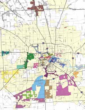
A couple of state senators are mulling over potential reform options for Houston’s ballooning tax increment reinvestment zones, which have more than tripled in area in the past decade according to Mike Morris and Rebecca Elliot’s article in Friday’s Chronicle (which includes a peek-a-boo-style before-and-after slider map for reference).  The zones, shown here on the city’s own map, collected around $109 million dollars of woulda-been property tax money this year for use on development projects inside their boundaries, which (in theory) are supposed to encompass blighted areas in need of an additional redevelopment boost.  Morris and Elliot also point out, however, that much of the tax money being collected by TIRZs would be lost altogether if the zones were disbanded at the moment, as the sudden influx would pass Houston’s revenue cap (which limits the amount of cash the city is allowed to collect each year to what was collected in the previous year, scaled up by 4.5% or by inflation and population increases, whichever is less). They also mention that Mayor Turner is pushing for a new vote on the revenue cap in 2017; Turner tells the duo that the city council has stuck with the TIRZ system to make up for some of the potential funds lost by the revenue cap, but notes that “you can only do that for so long without hurting the city as a whole.” [Houston Chronicle; previously on Swamplot] Map of Tax Increment Reinvestment Zones: City of Houston

09/27/16 2:45pm

Here’s the map posted by Houstonia’s Katharine Shilcutt this morning showing the usual haunts of 8 taco trucks now also serving as mobile voter registration hubs. This particular registration push, which started yesterday and will last through Texas’s October 11th registration deadline, is a combined effort of communication designer Thomas Hull and the local chapter of political-activity-encourager Mi Familia Vota. The plan developed in the wake of Latinos for Trump founder Marco Gutierrez’s comments earlier this month, which painted an accidentally delicious picture of a future US landscape hosting “taco trucks on every corner”; those comments, in turn, spurred a “Guac the Vote” campaign from the US Hispanic Chamber of Commerce, which has been calling for taco-truck-based voter registration at the national level.

CONTINUE READING THIS STORY

Guac the Vote
09/13/16 1:15pm

Some of the bloggers and photographers at clothing and trendy-places-to-go blog Wear+Where+Well (based in but not exclusively on Houston) have pulled together a long list of the mural walls found around town, complete with titles, artist names, photos, and the interactive map above. The list is annotated with an eye for photography conditions, as well as info on parking and on the likelihood of “indigents asking for spare change” nearby. The authors say the list will be updated frequently; info on how to submit new spots you think should be included can be found at the bottom of the document.

Map of Houston murals: Wear+Where+Well

Mural Mapping
09/01/16 5:15pm

Map of Weed Arrests in Early 2016 by Home Address, Superimposed over Median Incomes Greater than $80k

Is there a connection between where you live and your likelihood of getting arrested for weed in Houston? A map from January Advisor’s (and Sketch City‘s) Jeff Reichman adds a few data points to that conversation this afternoon, though he doesn’t appear to push any specific conclusions in his how, what, and why writeup. Reichman gathered data on the folks that Harris County’s public jail records system says were arrested over the first half of this year for minor marijuana possession offenses (instead of just being given a citation for the same offense). The red dots on the interactive map show the arrestees’ home addresses (scootched around a bit to somewhere within the dot’s 300-meter radius, for the sake of anonymity).

The other data layer (in shades of blue) shows census blocks with median income over $80,000 (marking roughly the start of what the US census measures as the top quarter of household earnings in the US, Reichman notes). The blue areas, which get darker as income gets higher, appear relatively arrest-free, though a 2012 study from the NIH suggest that more frequent weed use may be linked to higher socioeconomic status.

Map: Jeff Reichman

Mapping the Green
08/29/16 5:00pm

The larger the dot in the interactive map above, the more frequently the surrounding ZIP code deals with sewage overflows, per to the city’s tally of sewage spills between 2009 and 2014. The map, put together by Rachael Gleason with data prepped by John Harden and Mike Morris, goes along with Morris’s update in the Chronicle this weekend on the city of Houston’s ongoing negotiations with the EPA over what to do about the city’s sewage-related water quality issues, with the estimated cost of required infrastructure upgrades and education programs on the horizon currently hanging out in the neighborhood of $5 billion dollars.

The Chronicle’s analysis also notes that most of the areas with above-average sewage spill rates are home to above-average poverty rates, as well as above-average proportions of black and Hispanic residents than the city as a whole. The map above allows readers to superimpose the spill numbers over each ZIP code’s median income and poverty rate (you’ll have to look elsewhere for maps backing up the other claim, though). Another map released earlier this summer pinpoints more precisely the spots where the sewage flows most freely — areas in purple below have seen a minimum of 45 documented sewage spills in the 5-year data period:

CONTINUE READING THIS STORY

Sniffing Out the Cause
08/18/16 1:00pm

Find Your Watershed map, 2016

This month the Galveston Bay Foundation and Houston Advanced Research Center released their second annual report card on the health of Galveston Bay, boiling down a wide range of measurements into a series of letter grades. The report card, which looks at the bay itself along with the bayous that drain into it, aims to be easy to understand for folks with or without scientific training. Each of the 6 main categories of grade — including subjects like wildlife population trends, pollution sources, and human health hazards — is broken down with explanations of what specific measurements that rating is based on (and more details in the full report, for those who want them).

The agencies have also put together a Find Your Watershed tool, which lets you check in on how your own part of town is affecting the bay’s GPA. (That’s Buffalo Bayou watershed’s report shown above; the bayou did exceptionally well in dissolved oxygen and nitrogen content this term, but failed wetlands.) You can look up any address and see how the surrounding runoff area measures up in some of the report’s subject categories. (Note that the search tool’s map doesn’t use the same color-by-grade scheme that the rest of the report employs — you’ll have to click on each watershed to see the actual marks).

So how did the bay do this year?

CONTINUE READING THIS STORY

Galveston Bay Schooling
08/11/16 11:30am

GOOGLE’S MAP OF HOUSTON’S INTERESTING PLACES Google Maps Areas of Interest Screenshot
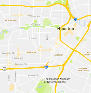
The light smudges of orange seen here are some of Google Maps’ latest updates to its slow digital document-everything push: highlighted areas of interest, based on density of retail and dining options. A glance around the new map, which rolled out late last month, reveals a fair amount of orange shading in strips and spots from Downtown west toward the Galleria and out along the Westheimer corridor, with bits of color appearing around Heights hotspots and the Rice Village area, among others. The areas east and north of the city’s center, however, are notably barren by Google’s accounting; Kyle Shelton writes that “This doesn’t, of course, mean that no activity occurs. It means the algorithm Google used did not register the form of activity that predominates there: more isolated shops and businesses spread among homes, along roadways or next to larger industrial tracts. What are the consequences of Google Maps, a visible, popular product showing that no areas of interest exist in these areas? How might that designation affect the bottom lines of businesses not within a hub?” [Urban Edge via Houston Chronicle] Map of Houston Areas of Interest: Google Maps

08/09/16 10:30am

For at least the 3rd time this summer, the city is back in emergency heat plan mode in the face of the in-the-shade 105 to 110 heat indices forecast across the area yesterday afternoon (and again today, from 1 to 7 pm). The plan kicks in when indices hang around 108 for more than 1 day in a row. A chat with the folks at 311 will get you a ride to one of the nearest air-conditioned chillout centers, mapped above — the majority are public libraries (marked in yellow), with a few municipal multiservice centers thrown in for color (namely blue). The list of centers is also broken out by postal code on the city’s emergency website, along with each spot’s operating hours — in the process providing a quick review of how some of those turn-of-the-decade library hours cuts shook out.

Map of emergency cooling centers: City of Houston

Reading is Cool
06/27/16 5:30pm

Above is Rewire’s interactive map of what happened to most of the abortion clinics in Texas since the 2013 passage of  HB2, parts of which were struck down today by the Supreme Court. The 5-3 ruling this morning overturned a section of the law that would have required prohibitively expensive remodeling of many clinic buildings, as well as a section requiring that abortion providers make arrangements that let them personally admit patients to nearby hospitals.

The latter requirement alone, when it went into effect in November 2013, caused more than half of the state’s 41 abortion providers to stop offering the procedure (including 4 out of 10 inside the Grand Pkwy. at the time). The University of Texas says that the full law, had it gone into effect, would have left Houston with 2 providers (compared to 33 in New York City, 10 in Los Angeles, and 13 in Chicago). Those 2 — the geometrically questionable Planned Parenthood HQ near University of Houston’s main campus, and the Texas Ambulatory Surgical Center in the Heights — show up on the map in green when the Ambulatory Surgical Center layer is activated:

CONTINUE READING THIS STORY

SCOTUS Rules on Texas
05/31/16 10:45am

Construction, Demo, and High Turnover rate map, Harris County, TX

The land between the Grand Parkway and Hwy.-6-FM-1960 contained more than 37 percent of the construction sites in Harris County over the last decade, according to the Houston in Flux report and interactive maps released by the Kinder Institute for Urban Research last week. The maps above highlight regions where demolition and construction permits were issued at above-county-average rates between 2005 and 2015. Red shows areas with high demolition rates, blue shows high construction rates, and purple shows spots where both stats beat the average — areas authors Kelsey Walker and Kyle Shelton refer to as high-turnover (mostly concentrated in the Inner Loop and to the northwest).

Each subsection of the walkthrough embedded above contains a “learn more” link that provides access to (and a quick explanation of) various data types that can be displayed. A section on census-tract-level trends (including building, demo, and turnover, as shown up top) is followed by a section allowing a detailed property-by-property browsing of the data, as shown below:

CONTINUE READING THIS STORY

Drawing It Out
05/27/16 3:00pm

NEED SOME HELP WITH THOSE 268,942 MAPPED HOUSTON PARKING TICKETS? Ticket Map Interactive Tool by Jordan Poles
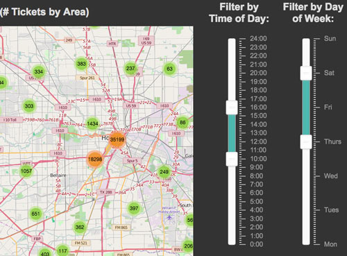
Amateur parking violation scrutinizer Jordan Poles has another new tool for those interested in the where- and when-abouts of parking citations in Houston. Each ticket from the same data set used in Poles’s earlier heat maps is now mapped individually (though thick clusters condense to single group markers at most zoom levels, since there are hundreds of thousands of tickets in the 2014-2016 dataset he uses). So far, the page lets users filter the tickets by time of day (sliders allow any hour-to-hour subdivision of a midnight-to-midnight window) and day of week (running Monday-through-Sunday); Poles plans to keep upgrading the site and to add new analytical features and datasets. [Previously on Swamplot] Image: HOU Interactive Parking Ticket Map