01/30/18 4:15pm

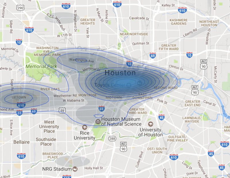
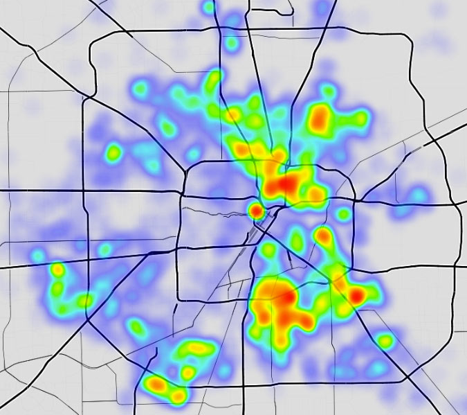
“On almost any map that plots some form of wealth,” writes the Kinder Institute’s Leah Binkovitz, “a familiar arrow takes shape over the Energy Corridor, Memorial and River Oaks, pointing east toward downtown.” Nowhere is that arrow clearer than on this map from fitness brand Strava, which visualizes running and biking activity in Houston from 2009 through last October. Strava updated its map — which includes 200,000 years worth of global exercise time — in November (although it’s been in the news more recently than that). Beginning just east of Hwy. 6, the arm of the indicator travels straight into Downtown, forming a point right around the Elysian St. bridge across Buffalo Bayou.

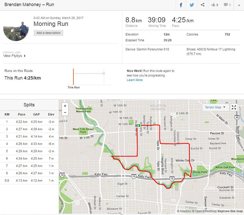
A little more zoom shows where the arrow’s edges run to the northwest and southwest of the city center:

CONTINUE READING THIS STORY

Citywide Fitness Tracking
09/13/17 10:15am

Yes, there are spots where Harris County public health officials have determined it’s still not safe to drink the water. And here they are: Areas still under drinking-water advisories are marked in red in the above interactive map; areas where advisories issued after flooding resulting from Hurricane Harvey have already been lifted are marked in green. Click on each area and a popup or panel will provide details. The county promises to update the map every 24 hours. A full-browser-width version of the map is available here.

Map: Harris County Public Health

Harvey Maps
09/07/17 4:30pm

The Galveston District of the U.S. Army Corps of Engineers has made public a set of interactive maps — normally used by emergency personnel — that show which areas along the length of Buffalo Bayou are predicted to remain under water or emerge from it as officials continue to release water from the Addicks and Barker reservoirs upstream. Individual interactive map panels cover each day from September 5th through the 16th, but as of this date all rely on data developed on Tuesday, when the maps were created.

The embedded version above mimics the view from a mobile browser; you can zoom in to view the projected water line on any street. To switch days, click on one side or the other of the panel at the bottom of the frame — or choose the date directly from the menu that appears after you click on the icon in the top left corner.

To view the map in its own browser window, click here.

Map: USACE Galveston District

Inundation Levels, Day by Day
09/04/17 9:30am

If you or someone you’re helping has been accepted into FEMA’s Transitional Shelter Assistance program — meant to clear out shelters by providing people who can’t return to their homes a hotel or motel room for a limited period of time — you may want to use the map shown here. It marks the locations of every eligible hotel or motel in the Houston area approved by the program. Using the map should make it easier to find an acceptable one nearby. To view the map in its own browser window, click here.

This map is yet another whipped-up-by-volunteers-in-a-jiffy product of Sketch City — this one created by the civic hacking group’s founder, Jeff Reichman. Sketch City volunteer and college sophomore Nile Dixon (who earlier created a similar tool to help people find nearby shelters) has created a simplified text-it-to-me version of it as well: Just text your ZIP Code to 832-981-4926 and a bot will send back contact info for the nearest verified accommodations in the program.

You can find out more about U.S. government Harvey assistance, including the TSA program, from the FEMA Harvey website.

Map: Sketch City

Harvey Maps
09/01/17 3:30pm

Here’s the latest publicly available high-resolution aerial imagery of Houston-area flooding, in an interactive map you can use to zoom in and examine in detail and by address. The imagery in the map above comes from the National Oceanic and Atmospheric Administration, and was taken this past Wednesday and Thursday, August 29th and 30th — as floodwaters subsided in many areas of the city but continued to build in a few parts west.

Included in the portions of the city photographed by NOAA: the sections of Memorial south of I-10, west of Gessner Rd., north of Briar Forest Dr. (that’s below Buffalo Bayou), and east of the Addicks and Barker reservoirs. That’s the area where Mayor Turner earlier today said residents who already have water in their homes should probably leave their homes now if they haven’t already — because water is likely to remain in them for the next 10 to 15 days as releases from the dams continue.

To zoom in on the latest aerial imagery from that area, you can click on the search box in the map above and type “Memorial, Houston,” then click on the first option that appears below where you’re typing. Then zoom in further to see where the floodwaters are and aren’t. You can identify the date of the imagery and turn on and off various layers if you click on the lower of the 2 icons on the top right of the map. To view the map larger in your browser window, navigate directly to NOAA’s Harvey site.

CONTINUE READING THIS STORY

Harvey Flooding from Above
08/29/17 8:45pm

Here’s another helpful online tool from the civic hackers at Sketch City, this one for would-be volunteers: a crowdsourced, interactive map showing which shelters near you are in need of what resources — and which ones might need people to come over and help out. Each icon on the map represents a shelter or providing organization that’s helping evacuees who’ve been put out of their homes by Harvey flooding. Click on one and a panel on the left will indicate any supply needs or volunteer needs identified by the site. (A larger, full-browser-width version of the map is here.)

The map was put together by Amanda Shih, Dr. Neeraj Tandon, and Chris Ertel, and is linked to data assembled and continually updated by a group of dozens of local and not-so-local volunteers hooked up to the project by Sketch City, a Houston nonprofit technology group. (The same bank of is behind Sketch City’s other new mapping project — one that simply identifies available Harvey shelters to people seeking them.) The volunteers have been making regular phone calls to update the information in a shared Google Doc. (If that kind of call-and-type-from-home work is your preferred method of volunteering, go ahead — you’ll find a direct link to the underlying spreadsheet in the map.)

How and Where To Volunteer
08/29/17 10:30am

The map above outlines the actual locations of neighborhoods designated by officials yesterday as being at risk from flooding over the back sides of Houston’s dual Buffalo Bayou reservoirs — in advance of actual spillovers, which began last night and continued this morning. The map was put together by Chronicle data reporter John D. Harden, using information from the Harris County Flood Control District. Zoom in and you can identify specific streets and neighborhoods on the upstream side of Addicks (in red) and Barker (in blue) reservoirs.

Names of the affected neighborhoods are listed on the map’s fly-out panel, available by clicking on the icon at the top left corner of the map. Click on the icon at the top right corner to enlarge the map if you need to.

To lessen the risk of flooding to these areas, officials have been releasing water out the other end, through the Addicks and Barker dams into Buffalo Bayou — possibly (depending on bayou water levels) endangering neighborhoods and structures downstream.

Map: Houston Chronicle

08/28/17 10:00am

WHERE THE SHELTERS ARE OPEN NOW 
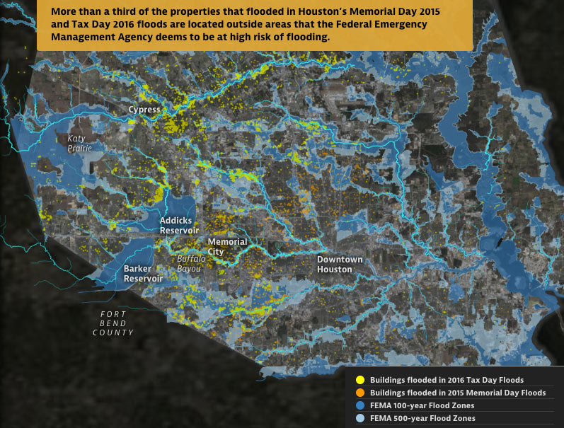
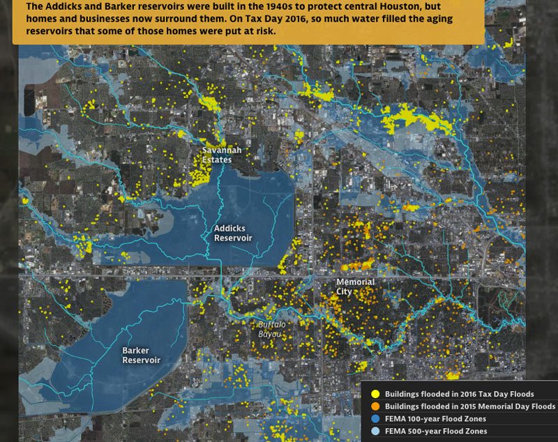
A few places you can hunt for shelters open now, whether you’re hunting for family or friends, looking for a volunteer opportunity, or have suddenly discovered your area is now under an evacuation order (as parts of Conroe and Missouri City found themselves this morning, following orders for Bay City and parts of Ft. Bend County and Rosenberg yesterday): Harris County’s Office of Homeland Security and Emergency Management has this list (last updated just before midnight last night, as of this writing), accompanied by the map above (though do ignore its overly optimistic delineation of evacuation routes). The Red Cross maintains a map of its own facilities, which covers a wider area but does overlap with the county’s list. Not yet included on either list: shelters that opened for the first time this morning at Katy ISD’s Morton Ranch and Cinco Ranch high schools. Update, 10:15 am: The list for Galveston.[ReadyHarris; Red Cross; Katy ISD] Map: Harris County Office of Homeland Security and Emergency Management

05/04/17 1:45pm

Don’t feel like hopping on your bike to see how construction on that northern piece of the White Oak Bayou hike-and-bike trail is coming along? The click-and-drag-able digital map released this week by the Bayou Greenways 2020 folks may be a decent substitute for the real thing (depending on how often it ends up getting updated). Zoom in closer on the map above to check out completed trail sections (outlined in green), under construction spots (traced in dark purple), and areas planned for trail-ification at a later date (highlighted in a purple haze).

Here’s the area around Mason Park (where that double-V suspension bridge is under construction at the moment):

CONTINUE READING THIS STORY

Green is for Greenway
04/12/17 12:45pm

Super Bowl Alcohol Sales Boost Map

“I can’t explain how a Chili’s got on the list, but that Chili’s must have been pretty lit,” writes engineer and bar aficionado Ian Wells. Wells just wrapped up his latest data-crunching escapade: a dive into how much extra alcohol sales revenue was actually pulled in by Super Bowl LI (as well as where that boost was distributed and who bagged most of the excess). The map above gives an idea of how the $8.9 million in extra alcohol sales (plus or minus a couple million) were spread out around town during February; Wells notes that probably only 5% of establishments saw more than a $25,000 boost above what they would have made in a normal February, though there’s lot of uncertainty in modeling any given bar’s expected “normal” revenue.

So who got the biggest percentage sales bumps? Here’s the rundown through the top 10, and some highlights from the top 100, plus more on where all those numbers come from:

CONTINUE READING THIS STORY

Crunching the Numbers
03/29/17 9:30am

Houston Heights Run Resembling the Shape of Texas

Swamplot reader Brendan Mahoney, an Aussie transplant, writes in to report a discovery he and his running partner made just a few weeks ago while out on a run in the Heights area: “The new 2 mile section of the White Oak Bayou Greenway that opened recently looks like the great state of Texas.” Mahoney’s kinda-familiar path (and split times) are visible in the screenshot of his running app, above. Here’s a closeup:

CONTINUE READING THIS STORY

Heights Lone Star-ish Lap
12/22/16 12:00pm

Texas RRC orphaned wells, by Luke Whyte for the Texas Tribune

Texas RRC orphaned wells, by Luke Whyte for the Texas TribuneThe map above (a snap from Luke Whyte’s click-and-zoom-able original version, published this week by the Texas Tribune) shows the abandoned oil and gas wells scattered in and around the Houston area, per the official accounting of the Texas Railroad Commission. The state agency (which has had nothing to do with railroads since 2005) regulates pipelines, oil, and gas, and keeps tabs on so-called “orphaned wells” whose original owners have stopped keeping tabs on them for one reason or another, writes Jim Malewitz this week — the ones that were reported in the first place, that is. Kerry Knorpp, formerly on a defunct state committee overseeing oilfield cleanup efforts, also tells Malewitz that “there is about to be a tsunami of [newly] abandoned wells — wells were drilled at $110 oil that you would have never completed otherwise.”

The shaded hexagons above are meant to help show the density of those holes, not the degree to which they might pose a pollution hazard (though the agency ranks each well by its hazard potential, too, to help it decide which ones to plug up first, of the more than 10,000 currently on the docket).

Just what kind of hazards can a bunch of abandoned holes pose, anyway?

CONTINUE READING THIS STORY

Boom and Bust
12/07/16 2:30pm

from Boomtown, Floodtown (Texas Tribune and ProPublica)

From some of the same folks who brought you those fun-with-worst-case-scenarios hurricane flood maps earlier this year —  Neena Satija and Kiah Collier of the Texas Tribune, and Al Shaw of ProPublica — comes a fresh set of animated maps of a few of Harris County’s most flooded and floodable places, along with a bit of investigation into how they got that way (and whether that might change any time soon). The new illustrated presentation shows off the spread of properties that took a dip during some of Harris County’s last few citywide submersion events (flooded properties from Tax Day 2016 are shown in yellow above, along with the Memorial Day 2015 flooded properties in orange).

Texas A&M Galveston researcher Sam Brody tells the authors that “more people die here than anywhere else from floods. More property per capita is lost here. And the problem’s getting worse.” In sorting through some of the whos, whats, and hows of Harris County’s flood infrastructure and chronically soggy residents, the article juxtaposes the recent flood damage data with the likes of FEMA-mapped 100- and 500-year flood zones (shown above), a visual tally of the land area developed last decade, and a view of what’s left of Houston’s coastal prairie (as of 2010):

CONTINUE READING THIS STORY

Harris High Water
11/28/16 10:45am

Jeff Reichman's Map of 2016 BARC service calls

Where do Houston’s furrier residents tend to congregate? Jeff Reichman’s latest city data tinkering provides some clues — the clickable heatmap above highlights the areas where the city’s BARC program got the most calls this year for services like stray pickups and code enforcements related to domestic animals. BARC is currently in the middle of a 3-month push for a 90-percent no-kill rate of its collected and surrendered menagerie, after a successful 1-month push for that rate last November; the average euthanization rate for the program reportedly flipped from about 80 percent euthanized to about 80 percent released alive between 2005 and 2015.

CONTINUE READING THIS STORY

Hot Dog Neighborhoods
11/14/16 9:15am

Update, November 22: The finalized county precinct data has been incorporated into the map above; a layer showing voter turnout has been added as well.

With all 1,012 precincts shaded in by civic data whiz Jeff Reichman, the interactive map above of last week’s election results shows both stark splits and gray areas in blue-swung Harris County, which gave only 41.8 percent of its vote to Wrestlemania hall-of-famer and historically litigious president-elect Donald Trump. The red-to-blue shading shows who won by what percentage, with results ranging from count-’em-on-one-hand margins to total blowouts for one major candidate or the other. You can click on each precinct to see the breakdown of votes and turnout (though Stein, Johnson, and McMullin voters will have to look elsewhere for the details on those candidates’ spreads).

On the east side of town, the red-blue divide runs roughly along the track of Beltway 8; the border of that central dark blue zone stretches north to include Greenspoint and then runs east along FM 1960 to 290. The split gets murkier on the west side of the Inner and Outer Loops, with many precincts showing much closer margins. More noticeably red areas inside Beltway 8 show up near Memorial, River Oaks, Bellaire, and Shepherd Park Plaza — plus spots like tiny Precinct 0830 on S. Main, where Trump took a total of 3 votes to Clinton’s 1.

Map of presidential election results by precinct: Jeff Reichman

Post-Election Breakdown