COMMENT OF THE DAY: DALLAS DISCOUNT “Nice property, but those prices per sq. ft. are RIDICULOUS. Even in comparison to other Texas cities, like Dallas and Austin. Best of luck leasing at that price point. Most NEW residential lease towers in Dallas have slashed rates. A friend of mine renewed his lease at the Cirque in Victory Park, which is much more fabulous than One Park Place, and his rate was reduced by $250 per month! Additionally, most properties now offer specials, like one-two months free.” [Ted, commenting on One Park Place or Another]
Downtown
 The brise-soleil modern Harris County Administration Building at 1001 Preston Downtown — across from a Metro Rail stop on Main St. — has been having a little problem holding it all together, reports the Chronicle‘s Liz Peterson. And it’ll take a little fixing:
Employees noticed the first bits of fallen concrete in February 2008, prompting the county to hire Walter P. Moore and Associates to evaluate the extent of the problem, said Mike Swain, the county’s deputy director of architecture.
The firm’s workers spent the next several months removing the most dangerous loose concrete and studying the rest of the 31-year-old building’s façade, he said.
Their report urges the county to install protective scaffolding around the building’s perimeter as soon as possible. Doing that and removing the rest of the loose concrete is expected to cost about $175,000.
Repairing the concrete façade is expected to cost at least $4.5 million, while waterproofing all the windows will eat up another $460,000.
- Look out below… [Houston Politics]

The River Oaks Examiner‘s Cynthia Lescalleet tours the brand-new 340-unit One Park Place, across from Discovery Green Downtown:
Units are bright and spacious, with several oversized features, such as 10-foot ceilings that, unlike loft properties, are finished, meaning no dust or gloomy black paint. Each unit has a balcony. Views vary. Overall, the apartments toured felt solid and private and very much like city living in other major cities, which was the point. In One Park Place, Finger Companies wanted to build a landmark residence reminiscent of the historic parkside properties in New York, Chicago and San Francisco. Meanwhile, the project’s rose-colored masonry with stone accents connotes other noted Houston architecture. . . .
Okay, how much?
. . . the property’s floorplans have verdant names like Cedar and Azalea. The smallest units have about 800 square feet and lease for $1,800-$2,550 if located on the lower floors of the tower. The six penthouses lease for $6,400 to $11,880 for units of 2,000 to 3,500 square feet.
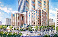 That 11-story, 240-room Hilton Garden Inn the WEDGE Group International was planning to build next to the company’s Downtown tower has been put on hold — at least until September — a source tells Swamplot. Financing apparently wasn’t the issue. Our source says that Hilton’s executive board is being cautious, and “wanted to watch the Houston market conditions to see if it would be a wise placement.”
The hotel was planned to fit directly to the north of the WEDGE tower at 1415 Louisiana and cover the blank parking-garage wall facing Clay St.
Rendering of Proposed Hilton Garden Inn: Mitchell Carlson Stone

In this episode: Katy Freeway anthill mover, moon-unit coffee, and that robot on the porch.
What’s this special delivery rushing down I-10?
From Downtown yesterday: Buffalo Bayou garbage flotilla!
- Crap on the Bayou [By the Bayou]

The fog cuts both ways: Reader Stephen Cullar-Ledford sends in this view looking back at Downtown, taken from the AIG American General building on Allen Parkway yesterday morning.
. . . Along with yet another economy/fog/building metaphor, ripe for the captioning:
COMMENT OF THE DAY: DOWNTOWN HILTON GARDEN INN FURNITURE PLAN “Financing? WEDGE’s principal can find the money for this project in his couch cushions. According to ArabianBusiness.com, Issam Fares is currently the 32nd richest Arab on the planet with a net worth of $2.4 Billion.” [Bernard, commenting on Downtown Wallflower: A New Hilton Garden Inn?]
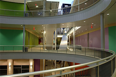
Houston’s Downtown office district, writes Christof Spieler in the RDA’s OffCite blog, “wraps around Pavilions on two sides. It ought to be delivering swarms of office workers to restaurants and the book store. But at lunchtime on weekdays, Pavilions seems empty compared to the streets a few blocks away. What’s wrong?”
In Cite, the blog’s paper-bound cousin, Max Page wishes all the stores in Houston Pavilions had simply faced the street, and that the apartments and condos hadn’t been cut from the project:
Like the residential component, the decision about whether to orient the project to the existing street grid, or turn away, was made in the wrong direction. [Architect Roger] Soto laments the choice. “We had some compelling ideas about activating the street,†he told me. “But in the end, the developer chose to attach retail stores to a ‘central spine,’†perhaps because that approach created a scheme that more closely resembled the traditional covered malls [Developer William] Denton had spent years developing.
How about the action along that central spine?
 Schemers at over- capitalized WEDGE Group International appear to have hatched a complicated plot to cover up that 11-story blank parking-garage wall at the base of the company’s Downtown tower at 1415 Louisiana. The plan: slide a new building of equivalent height — say, a Hilton Garden Inn — right next to the tower’s north base, then add a suburban-style porte-cochere entrance along Clay St.
HAIF user lockmat unearthed this small rendering of the hotel (above), which was hiding in plain view on the WEDGE Real Estate Holdings website. It shows how the completed wallcovering would look from Louisiana St., just north of Clay — if WEDGE’s separate 12-story Clay Garage wasn’t there to block the view. The tall buildings shown in the background are the WEDGE tower and the ExxonMobil building just behind it to the left.
How far along are these plans?
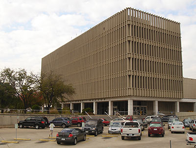
Nancy Sarnoff reports that the U.S. Postal Service is putting its entire 16-acre downtown facility on the market, including the classic modern main building. The building was designed by Houston’s own pseudo-brutalists Wilson, Morris, Crain and Anderson in 1962, when precast concrete fins were all the rage.
There are a few stipulations to the sale:
Whoever buys the property at 401 Franklin must build a replacement processing facility for the postal service, as well as provide a retail location near the existing site where consumers can mail packages and buy stamps.
- Downtown Houston post office up for sale [Houston Chronicle]
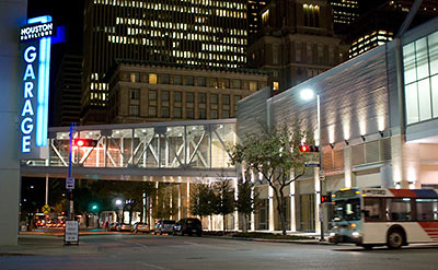
Last week Lucky Strike Lanes announced that the stalled buildout of the company’s new upscale bowling alley and lounge in Houston Pavilions would be “put on hold” — indefinitely. This time the company isn’t complaining about delayed equipment deliveries, though. It’s delayed money deliveries:
“At the moment we are seeking financing to complete the project and are having meaningful conversations with potential Houston-based partners as well as investors from elsewhere in the country,†Lucky Strike President Dolf Berle said. “We are still dedicated and committed to opening in Houston.â€
Meanwhile, this past Wednesday night HAIF poster houstonartstudent reported the quiet withdrawal of two minor — and seemingly out-of-place — retail tenants:
MAYBE HE JUST LIKED THE PARTY HAT ON TOP? Mayor White takes a turn hawking the expensive rentals at the Finger Companies’ One Park Place highrise Downtown. Rick Casey thinks he could have delivered a better pitch: “When it comes to a place to live, people are motivated by a dream. Only a pocket-protected city planner could have his dreams triggered by such phrases as ‘residential infrastructure,’ or ‘leisure destination,’ or ‘luxury multifamily rentals,’ or ‘price points lower than you would think,’ or ‘landmark project on a unique site.’ The mayor managed to stuff all these infelicitous phrases and more onto a single page. One can only speculate why White wrote the letter. He had already done enough, it seems to me, by marshalling the money, the research and the architects to build Discovery Green, a beautiful and exciting 12-acre park across the street from Finger’s property. It’s the best front yard an urban dweller could want, and the city mows the grass.” [Houston Chronicle]
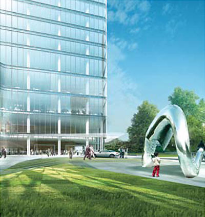
A major downturn in the economy tends to make it a bit easier to happen upon images of developments that have been planned in secret — though finding them can be somewhat less exciting than unearthing plans that are actually likely to happen. A tipster reports HAIF user lockmat’s discovery of two images of Brookfield Properties’ planned Five Allen Center office tower Downtown. We saw one hazy picture of this building back in June. But is there any more to it now than just a few pretty pictures?
Five Allen Center is marked “pre-development” on the Brookfield website: a 50-story, 1.2-million-sq.-ft. office tower planned for a 2.5-acre site at the northwest corner of Downtown — at the northeast corner of Houston Ave. and West Dallas. That’s a rather prominent position:
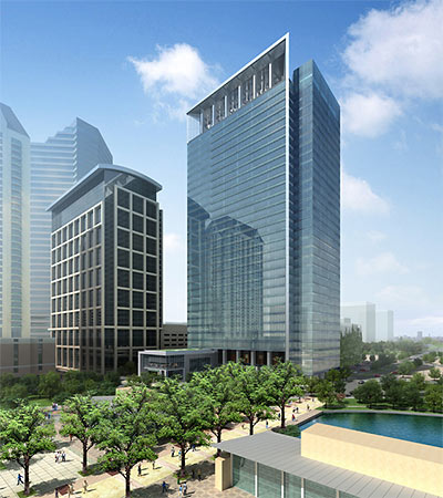
Hot off the Swamplot tipline: Discovery Tower, going up across McKinney St. from Discovery Green Downtown, has its first tenant — and it’ll be taking the whole building.
Beginning in late 2011 — about the time Hess’s current lease at One Allen Center expires — the 30-story tower with the wind turbines on top will be renamed Hess Tower.
After the jump, details from an email announcing the move — sent out to Hess Corporation employees late this morning:

